


CSS and browsers continued....
puggybw
20 years ago
Related Stories
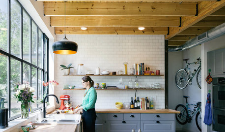
MOST POPULAR11 Modern Farmhouses That Could Make You Want to Change Your Life
Simple forms, cutting-edge materials and casual yet refined good looks characterize homes in this timeless style
Full Story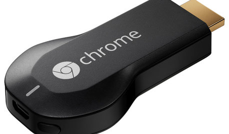
HOME TECHNow Playing in Homes Everywhere: TV, the App
It's easier than ever to beam streaming content from mobile devices to your TV screen
Full Story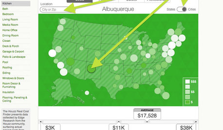
REMODELING GUIDESBreakthrough Budgeting Info: The Houzz Real Cost Finder Is Here
Get remodeling and product prices by project and U.S. city, with our easy-to-use interactive tool
Full Story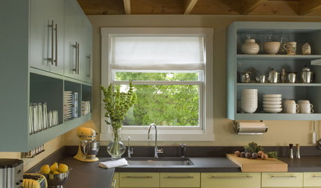
MOST POPULAR8 Great Kitchen Cabinet Color Palettes
Make your kitchen uniquely yours with painted cabinetry. Here's how (and what) to paint them
Full Story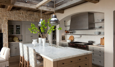
KITCHEN DESIGNHouzz Quiz: What Kitchen Countertop Is Right For You?
The options for kitchen countertops can seem endless. Take our quiz to help you narrow down your selection
Full Story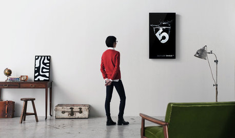
ARTNew Digital Art Frame Gets Put to the Test
Our writer sets up the EO1 at home, then invites artist friends over for a look — at images of their own work. See what they have to say
Full Story
HOME TECHIs the Timing Finally Right for Framed Digital Art?
Several companies are preparing to release digital screens and apps that let you stream artworks and video on your wall
Full Story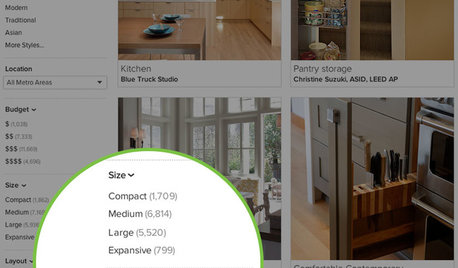
INSIDE HOUZZInside Houzz: More Filters Make Photo Browsing Even Better
Find the inspiration you’re looking for faster with room-specific filters for the millions of photos on Houzz
Full Story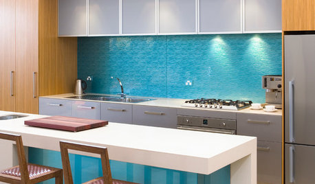
KITCHEN DESIGNHouzz Quiz: Which Kitchen Backsplash Material Is Right for You?
With so many options available, see if we can help you narrow down the selection
Full Story
REMODELING GUIDES6 Steps to Planning a Successful Building Project
Put in time on the front end to ensure that your home will match your vision in the end
Full StorySponsored
puggybwOriginal Author
lazy_gardens
Related Discussions
Jerky Scroll in browser
Q
IE9 switch to other browser?
Q
Why change browsers or email programs?
Q
Could any of these errors be my Loading Browser Problem?
Q
Ray Scheel
lazy_gardens
Ray Scheel
lazy_gardens