


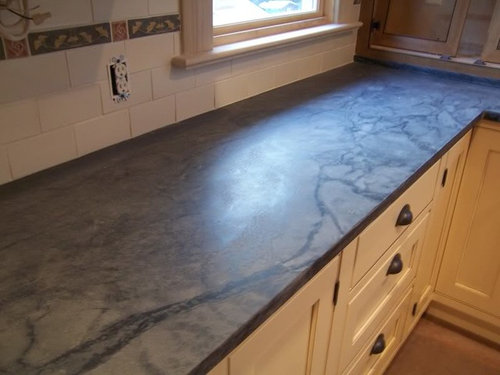
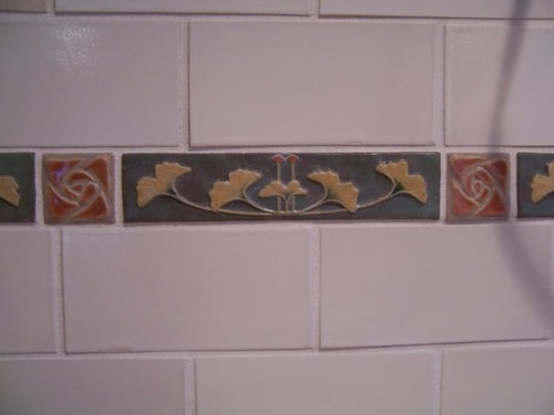
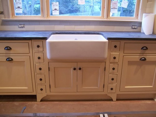
Help me pick a color for my new kitchen pic heavy
donna214
15 years ago


Featured Answer
Comments (24)

debb
15 years ago
Oakley
15 years agoRelated Professionals
Garden City Interior Designers & Decorators · Ridgefield Park Interior Designers & Decorators · Washington Interior Designers & Decorators · Carlsbad Furniture & Accessories · Des Moines Furniture & Accessories · Jupiter Furniture & Accessories · Topeka Furniture & Accessories · Newton Furniture & Accessories · Port Chester Furniture & Accessories · Kingsburg Furniture & Accessories · Carpinteria Furniture & Accessories · Laguna Niguel Lighting · Boston Window Treatments · Brenham Window Treatments · Chicago Window Treatmentsdebb
15 years agodonna214
15 years agobigdoglover
15 years agoyayagal
15 years agoValerie Noronha
15 years agodonna214
15 years agodilly_dally
15 years agoparma42
15 years agodonna214
15 years ago
msrose
15 years agoteacats
15 years agodonna214
15 years agodebb
15 years agodonna214
15 years agodonna214
15 years agobellaflora
15 years agomoremoremore
15 years agomdc08
15 years agoamysrq
15 years agolacombe
15 years agodonna214
15 years ago
Related Stories

COLORPick-a-Paint Help: How to Create a Whole-House Color Palette
Don't be daunted. With these strategies, building a cohesive palette for your entire home is less difficult than it seems
Full Story
COLORPaint-Picking Help and Secrets From a Color Expert
Advice for wall and trim colors, what to always do before committing and the one paint feature you should completely ignore
Full Story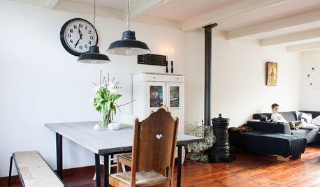
HOUZZ TOURSMy Houzz: Going Heavy on the Metal for Industrial-Style Beauty
Steel and iron pieces mix with antiques and heirlooms in an eclectic Netherlands home
Full Story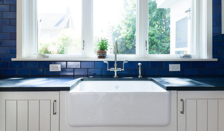
KITCHEN DESIGNKitchen Sinks: Fireclay Brims With Heavy-Duty Character
Cured at fiery temperatures, fireclay makes for farmhouse sinks that just say no to scratches and dents
Full Story
KITCHEN DESIGNKey Measurements to Help You Design Your Kitchen
Get the ideal kitchen setup by understanding spatial relationships, building dimensions and work zones
Full Story
SELLING YOUR HOUSE10 Tricks to Help Your Bathroom Sell Your House
As with the kitchen, the bathroom is always a high priority for home buyers. Here’s how to showcase your bathroom so it looks its best
Full Story
PRODUCT PICKSGuest Picks: Help Your Home Blossom With Floral Decor
Sprinkle hints of spring around your rooms with fabrics, wall coverings and more that recall nature's charms
Full Story
Guest Picks: Give Your Home a Helping of Spring Greens
Celebrate garden growth with this collection of housewares and gardening gear in the shades of budding plants
Full Story
ARCHITECTUREHouse-Hunting Help: If You Could Pick Your Home Style ...
Love an open layout? Steer clear of Victorians. Hate stairs? Sidle up to a ranch. Whatever home you're looking for, this guide can help
Full Story
COLORPick-a-Paint Help: How to Quit Procrastinating on Color Choice
If you're up to your ears in paint chips but no further to pinning down a hue, our new 3-part series is for you
Full StoryMore Discussions


IdaClaire