


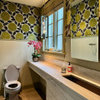
The color pink
neetsiepie
13 years ago


Sort by:Oldest
Comments (34)
Related Stories
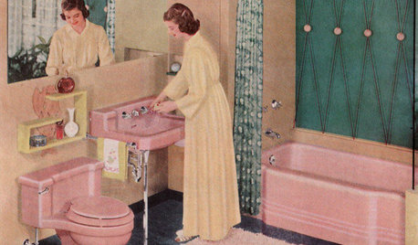
MOST POPULARHomeowners Give the Pink Sink Some Love
When it comes to pastel sinks in a vintage bath, some people love ’em and leave ’em. Would you?
Full Story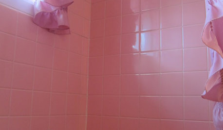
BATHROOM DESIGNTickled Pink in the Bathroom
We asked you to show us your vintage pastel bathrooms — and you responded with a tsunami of photos and comments
Full Story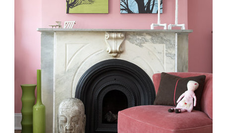
COLORPretty Pink Color Schemes, Subtle to Sensational
How do we love pink? Let us count the ways: soft, sassy, with chartreuse and electric blue and, yes, even red ...
Full Story
COLORBathed in Color: When to Use Pink in the Bath
Even a sophisticated master bath deserves a rosy outlook. Here's how to do pink with a grown-up edge
Full StoryCOLOR8 Pink and Purple Rooms Sans Sugar Shock
Little-girl dreams find grown-up expression in rooms that work pink and purple into chic and sophisticated palettes
Full Story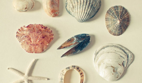
DECORATING GUIDESNature’s Color Wisdom: Lessons on Pink From the Great Outdoors
Leave your assumptions about pink at the princess playhouse door. Head outside instead for shades from shocking to subtle
Full Story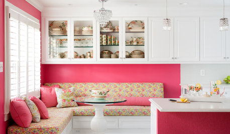
KITCHEN OF THE WEEKKitchen of the Week: A Punch of Pink for a White Kitchen
A homeowner shows her love of pink in bold walls that impart a cheerful vibe
Full Story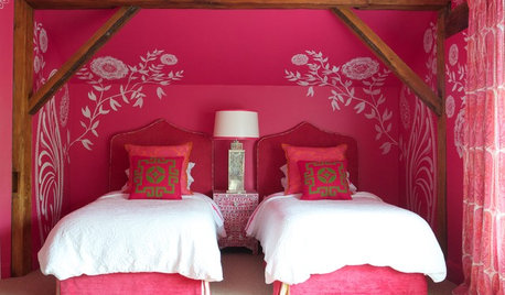
COLORDreaming in Color: 8 Pretty-in-Pink Bedrooms
Don't be afraid to rethink pink: Try softer hues for soothing comfort or bolder tones for a touch of drama
Full Story
PINKThe Pink Link — Learn the Secrets of a Decorating Darling
Is it the kiss of death for masculine rooms? Can it soothe a psyche? Discover the history and theories behind this delightful color
Full Story
PINK15 Rooms to Tickle You Pink
Beautifully blushing or sizzling in hot shades, these rooms show that pink can take on sophistication without losing the enchantment
Full StoryMore Discussions


IdaClaire
palimpsest
Related Professionals
Van Wert Interior Designers & Decorators · Cedar Rapids Furniture & Accessories · Dallas Furniture & Accessories · Evanston Furniture & Accessories · Davidson Furniture & Accessories · Eureka Furniture & Accessories · Golden Glades Furniture & Accessories · Hoffman Estates Furniture & Accessories · Riverton Furniture & Accessories · New Bedford Custom Artists · Immokalee Custom Artists · Mill Valley Custom Artists · Beech Grove Lighting · Orcutt Lighting · La Jolla Window TreatmentsIdaClaire
cooperbailey
newdawn1895
htnspz
User
stinky-gardener
cooperbailey
Sueb20
luckygal
pamghatten
amysrq
franksmom_2010
Oakley
stinky-gardener
User
Lyban zone 4
stinky-gardener
amysrq
awm03
neetsiepieOriginal Author
palimpsest
stinky-gardener
sistersunnie
cooperbailey
B H
skyedog
stinky-gardener
msrose
rmkitchen
amysrq
skyedog
stinky-gardener