


totally frustrated with paint color!!! help me!!!!
jockewing
15 years ago
Sort by:Oldest
Comments (19)
Related Stories

COLORPick-a-Paint Help: How to Quit Procrastinating on Color Choice
If you're up to your ears in paint chips but no further to pinning down a hue, our new 3-part series is for you
Full Story
COLORPaint-Picking Help and Secrets From a Color Expert
Advice for wall and trim colors, what to always do before committing and the one paint feature you should completely ignore
Full Story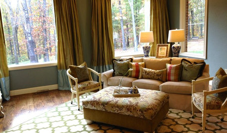
LIVING ROOMSA Living Room Miracle With $1,000 and a Little Help From Houzzers
Frustrated with competing focal points, Kimberlee Dray took her dilemma to the people and got her problem solved
Full Story
EXTERIORSHelp! What Color Should I Paint My House Exterior?
Real homeowners get real help in choosing paint palettes. Bonus: 3 tips for everyone on picking exterior colors
Full Story
HOUZZ TOURSHouzz Tour: Totally New Beauty for a Townhouse in Just 5 Months
Hardworking contractors and loved ones help a Canadian Realtor put a run-down house on the fast track to charm
Full Story
REMODELING GUIDESWisdom to Help Your Relationship Survive a Remodel
Spend less time patching up partnerships and more time spackling and sanding with this insight from a Houzz remodeling survey
Full Story
COLORPick-a-Paint Help: How to Create a Whole-House Color Palette
Don't be daunted. With these strategies, building a cohesive palette for your entire home is less difficult than it seems
Full Story
COLORPick-a-Paint Help: 11 Ways to Mine Your World for Colors
Color, color everywhere. Discover the paint palettes that are there for the taking in nature, shops and anywhere else you roam
Full Story
ENTRYWAYSHelp! What Color Should I Paint My Front Door?
We come to the rescue of three Houzzers, offering color palette options for the front door, trim and siding
Full Story
LIFEDecluttering — How to Get the Help You Need
Don't worry if you can't shed stuff and organize alone; help is at your disposal
Full Story


amysrq
brutuses
Related Professionals
Barstow Interior Designers & Decorators · Bel Air North Interior Designers & Decorators · Westbury Interior Designers & Decorators · Rosaryville Interior Designers & Decorators · Reno Furniture & Accessories · Rock Hill Furniture & Accessories · Roseville Furniture & Accessories · Hastings Custom Artists · Mill Valley Custom Artists · Lancaster Lighting · Miami Springs Lighting · Spring Lighting · Tampa Lighting · Antioch Window Treatments · East Setauket Window TreatmentsjockewingOriginal Author
brutuses
les917
brutuses
ingrid_vc so. CA zone 9
jockewingOriginal Author
brutuses
cursivesailor
jockewingOriginal Author
brutuses
jockewingOriginal Author
ingrid_vc so. CA zone 9
susanlynn2012
brutuses
Taralyn
msrose
jockewingOriginal Author