


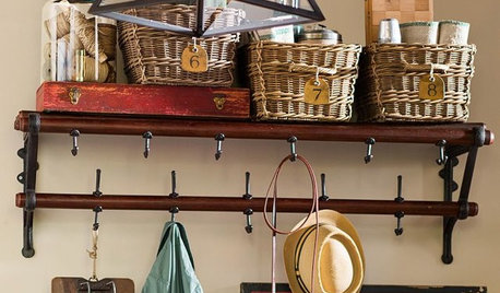
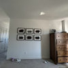
So relieved-no more big blank wall!
violetwest
9 years ago

Sort by:Oldest
Comments (31)
Related Stories
PRODUCT PICKSGuest Picks: Practical Ways to Use a Blank Kitchen Wall
Organize and keep kitchen items close with these racks, shelves, hooks and more
Full Story
COLORYou Said It: ‘Adding Color Is About So Much More Than Shock’ and More
Highlights from the week include color advice, Houzzers helping Houzzers and architecture students building community housing
Full Story
WALL TREATMENTSA Dozen Creative Ideas for Decorating Blank Walls
When you want to fill a lot of wall space in one fell swoop, these ideas will help you do it with aplomb
Full Story
DECORATING PROJECTSFill a Blank Wall on a Beer Budget
Tap your fabric bin, photo box or any kid for art that’s easy, personal and hecka cheap
Full Story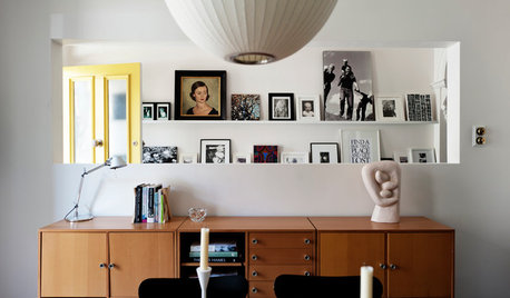
DECORATING GUIDESConquer That Blank Wall With a Versatile Picture Ledge
Turn a dull spot into your own personal art gallery with shallow shelves displaying artwork you can swap out on a whim
Full Story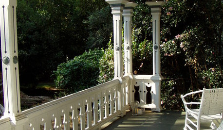
Balusters: Big Impact with Not-So-Big Details
Intricate or Simple, Balusters Define a Home's Architectural Style
Full Story
ACCESSORIESLive Boldly: How to Fill That Blank Wall
Sometimes living boldy in your design means simply filling your walls with something unexpected
Full Story
DECORATING GUIDESMission Possible: A Designer Decorates a Blank Apartment in 4 Days
Four days and $10,000 take an apartment from bare to all-there. Get the designer's daily play-by-play
Full Story
DECORATING GUIDES5 Jumping-Off Points for Decorating a Blank Space
Get your design mojo going by building your entire decor scheme off a single favorite piece
Full Story
DECORATING GUIDESMore Is More: The 10 Tenets of Maximalist Style
Ready to join the school of over-the-top design? Learn how to embrace excess in your interiors
Full StoryMore Discussions


violetwestOriginal Author
teeda
Related Professionals
Bel Air North Interior Designers & Decorators · East Hanover Interior Designers & Decorators · Mansfield Interior Designers & Decorators · Athens Furniture & Accessories · Bridgeport Furniture & Accessories · Miami Furniture & Accessories · North Bergen Furniture & Accessories · Potomac Furniture & Accessories · Washington Furniture & Accessories · Wilmington Furniture & Accessories · Woodstock Furniture & Accessories · Moraga Furniture & Accessories · San Juan Capistrano Furniture & Accessories · Richardson Window Treatments · Stony Brook Window TreatmentsUser
sjhockeyfan325
emmarene9
sumac
deegw
User
violetwestOriginal Author
teacats
blfenton
luckygal
melsouth
monicakm_gw
coll_123
sochi
violetwestOriginal Author
Skypathway1
BeverlyFLADeziner
ken_adrian Adrian MI cold Z5
violetwestOriginal Author
Mmmbeeer
daisychain01
lilylore
amykath
violetwestOriginal Author
amykath
lilylore
violetwestOriginal Author
springroz
lilylore