


Please vote!
jterrilynn
10 years ago

Sort by:Oldest
Comments (44)
Related Stories
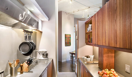
KITCHEN DESIGNKitchen Layouts: A Vote for the Good Old Galley
Less popular now, the galley kitchen is still a great layout for cooking
Full Story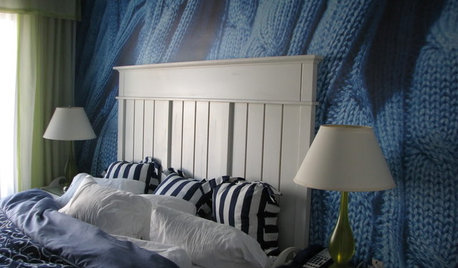
DECORATING GUIDESA Vote for the Cable Stitch in Home Decor
Warm Up a Room With the Look, Feel and Memories of Knitting
Full Story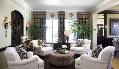
LIVING ROOMS8 Living Room Layouts for All Tastes
Go formal or as playful as you please. One of these furniture layouts for the living room is sure to suit your style
Full StoryKIDS’ SPACES8 Beautiful Nursery Styles From Classic to Whimsical
Go as traditional or as fun as you please. These nurseries offer grand inspiration for all kinds of looks
Full Story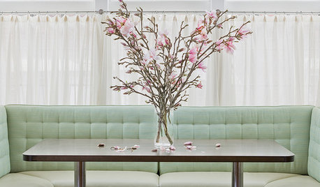
KITCHEN DESIGNPaging All Foodies: Your Banquette Is Ready
Please follow us to these 7 gorgeous dining nooks designed for everything from haute cuisine to s'mores
Full Story
INSIDE HOUZZInside Houzz: Enter PlayHouzz 2016
Show off your design skills and do good too by participating in the Houzz-AIA charitable playhouse design competition
Full Story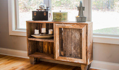
LIFEVisit a Furniture Workshop That Rebuilds Lives
Hand-crafted furniture often made from reclaimed materials isn't the only beautiful part of this Atlanta shop
Full Story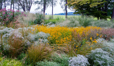
GARDENING GUIDESThe Surprising Ingredients Every Good Garden Should Have
See what to do — and not do — for lasting rewards in your landscape
Full Story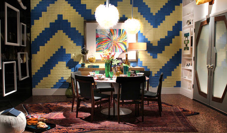
DESIGNER SHOWCASES20 Fantasyland Dining Room Designs That Delight
A wonder to behold, these incredible professionally designed rooms take everyday dining over the top
Full Story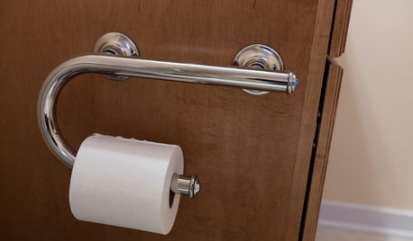
LIFEThe Absolute Right Way to Hang Toilet Paper. Maybe
Find out whether over or under is ahead in our poll and see some unusual roll hangers, shelves and nooks
Full StoryMore Discussions


auntie_ellen boston
Vertise
Related Professionals
Wanaque Interior Designers & Decorators · Chicago Furniture & Accessories · Lake Zurich Furniture & Accessories · Marietta Furniture & Accessories · Portage Furniture & Accessories · San Elizario Furniture & Accessories · Aliso Viejo Furniture & Accessories · Eureka Furniture & Accessories · Little Chute Furniture & Accessories · Laguna Niguel Lighting · Monrovia Lighting · Dallas Window Treatments · Tennessee Window Treatments · Walnut Creek Window Treatments · La Jolla Window TreatmentsjterrilynnOriginal Author
TxMarti
ellendi
DLM2000-GW
jterrilynnOriginal Author
Vertise
jterrilynnOriginal Author
finallyhome
joaniepoanie
romy718
lizbeth-gardener
Lyban zone 4
yayagal
jterrilynnOriginal Author
Olychick
Olychick
k9arlene
DLM2000-GW
k9arlene
dilly_ny
gsciencechick
Vertise
User
jterrilynnOriginal Author
k9arlene
jterrilynnOriginal Author
Olychick
indygo
kellienoelle
joaniepoanie
jterrilynnOriginal Author
Olychick
jterrilynnOriginal Author
DLM2000-GW
donnawb
joaniepoanie
zen4d
jterrilynnOriginal Author
WendyB 5A/MA
blackchamois
User
jterrilynnOriginal Author