

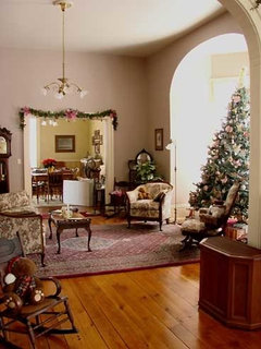
I promised my husband I wouldn't do pink but.........
oopsie913
14 years ago
Featured Answer
Sort by:Oldest
Comments (36)

User
14 years ago
Oakley
14 years agoRelated Professionals
Arkansas Interior Designers & Decorators · Aspen Hill Interior Designers & Decorators · Athens Furniture & Accessories · Marietta Furniture & Accessories · North Myrtle Beach Furniture & Accessories · Wilmington Furniture & Accessories · Fort Carson Furniture & Accessories · Glenview Furniture & Accessories · Urbandale Furniture & Accessories · Peachtree City Custom Artists · West University Place Lighting · Egypt Lake-Leto Lighting · Littleton Window Treatments · Ojus Window Treatments · Richardson Window Treatmentsoopsie913
14 years agoholleygarden Zone 8, East Texas
14 years ago
Sueb20
14 years agosweeby
14 years ago
Kathleen McGuire
14 years agooopsie913
14 years agojerseygirl_1
14 years agonicole__
14 years agostinky-gardener
14 years ago
awm03
14 years agopeaches12345
14 years agorosie
14 years agokyjo
14 years agooopsie913
14 years agostinky-gardener
14 years agostlouie
14 years agooopsie913
14 years agostlouie
14 years agomary_lu_gw
14 years agooopsie913
14 years agooopsie913
14 years agomary_lu_gw
14 years agostinky-gardener
14 years agooopsie913
14 years agostinky-gardener
14 years agoquailfeathers
14 years agogreenthumbfish
14 years agostlouie
14 years agooopsie913
14 years agostlouie
14 years agojlc712
14 years agooopsie913
14 years ago
Aglitter
3 years agolast modified: 3 years ago

Related Stories
FUN HOUZZEverything I Need to Know About Decorating I Learned from Downton Abbey
Mind your manors with these 10 decorating tips from the PBS series, returning on January 5
Full Story
WINTER GARDENING6 Reasons I’m Not Looking Forward to Spring
Not kicking up your heels anticipating rushes of spring color and garden catalogs? You’re not alone
Full Story
LIFEThe Polite House: Do I Have to Display Decor Given to Me as a Gift?
Etiquette columnist Lizzie Post tackles the challenge of accepting and displaying home decor gifts from frequent visitors
Full Story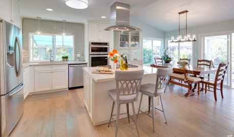
KITCHEN OF THE WEEKKitchen of the Week: Coastal Kitchen Honors a Beloved Husband
This Southern California kitchen makeover includes a touching story of a couple who faced a much bigger challenge during their remodel
Full Story
I Spy: Musical Instruments Around the House
Compose a Great Space With the Shapes and Promise of Music
Full Story
DECORATING GUIDESThe Dumbest Decorating Decisions I’ve Ever Made
Caution: Do not try these at home
Full Story
FEEL-GOOD HOME12 Very Useful Things I've Learned From Designers
These simple ideas can make life at home more efficient and enjoyable
Full Story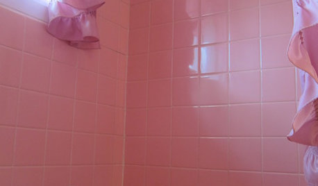
BATHROOM DESIGNTickled Pink in the Bathroom
We asked you to show us your vintage pastel bathrooms — and you responded with a tsunami of photos and comments
Full StoryMore Discussions


quailfeathers