


Options to wallpaper border on kitchen bulkhead?
tiskers
15 years ago
Sort by:Oldest
Comments (32)
Related Stories

KITCHEN DESIGNHouzz Quiz: Which Kitchen Backsplash Material Is Right for You?
With so many options available, see if we can help you narrow down the selection
Full Story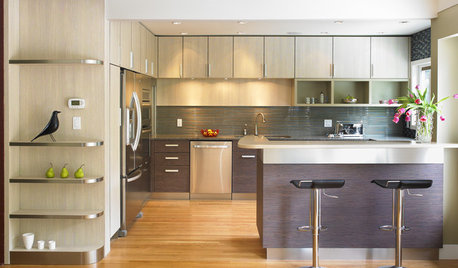
KITCHEN CABINETSGet the Look of Wood Cabinets for Less
No need to snub plastic laminate as wood’s inferior cousin. Today’s options are stylish and durable — not to mention money saving
Full Story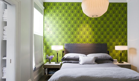
GREAT HOME PROJECTSConsidering Wallpaper? Here's How to Get Started
New project for a new year: Give your room a whole new look with the color, pattern and texture of a wall covering
Full Story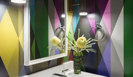
DECORATING GUIDES20 Bathroom Wallpapers That Bring the Wow
These spirited wallcoverings will add a drop of whimsy and a whole bucket of bold to your water closet
Full Story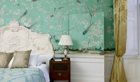
WALL TREATMENTSTempted to Try Wallpaper? 10 Tips for Finding the Right Pattern
Before you lay down a lot of cash, sit down with this advice for getting a wallpaper you’ll love for years
Full Story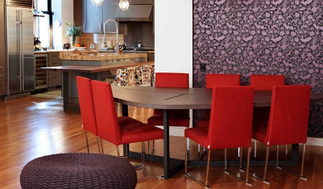
DECORATING GUIDES14 Ways to Make the Most of Your Wallpaper
Bring What You Love About Your Wallpaper Into the Rest of Your Room
Full Story
KITCHEN DESIGNNew This Week: Moody Kitchens to Make You Rethink All-White
Not into the all-white fascination? Look to these kitchens for a glimpse of the dark side
Full Story
KITCHEN DESIGNCountertop and Backsplash: Making the Perfect Match
Zero in on a kitchen combo you'll love with these strategies and great countertop-backsplash mixes for inspiration
Full Story
KITCHEN DESIGNKitchen of the Week: Exquisite Artistic Backsplash
Rippling colored glass forms an imaginative wall, while a clever layout embraces practicality in this stunning Texas kitchen
Full Story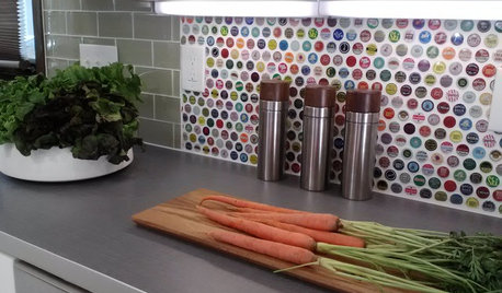
KITCHEN BACKSPLASHES15 Creative Kitchen Backsplashes for the Adventurous
Consider using snow skis, mirrors, bottle caps and other unusual materials for your next kitchen backsplash
Full StoryMore Discussions


tiskersOriginal Author
ingrid_vc so. CA zone 9
Related Professionals
Liberty Township Interior Designers & Decorators · Charlotte Furniture & Accessories · Reno Furniture & Accessories · Simpsonville Furniture & Accessories · Carlsbad Furniture & Accessories · Fair Lawn Furniture & Accessories · Fallbrook Furniture & Accessories · La Mirada Furniture & Accessories · San Juan Capistrano Furniture & Accessories · Arlington Custom Artists · Hastings Custom Artists · Laguna Beach Lighting · Wilmington Lighting · Northbrook Window Treatments · Oakland Window TreatmentstiskersOriginal Author
graywings123
Boopadaboo
Oakley
tiskersOriginal Author
prairiegirlz5
lorriekay
mitchdesj
bigdoglover
bronwynsmom
tiskersOriginal Author
bronwynsmom
dd70
tiskersOriginal Author
tiskersOriginal Author
yayagal
User
dilly_dally
tiskersOriginal Author
bronwynsmom
tiskersOriginal Author
sue36
graywings123
tiskersOriginal Author
bronwynsmom
tiskersOriginal Author
barbie08075
User
tiskersOriginal Author
sue36