Shop Products
Houzz Logo Print
whit461

Orange Trellis Curtain in Blue and white DR/KIT

whit461
10 years ago

I wanted to cross post, but don't know how. My original question is in the kitchen forum. We remodeled our kitchen/dining room earlier and are moving to refurbish the trim and wood windows. Walls are Blue Willow (medium blue) with stark white trim, white cabs and marble counters over oak hardwood flooring.

So of course now we need window treatments, right? It does to DW. We have two panels from Pottery Barn of a sheer in white with a blue/grey trellis pattern on it. Me and everyone loves it, but DW hates it. So we go hunting curtains and fabrics this weekend and we run across a bright orange with white Imperial Trellis pattern on it from or based on Schumacker's design. Bold. Powerfull. We'd do 3 windows in the DR with simple curtains 96" high. Bring in orange color in some items scattered through the kitchen to balance it visually, add some pillows in similar shade and patterns in the LR across the entrance foyer.

Too much? Maybe tone it down by using Roman Shades instead? Soften it by finding the pattern but in orange on a white background, not the other way?

Comments (19)

  • justgotabme
    10 years ago

    Hi Whit. I had to rethink there for a minute as we usually see DH for Dear Husband, but when you were talking about a kitchen and then wrote DW I thought of Dish Washer. Which if we were back in the "old days" that could work too. LOL
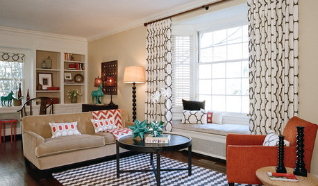
    Okay on to your dilemma. I like the idea of the white on Orange trellis with the blue walls and wood floors. And yes it might be a bit on the bold side, but I personally like bold kitchens. Is this the pattern you are speaking of?


    If so I love it. Is the fabric you found brighter than the above panels? Either way I think it could be quite striking. Blue and Orange are opposite on the color, as you might know, so they are considered complimentary colors. I've decorated with those colors a number of times over the years and love it.

  • mtnrdredux_gw
    10 years ago

    Hi,

    It's hard for people to comment without photos of the kitchen, an example of the paint color and of the fabric.

    Can you post those?

  • Gooster
    10 years ago

    here's the thread in the Kitchen forum. It has pics of the fabric and the space.

    Here is a link that might be useful: bold color question

  • romy718
    10 years ago

    Whit's kitchen/DR

  • romy718
    10 years ago

    Whit's fabric

  • geokid
    10 years ago

    Your kitchen is beautiful! The orange would definitely change the look, but it could be a good look. I think if the orange is more on the rusty side vs bright orange it would work.

    I really like the idea of the fabric on roman shades.

  • justgotabme
    10 years ago

    I just did up a virtual to help you see how the fabric in a mixture of panels in the dining room and valances or roman shades could work in the kitchen.

  • whit461
    Original Author
    10 years ago

    Justgotabeme, WOW. I need to learn to do this kind of stuff.

    Anyway, that's great stuff. If we go this route, we definitely need to incorporate this color in accent pieces throughout the space. We feel it really ties the various rooms in our home together, but I am getting concerned it may be too bold and needs to be toned down. Based on this mock up (again, it is so cool), I would point out that the picture of the room is dark, and the curtains are very bright.

    I am thinking we need to get the bolt of cloth from Calico Corners for the weekend and hang it over the window and then take pics.

    You guys are the best and I appreciate your feedback. And yes, DW is Dear Wife. I know it is usually DH, but hey, you don't think that she is the designer, builder, contractor, architect, or tradesman here do you?

  • nosoccermom
    10 years ago

    How about these from West Elm, currently on sale.

    Here is a link that might be useful: west elm ochre curtains

  • nosoccermom
    10 years ago

    duplicate post

    This post was edited by nosoccermom on Wed, Dec 4, 13 at 18:18

  • justgotabme
    10 years ago

    Ha ha! Whit, I've been super stressed the last few weeks getting everything accomplished before we left for Cali last Saturday. Then having trouble with WordPress while trying to write my article Monday finished me off. I was a total wreck, so doing your virtual yesterday was fun. I was so exhausted that I didn't get out of my jammies yesterday until it was time to get ready to get dinner. Normally I'm up and dressed within minutes. So as you might imagine, my brain was just not functioning well enough to get the DW as Dear Wife right away.
    If you'd like to take better, truer color, photo I'll be happy to do another virtual for you.

  • sjhockeyfan325
    10 years ago

    justgottobeme, how did you do the "virtual"?

    IMHO, the orange trellis curtains look great (bold, and great) in the dining area, but adding the valance in the kitchen is what makes it "too much". I think I'd prefer a more neutral shade or shutters in the kitchen (or nothing, depending on your view - in and out).

  • justgotabme
    10 years ago

    sjhockeyfan, I just used Windows Paint program.

    Out of curiosity does your nickname mean you're in San Jose? I'm in Newark right now.

    Here is a link that might be useful: Windows Paint

  • sjhockeyfan325
    10 years ago

    justgotabme, I actually live and work in San Francisco, but I'm a Sharks fanatic!!

  • theclose
    10 years ago

    LOVE the orange and white trellis! Looks fab and yes, it is somewhat bold, but also a classic look. Really looks great with your walls, much more so than the gray and white. The gray and white gets a little lost.

    Hope you go with it!

  • Gooster
    10 years ago

    There were a number of similar trellis prints to the Kelly Wearstler Shumacher Imperial Trellis in a variety of colorways -- including an orange that was more muted.

    Per the other thread, if you wanted to cut down on the graphic impact of the one at CC, you could do what Peacock did in his home (except in the inverse) and do a comparable linen roman blind (or valance) with grosgrain ribbon accents in the orange.

    (funny thing-- I noticed my dog bed has the same print in green!)

  • justgotabme
    10 years ago

    sjhockeyfan, I was planning on taking the hotel shuttle to San Francisco (Union Square area) tomorrow, but after the comparative little walking I did today and the way my feet and lower back hurt I think I'll wait until next week so I can build up some stamina.

  • whit461
    Original Author
    10 years ago

    Sharks!! At least it's not the Kings. Habs fan as a kid, but now hard not to like the Hawks or the Pens. So bring it.

    We are still leaning toward curtains, but how do you not love what Peacock does?

  • ttodd
    10 years ago

    Would be totally Fab! Do it!