


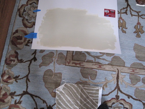
Do I need darker or lighter tones?
Jamie
11 years ago

Sort by:Oldest
Comments (11)
Related Stories
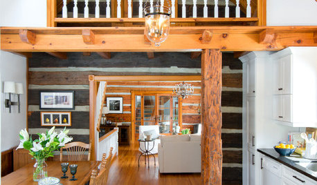
CABINSA Quirky Ontario Cabin Gets a Lighter Touch
Many eccentricities got to stay during this home’s redesign, but now they’re joined by better lighting, looks and functionality
Full Story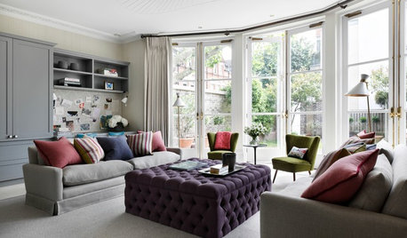
DECORATING GUIDES10 Ideas for a Lighter, Brighter Living Room
Give your space a boost all year round by making the most of every bit of daylight
Full Story
DECORATING GUIDESRoom of the Day: Lighter Look for a Townhouse Great Room
Built-in cabinets consolidate media equipment and collectibles. Beach-cottage-style touches create a relaxing vibe
Full Story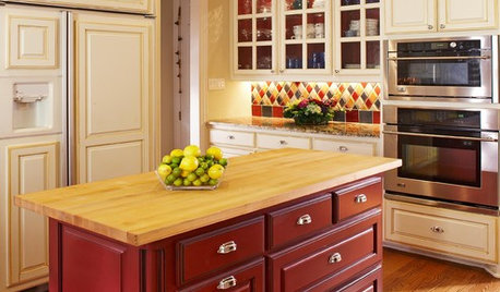
KITCHEN DESIGNTwo-Tone Cabinet Finishes Double Kitchen Style
Love 'em or not, two-tone kitchen cabinet treatments are still going strong. Try these strategies to change up the look of your space
Full Story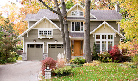
EXTERIOR COLORDynamic Duo: How to Pull Off a Two-Tone Exterior Color Scheme
Why stick to one main house color if you can easily and beautifully combine two?
Full Story
KITCHEN DESIGNA Two-Tone Cabinet Scheme Gives Your Kitchen the Best of Both Worlds
Waffling between paint and stain or dark and light? Here’s how to mix and match colors and materials
Full Story
COLORHow to Layer Tones of Gray for Depth and Harmony
Use texture, pattern, contrast and more to create a subtle, sophisticated look with this popular color
Full Story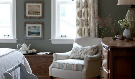
DECORATING GUIDESSplit Your Colors with Two-Toned Walls
There's no need to choose between two paint colors — use both to add dimension and interest to your walls
Full Story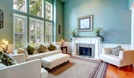
DECORATING GUIDESNeed Peace and Quiet? Muted Colors Tone Things Down
Subtle hues can be perfect for large rooms and to balance out bolder colors in a home
Full Story
COLORNature’s Color Wisdom: Lessons on Earth Tones From the Great Outdoors
Look to the land for hues that are grounding, soothing and endlessly versatile
Full Story


graywings123
palimpsest
Related Professionals
Fernway Interior Designers & Decorators · Linton Hall Interior Designers & Decorators · Liberty Township Interior Designers & Decorators · Frisco Furniture & Accessories · Roswell Furniture & Accessories · Kansas City Furniture & Accessories · Eugene Custom Artists · Peachtree City Custom Artists · Decatur Custom Artists · Aurora Lighting · Batavia Lighting · El Mirage Window Treatments · Phoenix Window Treatments · Rockford Window Treatments · Stanton Window TreatmentsJamieOriginal Author
madeyna
franksmom_2010
SparklingWater
JamieOriginal Author
SparklingWater
blfenton
palimpsest
lizzie_grow