


Help with ceiling paint color for cinnamon-colored library/office
frogtalk358
9 years ago

Related Stories

COLORPick-a-Paint Help: How to Create a Whole-House Color Palette
Don't be daunted. With these strategies, building a cohesive palette for your entire home is less difficult than it seems
Full Story
COLORPick-a-Paint Help: How to Quit Procrastinating on Color Choice
If you're up to your ears in paint chips but no further to pinning down a hue, our new 3-part series is for you
Full Story
HOUZZ TOURSMy Houzz: Saturated Colors Help a 1920s Fixer-Upper Flourish
Bright paint and cheerful patterns give this Spanish-style Los Angeles home a thriving new personality
Full Story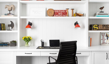
REMODELING GUIDESKey Measurements to Help You Design the Perfect Home Office
Fit all your work surfaces, equipment and storage with comfortable clearances by keeping these dimensions in mind
Full Story
COLORHow to Choose a Paint Color
Designers offer tips for examining your closet, memories and daily life to find the right paint colors for your home
Full Story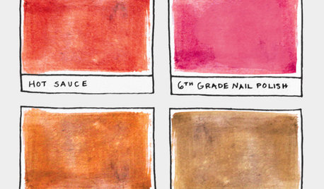
FUN HOUZZ16 Creative Paint Color Names We Haven't Seen — Yet
Someday, the namers of new paint colors will finally run out of ideas. We're here to help
Full Story
MOST POPULAR8 Great Kitchen Cabinet Color Palettes
Make your kitchen uniquely yours with painted cabinetry. Here's how (and what) to paint them
Full Story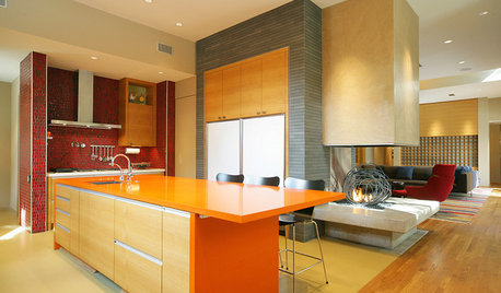
KITCHEN DESIGNPalatable Palettes: 8 Great Kitchen Color Schemes
Warm and appetizing or cool and relaxing? These 8 paint palettes can help you choose the best colors for your kitchen
Full Story
KITCHEN DESIGNDesign Dilemma: My Kitchen Needs Help!
See how you can update a kitchen with new countertops, light fixtures, paint and hardware
Full Story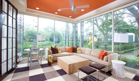
MOST POPULARHeads-Up Hues: 10 Bold Ceiling Colors
Visually raise or lower a ceiling, or just add an eyeful of interest, with paint from splashy to soothing
Full StoryMore Discussions


bbstx
tibbrix
Related Professionals
Fernway Interior Designers & Decorators · Easton Furniture & Accessories · Oshkosh Furniture & Accessories · Woodstock Furniture & Accessories · Mahwah Furniture & Accessories · Richfield Furniture & Accessories · Peachtree City Custom Artists · Decatur Custom Artists · Walnut Creek Lighting · East Setauket Window Treatments · Northbrook Window Treatments · Richardson Window Treatments · Rockford Window Treatments · Tennessee Window Treatments · Walnut Creek Window Treatmentsfrogtalk358Original Author
palimpsest
frogtalk358Original Author
Annie Deighnaugh
schoolhouse_gw
Annie Deighnaugh
amykath
bossyvossy
lilylore
Bunny
tibbrix
tibbrix
tibbrix
tibbrix
tibbrix
Olychick
sprout26
Karenseb
Honu3421
frogtalk358Original Author
Annie Deighnaugh