


7 Basic Plots. 3 Basic Palettes?
mtnrdredux_gw
11 years ago
Sort by:Oldest
Comments (76)
Related Stories
HOUZZ TOURSMy Houzz: A Basic Builder Home Gets the Glam Treatment
From blank canvas to decorated beauty, this home in Massachusetts changed a family's life in more ways than one
Full Story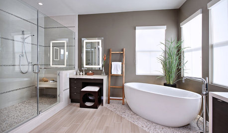
WORKING WITH PROSGo Beyond the Basics When Interviewing Architects
Before you invest all that money and time, make sure you and your architect are well matched beyond the obvious levels
Full Story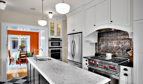
KITCHEN DESIGN8 Statement-Making Kitchen Backsplashes Beyond Basic Tile
Look to metal, glass and even wooden crates for an attention-getting backsplash that might even save you some money
Full Story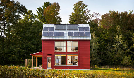
GREEN BUILDINGGoing Solar at Home: Solar Panel Basics
Save money on electricity and reduce your carbon footprint by installing photovoltaic panels. This guide will help you get started
Full Story
GREEN BUILDINGInsulation Basics: Heat, R-Value and the Building Envelope
Learn how heat moves through a home and the materials that can stop it, to make sure your insulation is as effective as you think
Full Story
BATHROOM WORKBOOKStandard Fixture Dimensions and Measurements for a Primary Bath
Create a luxe bathroom that functions well with these key measurements and layout tips
Full Story
RUSTIC STYLE10 Cabin Rental Basics for City Slickers
Stay warm, dry and safe while you’re enjoying winter cabin life with this valuable advice
Full Story
DECKSDecking Materials Beyond Basic Lumber
Learn about softwoods, tropical hardwoods, composites and more for decks, including pros, cons and costs
Full Story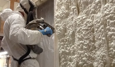
MATERIALSInsulation Basics: What to Know About Spray Foam
Learn what exactly spray foam is, the pros and cons of using it and why you shouldn’t mess around with installation
Full Story
LANDSCAPE DESIGN6 Basic Elements of Classic Garden Style
Use symmetry, geometry and other principles of formal design to give even a modest garden a pleasing balance
Full StoryMore Discussions


Diane Smith at Walter E. Smithe Furniture
palimpsest
Related Professionals
Charleston Interior Designers & Decorators · Glenbrook Interior Designers & Decorators · La Habra Interior Designers & Decorators · Fort Wayne Furniture & Accessories · Lake Zurich Furniture & Accessories · Mansfield Furniture & Accessories · Mesa Furniture & Accessories · Minneapolis Furniture & Accessories · Fort Carson Furniture & Accessories · Mahwah Furniture & Accessories · Arlington Custom Artists · Decatur Custom Artists · Lancaster Lighting · Del City Window Treatments · Littleton Window Treatmentsmtnrdredux_gwOriginal Author
mtnrdredux_gwOriginal Author
palimpsest
lyfia
chris11895
kitchendetective
palimpsest
mtnrdredux_gwOriginal Author
kimiko232
marcolo
Annie Deighnaugh
kitchendetective
eandhl
palimpsest
Sueb20
User
bronwynsmom
kitchendetective
jlc712
jterrilynn
palimpsest
chickadee2_gw
chickadee2_gw
sochi
Annie Deighnaugh
Annie Deighnaugh
geokid
patty_cakes
Pipdog
kathy77
bestyears
Annie Deighnaugh
ttodd
sochi
mtnrdredux_gwOriginal Author
sochi
lazy_gardens
mtnrdredux_gwOriginal Author
User
palimpsest
artydecor
bronwynsmom
susiemw
susiemw
juliekcmo
mtnrdredux_gwOriginal Author
juliekcmo
KevinMP