Shop Products
Houzz Logo Print
amykath

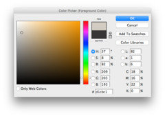
Agreeable Gray looks Pink???

amykath
9 years ago

I thought I had chosen my exterior siding color. I put up some samples of agreeable gray (although mixed by ace hardware claiming they had the formula). It looks a bit pink. Has anyone noticed a pink undertone in this color? Maybe it's the ace hardware mix?

Comments (26)

  • amykath
    Original Author
    9 years ago

    Well I did some research and agreeable gray definitely has some pink taupe undertones. Can someone suggest a gray about the same hue/tone (in lightness I mean) without a pink undertone? I am not a fan of pink. I need to pick my exterior color quickly.

    Thanks!!!

  • amykath
    Original Author
    9 years ago

    I know I am the only one answering my own questions. lol

    I think I am going to give gray owl mixed by SW a try. Hope it works out!

  • tibbrix
    9 years ago

    How about Revere Pewter from BM?

    Revere Pewter

    This post was edited by Tibbrix on Tue, Dec 16, 14 at 14:35

  • Holly- Kay
    9 years ago

    I love BM Thunder.

  • Holly- Kay
    9 years ago

    Here is a sample.

    Here is a link that might be useful: Thunder

  • amykath
    Original Author
    9 years ago

    Those are both gorgeous and I love them too! I am trying to stay really light but not white. Here is my inspiration photo for my house siding and stone. They used agreeable gray but on my house it looks like light pink. So, I am hoping gray owl might do the trick. Who knows.

  • tibbrix
    9 years ago

    Oh artillery, look at BM Bunny Gray!

    The lighting in that photo is so off, seems like either very early morning or evening, that it's very hard to even tell what the color is.

    Bunny Gray

  • tlbean2004
    9 years ago

    I used aloof gray in my kitchen and l love it!

  • Bunny
    9 years ago

    Tibbrix, oooh, love Bunny Gray. And who couldn't love something with Bunny in the name?

    As much as I don't care for true gray on inside walls, I love it on exterior walls. My little house is gray with white trim and it's due to be painted in 2015. I say that every year. If I don't paint it the exact same shade of gray, I'm thinking of going a hair darker. No pink or blue undertones. Pure gray with a smidge of warmth, as long as it reads gray.

  • amykath
    Original Author
    9 years ago

    Thanks Shayne, yes it does look white but they did use agreeable gray. Thanks for the tips.

    I like argos. I will get a sample of that!

    Thank you again!
    Amy

  • Holly- Kay
    9 years ago

    I read that Thunder is the perfect grey if you are looking for one with no undertones. If the gray owl doesn't work you could look at using a darker grey at 25 or 50 percent.

  • klem1
    9 years ago

    Forget the named colors and work off of secoundary or tertiary colors which are/will be on the house. Make an appointment with Sherwin Williams or other paint store to take samples of existing colors on house in. If you can't get samples off house,borrow their "color fan" and match colors on your house. Unless you understand color and how one effects others,choosing colors can make one pull their hair out. Let an expert help and you will be suprised with the results.

  • nosoccermom
    9 years ago

    Make sure to bring in the BM card and see how well the match is. I had success and failure with SW trying to match BM colors. Gray is fickle. I ended up with purple scales on my house, which thankfully faded after a couple of years into the bluish/gray I had envisioned initially..

  • kswl2
    9 years ago

    One should never, ever look at the name of a color. Ever.

    All colors are affected by the amount of light, the type and quality of light, whether the color is applied to a horizontal or vertical surface, what colors are adjacent, etc. The color you see in a photo or magazine has likely been photoshopped or color corrected anyway. I am always appalled when I see people in a paint department who browse for five minutes, pick out a color chip, squint their eyes and say "this should be fine" and order three gallons of it for their home. I want to run after them and suggest they paint a section of drywall or siding and see how the color changes over a 24 hour period in the actual room. Don't worry, I don't offer strangers unsolicited advice in stores, but there are times when I really feel it is my duty to warn them how fickle paint color can be!

    And then I imagine them slowing backing away, reaching for their cell phones, and whispering the words "Baker Act" ...... Yep, I leave strangers---and sometimes the near and dear-----to make their own color mistakes. And it's funny how often they are completely unaware that their "gray" room is really lavender, or the beige is actually green.

    You have my sympathy with the decision process, Akillery, but I've seen enough of your staging pictures to know that you've got this :-)

  • amykath
    Original Author
    9 years ago

    kswl, thanks for the thoughts. Trust me, I am not one of those ppl! Far from it. I obsess over color. I will definitely put up several colors and stare at them for days before I decide. I hope I can get it right!

  • kswl2
    9 years ago

    If anybody can get it right, it's you. Your process is deliberative, not impulsive, and unless a person just hits on the right color on their first choice by luck, that's what it takes. But good luck anyway :-)

  • amykath
    Original Author
    9 years ago

    Those are some encouraging words. I sure hope you are right!

    Thanks for the vote of confidence. That is very sweet kswl!

    Amy

  • Hydragea
    9 years ago

    AKtillery - I think Grey owl is a good start if you want to match the inspiration pic, or even one tone darker on the paint ladder.
    I'm pretty sure that paint looks a lot lighter outside.

  • amykath
    Original Author
    9 years ago

    I think Gray Owl is the winner. It is subtle and similar to my inspiration pic and definitely not pink. I chose another color and now I cannot for the life of me remember the name. It came out a little brighter and slightly bluer/greener. I need to go back to be sure. It was fairly dry but it is a very overcast foggy day, so I might change my mind! I will keep you posted!

    When I go back I will take better photos.

    Here is a photo. Photos never show what is reality, so I am not sure this even helps.

    From left to right
    Name of blue/gray/green paint I cannot remember
    Second is Gray Owl
    Last is the pinkish hue of the agreeable gray (not agreeing with me)

  • Hydragea
    9 years ago

    From this pic, the grays are in danger of looking white. In the sun, they'll look even whiter. I would try one rung down on the fan deck.

    The blue/gray/green paint looks like the closest to your inspiration pic.

    agreeable gray looks pinker, yes.

  • amykath
    Original Author
    9 years ago

    Hydrangea, thanks for your thoughts. I actually do want for it to look white. My stone will be white, but I never wanted to go out and pick a white. So, this is likely the best of both worlds.

    Thanks for noticing the blue/gray/green color looking more like my inspiration photo. I will look for that when I go back.

  • Kiwigem
    9 years ago

    I can't wait to see your house!

  • amykath
    Original Author
    9 years ago

    Thanks Kiwi! I can't wait either.

    I'm looking forward to yours as well!!

  • chinesenegotiator
    7 years ago

    sw agreeable gray DOES not have any pink undertones. Using the RGB values provided by Sherwin Williams site shows that this warm gray leans more to the orange family. With that being said I chose this color for my house and it's great. You get 4 colors in one depending on light. It can look white, cream, light gray, warm gray.

    amykath thanked chinesenegotiator
  • Albert L. Fox
    last year
    last modified: last year

    I've been painting bits and pieces of AG throughout my house, and in the north it comes off as a beautiful light gray, but on the south and west side of the house it reads warm light earthy taupe.... Definitely see subtle warm pink tones. But with the WHOLE GREIGE kick thats just lifting off, don't be afraid of it. It won't LOOK pink once up, and if anything, looks fresh and updated. Next to my BM Classic Gray walls, it looks almost beige, and the contrast is subtle but surprising. But I may just follow Nate Berkus' kitchen and paint them white and really pop the AG. It seems to do best with crisp partners.