


Pantone color for 2014: Orchid?
nosoccermom
10 years ago
Sort by:Oldest
Comments (56)
Related Stories
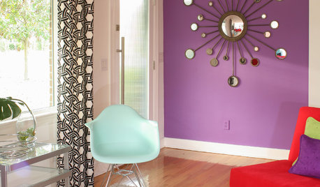
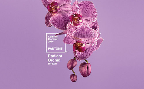
COLORBest Ways to Use Radiant Orchid, Pantone's Color of 2014
Learn how to work in this bold fuchsia-pink-purple successfully around the home, and give it a yay or nay in the Houzz poll
Full Story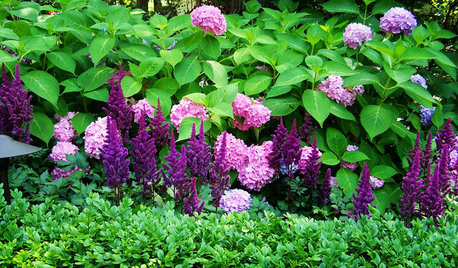
FLOWERS9 Plants That Channel Pantone’s Color of 2014
Try these pinkish-purple wonders to be right on trend — or just for their own captivating beauty
Full Story
COLORHow to Use Marsala, Pantone’s 2015 Color of the Year
Pantone digs deep and goes earthy with its selection. Here are ways to make it work in your home
Full Story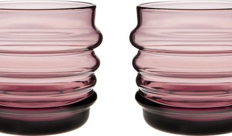
PRODUCT PICKSGuest Picks: Raise a Glass to Radiant Orchid
Celebrate the new year with barware and glasses done up in hues akin to Pantone's 2014 Color of the Year
Full Story
COLORSay Hello to Minion Yellow, Pantone’s Newest (and Happiest) Color
This Hollywood-inspired shade is anything but despicable. Here’s how to work the cheerful and cheeky color into your home
Full Story
HOUSEPLANTSHow to Grow Orchids Indoors
Orchids are the exotic aristocrats of the flower world and can make themselves comfortable in almost any home
Full Story
COLORS OF THE YEARPantone Has Spoken: Rosy and Serene Are In for 2016
For the first time, the company chooses two hues as co-colors of the year
Full Story
COLORBest Ways to Use Exclusive Plum, Sherwin-Williams’ Color of 2014
Pretty, moody, maybe even a neutral, this toned-down grayish purple can work in any room. Here's how
Full Story
COLOR20 Wide-Ranging Colors Touted for 2014
Behr takes its turn in the color-forecasting game with 4 paint collections from superbold to sophisticated
Full Story
COLORBest Ways to Use the Soft Yellow Color of 2014
You may fall for PPG Pittsburgh Paints’ Turning Oakleaf if you like your hues warm, mellow and cheery
Full StoryMore Discussions


camlan
Gooster
Related Professionals
Middle Island Interior Designers & Decorators · Westbury Interior Designers & Decorators · Camarillo Furniture & Accessories · Minneapolis Furniture & Accessories · Norwalk Furniture & Accessories · Peachtree City Furniture & Accessories · Racine Furniture & Accessories · Fargo Furniture & Accessories · Discovery Bay Furniture & Accessories · Tucker Furniture & Accessories · Tamalpais-Homestead Valley Furniture & Accessories · Chapel Hill Custom Artists · Egypt Lake-Leto Lighting · Lancaster Lighting · Red Bank Lightinglolauren
Diane Smith at Walter E. Smithe Furniture
francoise47
francoise47
joaniepoanie
luckygal
mtnrdredux_gw
bbstx
Annie Deighnaugh
pcweary
Lori A. Sawaya
zen4d
violetwest
Annie Deighnaugh
mlweaving_Marji
mdrive
kellienoelle
mtnrdredux_gw
Gooster
Annie Deighnaugh
Elraes Miller
mdrive
williamsem
Annie Deighnaugh
Elraes Miller
nosoccermomOriginal Author
User
victoria_g
Elraes Miller
Annie Deighnaugh
Elraes Miller
sable_ca
Annie Deighnaugh
sable_ca
lavender_lass
juliekcmo
Annie Deighnaugh
xc60
susanlynn2012
patricianat
happyintexas
justgotabme
xc60
happyintexas
ineffablespace
Baroo2u
Elraes Miller
octoberdana