

OMG - Painter Coming 2morrow !? Final Decision
dakota01
11 years ago
Sort by:Oldest
Comments (19)
Related Stories
HOUZZ TOURSMy Houzz: Personalized Style in a Portland Painter’s Live-Work Home
Empty nesters bring DIY touches and industrial-style creativity to their 1908 Oregon house
Full Story
DECORATING GUIDESThe Dumbest Decorating Decisions I’ve Ever Made
Caution: Do not try these at home
Full Story
HOUZZ TOURSMy Houzz: Oregon Landscape Inspires a Painter’s Dream Home and Studio
Acres of unspoiled land and abundant natural life surround this special live-work space in eastern Oregon
Full Story
STUDIOS AND WORKSHOPSStudio Tour: A Painter’s View From on Top of the World
This colorful artist’s space in Australia sits up high and opens up to inspiring views of the Queensland rainforest
Full Story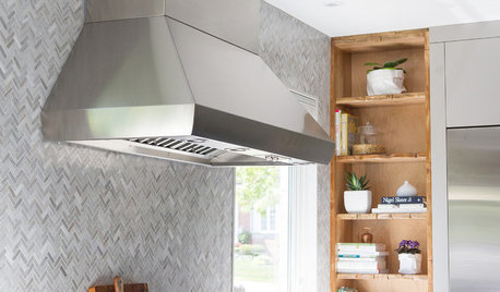
KITCHEN DESIGNKitchen of the Week: Function and Flow Come First
A designer helps a passionate cook and her family plan out every detail for cooking, storage and gathering
Full Story
WORKING WITH PROSHow to Work With a House Painter
A professional house painter may be your best friend for refreshing rooms. Here's what you need to know to get the best result
Full Story
REMODELING GUIDESHouzz Tour: Seaside Home's Charms Come to Light
A dark 1902 house brightens up with a new layout, a white interior and furnishings with plenty of character
Full Story
DECORATING GUIDESHouzz Tour: A Family Home Comes Together, One Piece at a Time
A decorator uses her expert eye to outfit her family’s home with finds from thrift stores, online resale sites and yard sales
Full Story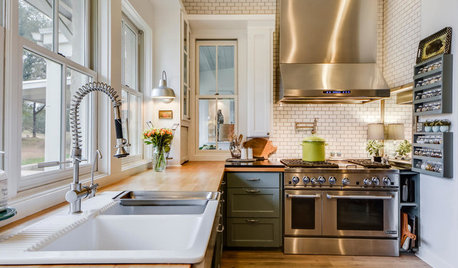
DECORATING GUIDES25 Design Trends Coming to Homes Near You in 2016
From black stainless steel appliances to outdoor fabrics used indoors, these design ideas will be gaining steam in the new year
Full Story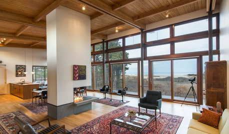
MODERN HOMESHouzz Tour: Cape Cod’s Midcentury Modern Tradition Comes to Life
A new home nestled in the Cape Cod National Seashore area balances architectural history and modern technology
Full Story


vsalzmann
funkyart
Related Professionals
Centerville Interior Designers & Decorators · Sweetwater Interior Designers & Decorators · Carlsbad Furniture & Accessories · Evanston Furniture & Accessories · Kearny Furniture & Accessories · Peachtree City Furniture & Accessories · Eau Claire Furniture & Accessories · Beverly Hills Furniture & Accessories · New Bedford Custom Artists · Salem Custom Artists · Los Gatos Custom Artists · Saratoga Custom Artists · Seal Beach Custom Artists · Sacramento Lighting · Mesa Window Treatmentsdakota01Original Author
dakota01Original Author
arlosmom
Scarlett001
jenniferPA
dakota01Original Author
kimiko232
KevinMP
annzgw
msrose
alex9179
dakota01Original Author
dakota01Original Author
dakota01Original Author
funkyart
User
dakota01Original Author