


Selected a paint color.. but having second thoughts
funkyart
11 years ago

Sort by:Oldest
Comments (17)
Related Stories
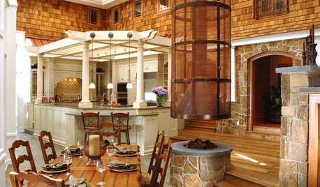
KITCHEN DESIGNNew This Week: 4 Kitchen Design Ideas You Might Not Have Thought Of
A table on wheels? Exterior siding on interior walls? Consider these unique ideas and more from projects recently uploaded to Houzz
Full Story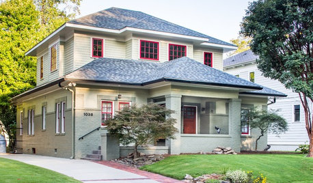
CRAFTSMAN DESIGNHouzz Tour: Thoughtful Renovation Suits Home's Craftsman Neighborhood
A reconfigured floor plan opens up the downstairs in this Atlanta house, while a new second story adds a private oasis
Full Story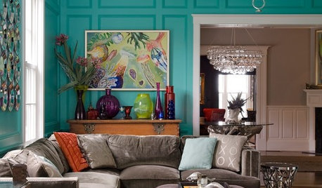
COLORSpeed-Dial Color Selection to Get the Best Result
You’ve belabored your color decisions and are still stuck. Here is how to evaluate your space and make choices that are right for you
Full Story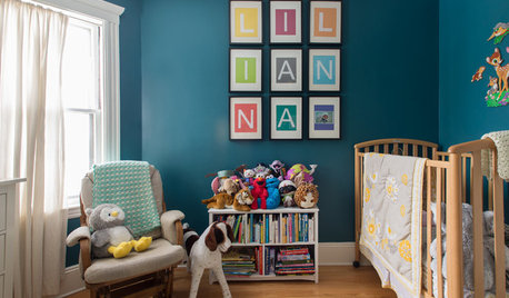
HOUZZ TOURSMy Houzz: Thoughtful Updates to an Outdated 1900s Home
Handmade art and DIY touches bring a modern touch to a classic Boston-area home
Full Story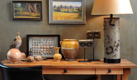
ARTExpert Talk: Have a Field Day With Landscape Art
Paintings of moody skies or serene seas bring nature's soothing touch to even the most urban homes
Full Story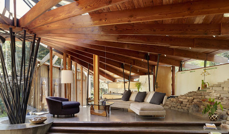
ARCHITECTUREHave It Your Way — What Makes Architecture Successful
Universal appeal doesn't exist in design. The real beauty of any home lies in individualization and imagination
Full Story
REMODELING GUIDESGet What You Need From the House You Have
6 ways to rethink your house and get that extra living space you need now
Full Story
MOST POPULARHouzz Quiz: What Style of Kitchen Should You Have?
Should you be cooking up a storm in a modern, traditional, farmhouse or another style of kitchen? Take our quiz to find out
Full Story
BUDGET DECORATING14 Ways to Make More Money at a Yard Sale — and Have Fun Too
Maximize profits and have a ball selling your old stuff, with these tips to help you plan, advertise and style your yard sale effectively
Full Story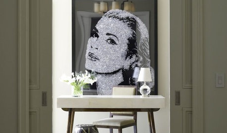
DECORATING GUIDESThe Faces Have It: Large Portraits Go Over Big
Oversize visages of celebrities and mere mortals make for double-take drama in interiors
Full Story


User
SparklingWater
Related Professionals
Mount Laurel Interior Designers & Decorators · Augusta Furniture & Accessories · Lake Zurich Furniture & Accessories · Union City Furniture & Accessories · Greenwood Village Furniture & Accessories · Little Chute Furniture & Accessories · Kendall Furniture & Accessories · Aurora Lighting · Englewood Lighting · Green Bay Lighting · Green Bay Lighting · Jefferson Valley-Yorktown Lighting · San Francisco Lighting · Berkley Window Treatments · New Baltimore Window Treatmentsbestyears
bestyears
funkyartOriginal Author
funkyartOriginal Author
jerseygirl_1
funkyartOriginal Author
User
SparklingWater
Sueb20
chispa
funkyartOriginal Author
gmp3
funkyartOriginal Author
funkyartOriginal Author
lizzie_grow