


Non-neutral neutrals.
palimpsest
11 years ago
Sort by:Oldest
Comments (42)
Related Stories

DECORATING GUIDESNo Neutral Ground? Why the Color Camps Are So Opinionated
Can't we all just get along when it comes to color versus neutrals?
Full Story
COLOR11 Ways to Spice Up Neutral Palettes
Side with texture and pattern in a neutral room for a look that commits to high sophistication and elegance
Full Story
GRAYGoing Greige: Tips for Choosing This All-Around Neutral
Here are some ways to highlight and complement your home with this elegant hybrid of gray and beige
Full Story
COLORBest Ways to Use the Neutral Green Color of 2015
Benjamin Moore’s Color of the Year is soft and natural
Full Story
MOST POPULARWhat’s Your Neutral: Beige or Gray?
A designer shares 10 tips for using the neutral shade that works best for you
Full Story
NEUTRAL COLORSHow to Do Neutrals With Attitude
Add a little edge to a neutral palette with pattern, texture, contrast — and a dash of color
Full Story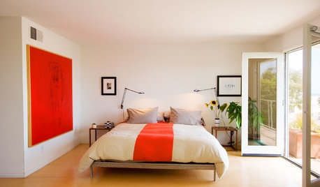
NEUTRAL COLORSSoothing, Almost-Neutral Bedrooms
You don't have to go all-neutral for a relaxing bedroom. If color is calling your name, here are some ways to answer
Full Story
NEUTRAL COLORS8 Great Color Palettes: Surprising Bedroom Neutrals
Peaceful plum, relaxing black and many shades of gray show an unpredictably neutral nature in the bedroom
Full Story
COLOR4 New Neutrals for the New Year
So you're not resolved to go crazy with color in 2013. These refreshing on-trend neutrals can still broaden your rooms' color horizons
Full Story
NEUTRAL COLORSHow to Prevent Your Neutral Decor From Falling Flat
Dodge the bullet of bland interiors with these tips for enhancing a neutral color scheme
Full Story


SunnyCottage
palimpsestOriginal Author
Related Professionals
Mount Laurel Interior Designers & Decorators · Lorton Furniture & Accessories · Reno Furniture & Accessories · Silver Spring Furniture & Accessories · Simpsonville Furniture & Accessories · Atlantic Beach Furniture & Accessories · Crofton Furniture & Accessories · Carson Furniture & Accessories · North Bellmore Furniture & Accessories · Chapel Hill Custom Artists · Folsom Custom Artists · Saint Petersburg Lighting · Tukwila Lighting · Oklahoma City Window Treatments · Rockford Window Treatmentsluckygal
blfenton
palimpsestOriginal Author
funkyart
palimpsestOriginal Author
gmp3
bronwynsmom
palimpsestOriginal Author
lizzie_grow
palimpsestOriginal Author
gmp3
rosylady
funkyart
Annie Deighnaugh
alex9179
EngineerChic
palimpsestOriginal Author
gmp3
katrina_ellen
palimpsestOriginal Author
Circus Peanut
katrina_ellen
palimpsestOriginal Author
katrina_ellen
awm03
pricklypearcactus
EngineerChic
gmp3
palimpsestOriginal Author
gmp3
palimpsestOriginal Author
User
EngineerChic
crl_
User
gmp3
hosenemesis
katrina_ellen
patty_cakes
palimpsestOriginal Author