


Lovely Green Kitchen--Help Finding Similar Color
LindsayMarie
12 years ago

Related Stories
KITCHEN APPLIANCESLove to Cook? You Need a Fan. Find the Right Kind for You
Don't send budget dollars up in smoke when you need new kitchen ventilation. Here are 9 top types to consider
Full Story
HOUZZ TOURSMy Houzz: Online Finds Help Outfit This Couple’s First Home
East Vancouver homeowners turn to Craigslist to update their 1960s bungalow
Full Story
GREEN DECORATING8 Questions to Help You See Through Green Hype
With the ecofriendly bandwagon picking up some dubious passengers, here's how to tell truly green products and services from the imposters
Full Story
HOUZZ TOURSMy Houzz: Salvage Finds and DIY Love in Rhode Island
A Providence couple layers on meaningful mementos and hands-on style for a personalized interior palette
Full Story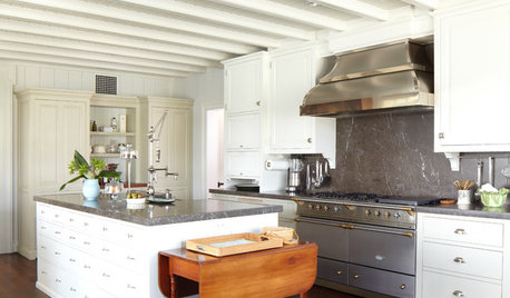
KITCHEN DESIGNHow to Find the Right Range for Your Kitchen
Range style is mostly a matter of personal taste. This full course of possibilities can help you find the right appliance to match yours
Full Story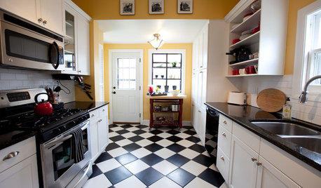
KITCHEN DESIGNKitchen Flooring 101: Find Your Material Match
From cork to concrete, our guide will help you pick the perfect surface for your kitchen floor
Full Story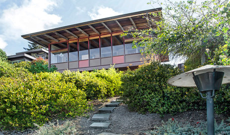
MY HOUZZHouzz TV: Love Letter to a Small Midcentury Find
A 630-square-foot 1956 home captures its owner’s heart. See it when it was new and now
Full Story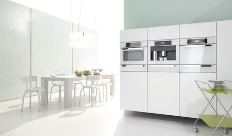
KITCHEN DESIGNWhite Appliances Find the Limelight
White is becoming a clear star across a broad range of kitchen styles and with all manner of appliances
Full Story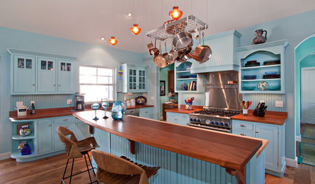
KITCHEN DESIGNHere's Help for Your Next Appliance Shopping Trip
It may be time to think about your appliances in a new way. These guides can help you set up your kitchen for how you like to cook
Full Story
Guest Picks: Give Your Home a Helping of Spring Greens
Celebrate garden growth with this collection of housewares and gardening gear in the shades of budding plants
Full Story


joyce_6333
User
Related Professionals
Charleston Interior Designers & Decorators · Fort Smith Interior Designers & Decorators · Linton Hall Interior Designers & Decorators · Rock Hill Furniture & Accessories · Roswell Furniture & Accessories · Shakopee Furniture & Accessories · Sioux Falls Furniture & Accessories · Woodbury Furniture & Accessories · Fallbrook Furniture & Accessories · Los Gatos Furniture & Accessories · Pinehurst Furniture & Accessories · Green Bay Lighting · Palm Desert Lighting · Oak Park Window Treatments · Salt Lake City Window Treatmentskitchendetective
teacats
LindsayMarieOriginal Author
kitchendetective
LindsayMarieOriginal Author
karinl
LindsayMarieOriginal Author
Oakley
LindsayMarieOriginal Author
kitchendetective
kitchendetective
nanny2a
riosamba
karinl
schoolhouse_gw
liriodendron
kitchendetective
redbazel
LindsayMarieOriginal Author
biochem101
LindsayMarieOriginal Author
User
design_wotcha