Shop Products
Houzz Logo Print
macybaby_gw

Help for Dining room please!

macybaby
12 years ago

This poor room has been through a lot. Started out as a front porch that got enclosed and used as a den. The original plans had you walking through the kitchen and through the dining room into the den. We moved the front entrance and moved the kitchen to where the dining room was. Thought about putting the dining room where the den was, but decided to leave it as a den because we needed to put the wood stove there. So that room was completely redone as a den. The old kitchen was fixed as the dining room, but because of where the new entrance was it just didn't work like we hoped. When we got to the final stage of the kitchen, decided to trade the den and dining room, and the new den is very nice, but the new dining room needs HELP!

I fell in love with the wallpaper - at the store, but it wasn't up long before I realized it just was not going to work - that was two years ago and I still don't know what to do.

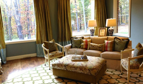
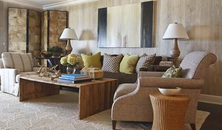
the "look" I am after is Old Farmhouse with a touch of Victorian. I want the dining room to have a bit of "impress the neighbors" look - just like what you might expect with an old farmhouse. It is also important that it tie in well with the kitchen.

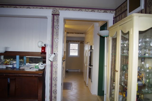
From the kitchen looking into the dining room.

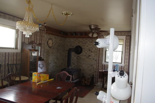
The wood stove stays, and we've found having it facing directly toward the kitchen is the best for heat flow. Z-brick can go, but we need some fire retardant surface on the walls. Could also put in a different hearth, but it would have to be something I loved as getting the cement pavers out won't be fun. The plate rail can be changed or removed though I didn't like the look before we put it up there. It looked good when the room was a den.

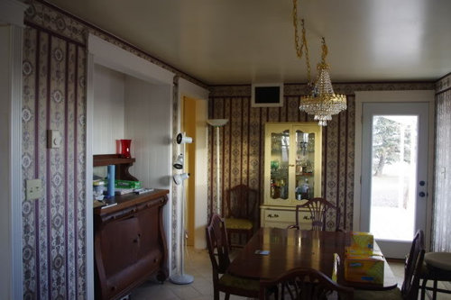
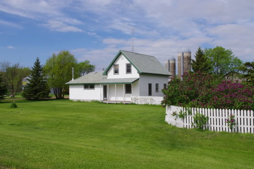
The door leads to the small porch. It is used mostly to let the cats in and out. Here is an outside picture - you can see the door will never be used as a "real" entrance.

Both ends of the room open into the kitchen.

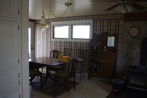
And looking back from the kitchen into the dining room. The stools are there because they don't fit in the kitchen. I need to find a new home (not mine) for them.

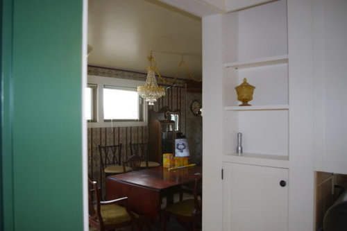
The alcove was made specifically for this hutch. I am in love with this piece and it would have never fit in this room without bumping the wall out into the kitchen. There is an outlet up at the ceiling level for lighting. Was thinking of shelves or something . . . While I want to keep the trim matching the kitchen, the interor of the alcove can change color. It is pine beadboard.

Looking back towards the wood stove

And towards the kitchen - while the trim is new (but nailholes not filled yet) the windows and door need to be painted to match. I starting to think it might look best to extend what ever is used around the stove to cover the entire short wall, instead of having around the window match the rest of the room.

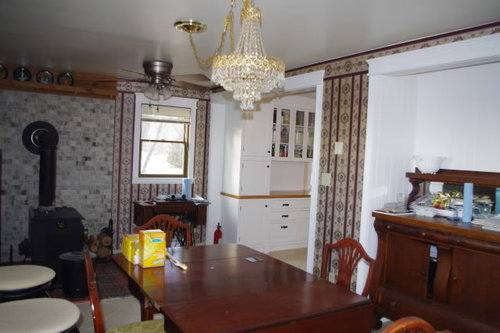
Though the trim looks white, it's more cream and is the same color as in the kitchen so I do want to keep it that way. The tile floors also flow from the kitchen and need to stay. We need to keep a ceiling fan above the wood stove, and that location works well. The chandelier was put where the ceiling fan use to be, but it needs to be moved. I like the swag look, and it makes lowering the fixture for cleaning much easier. I'd like to keep the chandelier, it's swarovski crystal and very dusty right now. When clean it causes prisms of color all over the room. Was thinking putting the box between the alcove and table, not the table and ceiling fan. Because of the wood stove, the ceiling does need to be something washable.

I love the look of wallpaper, however my cats have started making a mess of it so I was thinking of wall stenciling instead. Maybe match the light gold color in the kitchen with a darker gold stencil. It's a much paler gold than it looks in the pictures.

A bit on the furniture - all of it I've picked up since moving here - the piece next to the wood stove is the only real "antique" but it's in such rough shape that I am not against refinishing. The rest was picked up at assorted auctions. I would like to put a stone top on the hutch at some point - probably marble.

I'm open to ideas. I really do not want to spend a lot of time and decide I still don't like it.

Comments (36)

  • graywings123
    12 years ago
    last modified: 9 years ago

    Just to set the ground rules, which of the following are "must keep in the room" items:

    ceiling fan
    crystal chandelier
    antique sewing machine
    secretary/bookcase piece

  • roarah
    12 years ago
    last modified: 9 years ago

    I love your farmhouse! I like many elements of the room, including the wallpaper. I do not like any of your lighting options other than your chandi. Can you remove the fan, it is too modern to work with the other elements. Also the white floor lamps are not in style with your beautiful furnishings, I feel.
    IRT the wallpaper could you remove the bottom half but keep the top and add paint and a chair rail below that the cat can not claw?
    I think if you just edited a bit of the lighting, the room would instantly look nicer!

  • roarah
    12 years ago
    last modified: 9 years ago

    PS on the design around this victorian thread in kitchens the last post shows a ceiling fan I think might work better with your room if you need to have a fan. Here is the link scroll to post 101 I think.

    Here is a link that might be useful: ceiling fan option

  • ellendi
    12 years ago
    last modified: 9 years ago

    You are right to change the wall paper. It does not achieve the effect that you are looking for. I am not good at wall paper. I would paint it.
    The alcove is a nice feature but I think you need to play it up more. Something needs to be displayed over the hutch.
    I guess you want to keep your dining set, but it reads formal not farm house to me. I am not sure how you can achieve a farm house look with this style dining set.

  • patty_cakes
    12 years ago
    last modified: 9 years ago

    You might want to consider a faux beadboard paintable wallpaper~~you may be able to use over your existing wallpaper if the corners are secure.

    The chandy is too much for what could be a cute farmhouse style kitchen~is the fan necessary?

    The brick could be painted(grayed white??)with a heat tolerant paint.

    I would keep the furniture, but paint it a sagey green or muted blue.

    IMO, you have a lot of great pieces of furniture, but there is too much in the room, leaving none of it to stand out on it's own. The little desk cabinet w/mirror should be in a hallway or bedroom.

    You have a very pretty kitchen and this room should carry thru the same look/feeling. ;o)

  • dedtired
    12 years ago
    last modified: 9 years ago

    I would definitely replace the wallpaper with paint. Change that chandelier, it's too shiny and ornate for the room. It would be nice if it didn't have the chain and hung directly over your pretty furniture.

    Your house is just adorable. I would love to have a place like that. Your kitchen is really nice, too.

  • blfenton
    12 years ago
    last modified: 9 years ago

    I'm seeing a real disconnect between your kitchen and dining room. I think your wood stove and the back pavers behind it tie into your kitchen. The pavers are quiet looking just like your kitchen. However, IMHO ( and a caveat here - I detest fussy) your wall paper is awful. There is no connection to the kitchen. The colours in it, the busyness of the pattern, the pattern itself, doesn't correspond to anything else. It is in isolation. So either get rid of it or use it as a starting off point, in which case you will also have to address your kitchen.

    The alcove with the hutch - the white is doing nothing for the hutch. I see some green paint in your pictures - what is that on? One suggestion is to paint just the alcove in an accent colour - perhaps the green but in a tone to match the yellow/cream of the other piece that you have in your DR if it is staying. Then on the rest of the walls put beadboard on the bottom, painted in the same colour as the trim, with a chair rail and then some sort of wall paper on the top. Have the wall paper have some of the same green (or whatever accent colour you choose to paint the alcove in)as the paint in the alcove.

    The lights - the chandy is very pretty and feminine while the fan is clunky and masculine looking. If you want to keep the chandy I would buy a new fan in the same finish as the chandy.

    This is my 2cents and my opinion is worth exactly that.

  • teacats
    12 years ago
    last modified: 9 years ago

    For now:

    Keep the look Farmhouse Fresh and Simple:

    Strip the wallpaper and paint the walls in fresh milky white to match the trim -- and the whole room will look far more cohesive to the viewer's eye.

    IF possible add tall beadboard to the walls and keep it white and fresh.

    Switch to two matching ceiling fans to make the airflow work much better AND add even more visually cohesive room.

    Redo the fabric on the chairs to a basic fresh white duck cotton -- with stainguard -- of course!

    Add a white hobnail glass lamp to the secretary and also add lamps to the buffet.

    Add artwork above the buffet. Or simply re-do a lovely photo of your home into black-and-white -- and mat it in milky white and frame in dark brown.

  • chickadee2_gw
    12 years ago
    last modified: 9 years ago

    You're probably not going to like this idea, but I'm going to throw it out there. I was thinking that since the area surrounding the wood stove needs some protection and you already thought about extending that wall treatment around the window, why not continue and do the stone veneer all around the room removing that high shelf. That way the walls and room would have a uniform look, and the dining room would look like the oldest section of the house where you've exposed the original stone walls.

    Right now there is just too much going on in there with the stone and wallpaper and all the different lighting. I think your farmhouse's beauty is its elegant simplicity and the chandelier just doesn't fit. Are there other options available for circulating the heat besides a ceiling fan?

    I can also see putting larger windows on that wall where the 2 windows are up high so you can see out.

    Here is a link that might be useful: [stone walls from houzz.com[(https://www.houzz.com/photos/river-house-rustic-kitchen-columbus-phvw-vp~69508)

  • biochem101
    12 years ago
    last modified: 9 years ago

    Hi macybaby! I love your kitchen and remember it from the Kitchen forum. But it does seem as if your DR has a slight personality disorder. It's being in pulled in several directions.

    It occurs to me that perhaps some pictures might help the discussion. Here's some other farmhouse DR's.

    This first is the way I think you originally saw the DR going: (but it has dark woodwork)

    Here is a simple white walled farmhouse DR:

    Again a more simple country farm table and white walls:

    Farmhouse with wood stove and cream woodwork:

    English farmhouse with pale green walls and tile floor:

    Do the simple rooms look too simple? They would match your kitchen style. Or do you want to stick with something closer to the first one?

    HTH!

  • macybaby
    Original Author
    12 years ago
    last modified: 9 years ago

    Thanks all for the ideas - you've given my some new ideas that I would not have come up on my own.

    I've got 20 lbs of potatoes cut up that need to be blanched and frozen, then I'll get back online and respond in more depth

    Right now - air flow is a big deal, we have no central anything and have fans throughout the house- makes a big difference in comfort level year round. Ceiling is 7'8", but a fan over the wood stove does not need a light fixture. We had the room without a fan for about 6 months, and that did not work at all. Stove does have a blower, but a fan in that location is important - does not have to be that fan though.

    Floor lights are not part of the lighting. They have been moved around as needed for home repair projects. They do a good job of lighting walls during painting and stuff like that. Eventually I'll get done on the house and they can go to the basement (or trash).

    I do love my chandelier, but it was bought when the dining room was in the other area, with a sloped ceiling. If I keep it in this room, the ceiling mount will be changed. It got put here the fan was when it was a den. But I do think the "gold" might not go, but I really don't want to end up with a "heavy" look. It would be easy to move towards wrought iron with the wood stove. Though DH did say in a few years we may need to replace it and then we could look at soapstone.

    The yellow hutch could be repainted - got it for $50 an an auction and I'm pretty sure the top and bottom didn't originally go together and someone else already refinished it(though they did a very good job). I do like having a visible liquor cabinet, even if I rarely drink. I think I like neat bottles and the colors more than anything.

    Fabric on the chairs will be changed, but I don't' know if I really want to refinish or paint the table/chairs. Half of what I like is the patina. I don't care for fake distressed furniture though. I thing the leaf that came with the table belonged to a different one, and there are too many chairs.

    The alcove does need work. I do want to use the hutch, but not sure what to above it. Maybe it would be better to just build something in there instead. We built all the kitchen cabinets so I think we could do it, but I love my hutch.

    The wallpaper is coming down for sure, partly because the cats have already started the process. I won't be putting wallpaper back up for that reason. I like the idea of beadboard half way up with a chair rail. We have that in the entryway and it looks nice.

    What do you all think of going with something like this on the upper half of the wall? (see link below) I'd like to go with a pale wall and darker stencil. I'm sort of "in love" with the idea of putting a stencil on the wall, but it will be a lot of work so I want to believe it's going to work before I do it.

    I've also been wandering the house looking for a different place for the secretary - it was bought for a specific location in the kitchen, and then we changed plans for that wall and now it's got no where to go.

    I realized in writing this out that part of the problem is the dining room is the last room in the house to be done, and those few pieces of furniture that ended up not fitting anywhere else have ended up in this room. We brought almost no furniture with when we moved here, and I've spent 8 years going to auction/estate sales and have picked up furniture here and there that really "spoke" to me.

    Here is a link that might be useful: stencil

  • kayec28
    12 years ago
    last modified: 9 years ago

    In my opinion, it's the "touch of Victorian" you want that is messing up the look of your rooms. You've already got the bones and the furniture pieces for the "Old Farmhouse" look. I think you should indulge your love for Victorian in a bathroom or guest bedroom and stick with Old Farmhouse for your main living spaces.

    The vertical, patterned burgundy? fuschia?-toned wallpaper next to the horizontal gray/white bricks are fighting with each other and producing visual clutter. A solid color is needed in one area or the other so the eye can rest. I like the brick and the colors in the brick, so I would remove the wallpaper, pull a white or pale gray color out of the brick and paint the rest of the walls that color. I would also paint the hearth pavers in the same solid color to neutralize their effect on the room, since they are bringing in even more color and pattern that is adding to visual clutter.

    The pictures biochem101 provided above are the look I see that would work best in your home, and I agree with earlier posters that the formal dining set and bling-y chandelier do not go with that look. Is the dining room set a cherished family piece? If not you might check Craigslist for a farmhouse table and a simple iron chandelier.

    The alcove with the sideboard is calling for some color--maybe one of the darkest colors in the brick? Some simple iron sconces would also look good in the space above it.

    You have some beautiful wood pieces that are not standing out like they should because of the busy walls. In a word, simplify, simplify, simplify. Good luck!

  • peegee
    12 years ago
    last modified: 9 years ago

    Ok, I'll be the voice of dissent...but first, have you considered the possibility of replacing the two dining room windows with one larger one that extends down low ?? or two side by sides that read as one that come down near the floor (- or french doors if you could put a little patio out there unless that is your front?? ) The impact of more light and opening up the room to your apparently gorgeous views would be dramatic, an IMHO the most important single change you could make. I would select windows that would be in keeping to your home, although your doors appear more contemporary; whatever direction, it could only improve the look and feel of your rooms.
    In looking at your furnishings, they are not so simple; since you clearly selected them, unless you are now tired of them and want a major change, I would go with what you love. And you already stated you want a farmhouse-victorian feel. Farmhouse's DID often have some fancy rooms -think front parlor, etc.
    I wouldn't wait to ditch some of the items that don't fit into your vision- do it now; the bar chairs, etc., and start stripping the wallpaper. That will make a huge difference right there. Your rug of course is too small for your lovely table; a large carpet in that area will soften the look and help the table to fit in better. I agree that unifying the hearth and surround will be important, too. Your lovely things are worth showcasing! Penny G.

  • Olychick
    12 years ago
    last modified: 9 years ago

    Lots of great advice here about making it more of a farmhouse look instead of the mix that you have now. I've lived with many woodstoves and don't know why the way the doors face would make a difference in its heat output, but to me it looks odd in the position it's in now. I'd turn it so it faces the table or perhaps angle it like the one shown that biochem posted in one of the inspiration rooms.

    It's hard to tell from the pics, but do you have room for the buffet under the windows and maybe move the secretary to the alcove? It might be worth a try, because the secretary is too tall to put under the window, but looks too crowded by the woodstove. I'd finish the interior of the alcove in whatever the rest of the wall finish/color ends up so it is a feature but not quite so dominant as it is now.

    It will be fun to see what you end up doing. The kitchen looks beautiful, so I'm sure the dining room will shine, too.

  • macybaby
    Original Author
    12 years ago
    last modified: 9 years ago

    I would like to keep the table, mostly because it took three years to find one that was they size that would fit. I'll have a pine trestle table in the kitchen so I want something more formal in the dining room.

    The woodstove has a blower, and it's the direction the blower is facing that makes a huge difference. We had it at an angle for several years (when it was a den) and that room would get way too hot, even with the upper wall vent going to the upstairs. We used a lot of floor fans to move heat, now we don't have to.

    I think I may have to mourn the loss of my dream to have the Victorian dining room. It would have worked fine when the dining room was open to the library (which was quite formal) but it does not work as well now that it's open to the kitchen. The house is much more functional this way, but it makes me sad that I can't make the dining room work like I hoped.

  • blfenton
    12 years ago
    last modified: 9 years ago

    Aww- don;t give up yet. What about doing things like:

    - unsway the chandelier which will help to make it not so "goldy" appearing. Put a large medallion on the ceiling and hang it from there and a little lower. About 30" from the table top. I would try to keep the chandy because it is victorian inspired. (I think)

    - place a large beveled-mirror above your hutch that is oval in shape with a dark brown frame. It will also help reflect light from the outside. And then on your hutch pick up a pair of candlestick lights for ambient lighting.

    - put beadboard or wainscoting with a chair rail along the bottom of the walls and above it put a large patterned wall paper. Similar to the size and idea of the stencil that you had linked to. You already have a small pattern in your pavers behind the stove so I would not want to add another small pattern.

    - look to your kitchen backsplash and wood counter top for goldy yellow colours as inspiration colours to bring into the dining room as part of your wallpaper (or stencil) colour and perhaps paint the hutch alcove the same or slightly darker colour. You want to stay in the goldy tones and not venture into mustard tones. The goldy yellow tones will also tie your kitchen into the DR and also include your chandy.

    - add a pair of curtain panels on the windows in either a solid colour or a tone-on-tone stripe with some glamourous tie-backs.

    - reupholster your chairs in something with some colour - maybe greens with some of the yellowy-gold.

    You can bring in some victorian-inspired colours and ideas without going all dark and heavy. Your kitchen is quite calm and i don;t think it can support the heaviness of a true victorian but you can sure have some of the elements.

  • live_wire_oak
    12 years ago
    last modified: 9 years ago

    I'm not really feeling that chandelier in that room. It's too fussy. Yes, Victorian is fussy, but Folk Victorian is much less so, and that's the style that was often used for farmhouses, so that's the style for you to research to emulate. Perhaps if you took off all of the crystals, and wirebrushed the brass to less of a sheen and then antiqued it and only replaced half of the crystals back it might work better. Or find a birdcage somewhere and place the central fixture and just some of the crystals in it ala this Restoration Hardware light fixture. It feels whimsical and much less formal which would be the direction for you to consider.

    Look at doing tin (or faux tin) ceiling panels below a chair rail. They are tough enough to stand up to cats, and you can paint it whatever color you want. Choose a simple pattern rather than an elaborate one. I used a turquoise painted tin ceiling in my Victorian kitchen design board, and while I don't think that color would be right for your room, the pattern would probably work.

    And instead of putting the classic tin on the ceiling, think about doing a wallpaper panel on the ceiling. I show some chinoiserie examples below because that was a Victorian obsession. Putting a large scale pattern up high will draw the eye upwards. Place a large panel of something like this centered on your ceiling surrounded by molding, and have the ceiling edge, panel molding and crown molding all be the same cream. (Panels like this.)


    I agree with tying in your kitchen colors and textures. To that end, I think I'd remove the brick and use soapstone tile around the stove. Or, maybe to keep it from being so dark, use a ceramic or stone chair rail with the soapstone below and your kitchen tile backsplash above.

    The other thing I think I'd definitely consider is painting your dining chairs. Paint the chairs and the nook the same color and it should be something bolder than the surrounding creams and whites. I could see doing a pretty salmon pink as your color of choice. It would work great with your white kitchen and the brown wood of the table and buffet.

  • blfenton
    12 years ago
    last modified: 9 years ago

    I was wondering about doing something with the ceilings but they are only 7'8" and wasn't sure what that would do to the scale of the room.
    That middle pattern in a fabric would be interesting to consider for side panel curtains.

  • live_wire_oak
    12 years ago
    last modified: 9 years ago

    I meant to say, the woodwork should be your cream color of your cabinets, and the walls and tin wainscotting should be a darker cream. Very monochromatic for the walls, with the spot of color on the ceiling panel, the chairs, and the alcove. Everything else is wood or the tile.

  • macybaby
    Original Author
    12 years ago
    last modified: 9 years ago

    thanks all - I think I need to back up a bit and do things one area at a time. I may end up replacing the chandelier and table, but like a child with a blanket, I'm not quite ready to give them up. For now I think I'll only work on the walls and think about the ceiling. For sure the ceiling fan has to be replaced - hard part is finding something.

    Right now the trim is the same color as the kitchen cabinets. It's a soft, cream white - it has a gold/green undertone in contrast to something grey or peach/pink. The door in the third picture down is white, though it looks sort of bluish in the picture due to the lighting. Helps to show how off white the trim actually is.

    I started taking down the wallpaper, and the wallpaper had made the room seem way darker than I realized. It made the cream trim look stark white. Tomorrow I'll be home during dayight hours, so I get a picture.

    I do like the idea of wainscoating, especially because it's a narrow room and the wall can use the protection.

    I do like that middle fabric. I've moved away from fabric curtains/drapes since we moved to were we didn't have neighbors. I use blinds for light blocking in the summer - does wonders to keep the house cool if I pull them all before I go to work in the summer. In the winter they all stay wide open.

  • live_wire_oak
    12 years ago
    last modified: 9 years ago

    I've got some time this morning, so here are some images to help you create a more cohesive look for your home. First are some exterior shots of Folk Victorian farmhouses, which your home style resembles. Add a few details to your exterior, and a more detailed Victorianish DR won't look as out of place in the home.

    {{gwi:1887174}}
    {{gwi:1887176}}


    {{gwi:1887183}}

    {{gwi:1887187}}

    Here are some interior shots. Most have a lot more detail than your low ceiling can support, and that's why I suggested a more monochromatic light colored palette as that would visually expand the room a bit better than all of the fussy true Victorian detail. Creating detail by using tone on tone elements give you a rich feeling texture, but without so much claustrophobia that many true Victorian rooms can have.


    {{gwi:1887191}}

    {{gwi:1887195}}

    {{gwi:1887199}}


    While looking at pics of old homes, I was reminded of what the "modern" solution to heating was when using the giant logs in a big drafty fireplace went out of vogue. You had small coal stoves or gas fires placed in the former fireplaces. I was thinking that you could possibly do that look for your woodstove. Create a big hearth and mantle, like that was the former large cooking fireplace, and that the stove replaced it.


    {{gwi:1599259}}


    {{gwi:1887225}}

    Hopefully this will at least give you some ideas to brainstorm for your own home.

  • lazy_gardens
    12 years ago
    last modified: 9 years ago

    I would make it more an extension of the kitchen theme and decor, with some touches of poshness and formality. Like the dining area of a previously genteel city family that is trying to ignore the fact they are living in a farmhouse by clinging to their heirloom furniture.

    The wallpaper is lovely, but doesn't have enough wall space to look good in that room. It's chopped up. The suggested florals are better because they have a less rigid pattern and can flow around things. A solid color paint would be even better, because you don't have much wall area and patterns in small areas make it look smaller.

    Also, the trim color makes the paper look dingy. I think you have an undertone mismatch or a "clean versus dirty" color mismatch.

    Rug should be bigger, because the flooring is also stark and modern-looking.

    Windows are too small and stark. Some curtains would soften them.

    I love that piece in the alcove, but the sharp contrast between the trim color and the wood diminishes the wood. I would paint that alcove a rich color taken from the chair covers when you decide on the fabric.

    Chair covers? I would make them stand out, and pull the rest of the palette from them.

  • macybaby
    Original Author
    12 years ago
    last modified: 9 years ago

    The low ceilings may make it hard to do any type of design, and with the one on the floor, it might be hard to coordinate them (that is not a rug, it's the tile).

    I was looking at white/cream ceiling fans. the fans in teh kitchen as offwhite, and it makes them way less noticable in the room. Please ignore everythign else in the picture, I'm pulling from what I have on photobucket to show the fan. There are two of these in the Kitchen.

    and this is what the floor looks like. The tile is the same as what is in the kitchen. that wallpaper was perfect with it was a den.

    And yes, I have been accused of designing around my cats.

  • GreenDesigns
    12 years ago
    last modified: 9 years ago

    I would agree with creating more architectural interest in the space by doing some type of wainscoting, and I like the idea of the molding panels with a subdued wallpaper inside. I also agree with dressing up the home's exterior a bit to make the interior and exterior styles match better.

    The room is too small for the amount of furniture that you have in it. I'd remove everything except the piece you built in and I'd move that under the window next to the stove where the old sewing machine currently is located. The ivory/yellow china cabinet is especially bad in this regard as it's directly in your traffic path from the kitchen to the door. Take the alcove and put that china cabinet there or build in something that fits it perfectly with some glass doors for all the stuff that's in all of the other pieces of furniture. You also need to do some electric work and center the electrical box over your table. Sconces areound the stove would also be a good touch.

  • macybaby
    Original Author
    12 years ago
    last modified: 9 years ago

    GreenDesigns, unfortunately the only place the hutch in the alcove will physically fit is in the alcove.

    I agree that it would be neat to do some work on the outside of the house to make it look more Victorian, but I don't think that will ever happen, unless the siding falls off. It's way past the point that we'll recoup the money we put into this house anyway, except that the value of the land is still appreciating.

    This is what it looked like when I first saw the place.

    At least it looks like it belongs on the farm now.

    Moving the light is an easy job - I want to make sure I have the light picked out first. The ceiling could use a re-painting anyway.

    I've gone back and looked at some of the pictures of when we had that room gutted - it might still need work but at least it's structurally sound now.

  • ladeeda
    12 years ago
    last modified: 9 years ago

    As usual here, you've been given a lot of good adivce. How exciting to begin work on creating the look you want for your dining room. I enjoyed searching for pics that may help with the vision for your room based on the previous posts. Maybe there are some elements you can pull from these for your room. If not, just have fun looking at them :)

    This is a nice, updated farmhouse look. Notice the creamy walls and white trim. Also notice the formal lighting. The brass is antiqued or aged not bright. (Not necessarily suggesting slipcovers for your chairs.)

    While less formal, this room seemed to have the "feeling" that may work for you. If not it's just pretty with all the light lol.

    Here's a mix relaxed mix of formal and informal furnishings, light walls and colorful fabrics.

    Enjoy redoing your dining room. I can't wait to see the end results.

  • blfenton
    12 years ago
    last modified: 9 years ago

    One thing I noticed in these last pics is that all the curtains are hung right at the ceiling height. If you were to do side panels (or curtains) on your windows do the same. It will help to give the illusion of a higher ceiling and adds to the "grandness" of the room.

  • macybaby
    Original Author
    12 years ago
    last modified: 9 years ago

    thanks for the pictures. After looking through them and doing more internet searching, I'm realizing I don't like what most consider "farmhouse" style.

    Most of what is considered farmhouse/country is way more rustic than I want. I grew up on a working farm, and my folks and the neighbors worked hard to avoid visitors considering their homes "rustic". I'm going for the "well to do farmer" look, maybe landed gentry?

    I think I'm going to look for "historic South Dakota homes" and see what I find. I'm fine with the interior not matching the exterior. We already often get the comment "wow, your place is a lot nicer on the inside then I expected" from people seeing the inside for the first time.

    It's rare that someone wants to fix up the old homes in this area. There are times I believe it would have been cheaper and a lot less work to tear our place down and start over on a real foundation!

    But there is something neat knowing right now I am sitting in part of the home that was the original claim shack for the settlers who decided to try to make a life out here in South Dakota. In the middle of the winter, I realize just how hardy those people must have been!

    This is a picture from last winter - we don't have any snow yet this winter.

  • lyfia
    12 years ago
    last modified: 9 years ago

    I think you have a very charming house. I would keep your furniture, but change out a few things.

    I agree with Peegee though if you have the skill/money to make the window by the table much larger. It would provide a lot of light and allow a very nice view (based on your pictures to look out at when sitting at the table.Since it is winter now it would likely have to wait some, but I think it would wonders for your room and also make it feel more Victorian - short windows just doesn't fit this style very well. Seems morelate 60's early 70's to me.

    Since you need the wood stove turned, I'd try to furnish things like that area and the dining area are two separate areas. This would likely make it feel a little less disjointed. I'm all for function over form, but with trying to make the function work too.

    How about putting a comfy chair with a floor light in that corner under the window as sort of a little reading nook, place to relax and chat with somebody in the kitchen.

    I think some paneling around the lower walls would look nice too. Maybe go for a little fancier style such as raised or picture molding type. Probably help keeping your cats from messing with the walls too. I also like your idea of a tone on tone stencil to put above the paneling instead of wall paper. Would give you the look, but easy to change if the colors aren't your choice.

    Since you already have an eating nook I see no problem with making the area a little fancier. I'm not sure about the chandelier though. It seems like the era of it is a bit wrong. I'm picturing a little more scrolly type than the straighter lines of what you have.

  • franksmom_2010
    12 years ago
    last modified: 9 years ago

    Macybaby, I almost hesitate to add my voice to the mix, because you sound frustrated and overwhelmed. I would be, too.

    But...if it were me...I'd start by clearing the room of anything that doesn't belong, clutter, and anything that you just don't love.

    Removing the wallpaper and painting a color that works with the brick facade and the tile and trim will give you instant results and a much cleaner slate.

    Next, I would buy an area rug that's big enough to sit under the table and all of the chairs. The "rug" that's implied by the tile is too small, and isn't adding anything to the room in the way of texture, color, or pattern.

    The style of your chandelier doesn't bother me, but it's location does. The swagging creates way too much clutter on your short ceiling. I would center the chandy over the table and lower it quite a bit. When you change the location, adding a ceiling medallion would look fabulous.

    The shiny brass finish also doesn't seem to fit. I don't know if adding more shiny brass to the room (candelabra, bowl, picture frames?) will make it work, but there's always the option of changing the finish. You can either use a brass darkening solution (if it's not lacquered) or a product like Sophisticated Finishes to change it to bronze, copper, whatever.

    When you get to this point, I would consider all of the other great suggestions above...wainscoting, bigger windows, etc. Use the colors in your rug to guide you for fabric for the chair seats, window treatments, paint for that china hutch (if it stays), etc.

    I don't think you need to scrap the whole room, floor to ceiling and start over. You have some interesting pieces, and I think you can make this work.

  • gwbr54
    12 years ago
    last modified: 9 years ago

    Lots to think about in the dining room, and I may pipe back in later, but just wanted to say I can't believe the improvement you made to the exterior of your home -- it's amazing! Love your kitchen too.

  • macybaby
    Original Author
    12 years ago
    last modified: 9 years ago

    We've been working on this house since 2004, so it's hard to stay motivated at times. I should be finishing the kitchen, but just could not get the ambition,so I've done not much of anything on the house all summer.

    I finally told me self "forget the kitchen and mess with the dining room" and at least I'm back to doing something. I hope I'll get back into the habit of working on the house again, and get things wrapped up. It's literally been a part time job for years now.

    So far I've got most of the wallpaper down, but not the backing yet. Kind of neat as the paper backing is almost the same color I was considering putting in the room. Does not photo that way though.

    The sewing machine has been moved to the . . .sewing room LOL! It was one of the spur of the moment purchases that I should not have made.

    Reading though all the ideas got me to wandering around the house, giving things a hard look. After over 30 years and three houses, I have too much "stuff" that probably does not really fit in this house. My son (still single) just bought a big house and he has almost nothing to fill it with. If he wasn't 1,200 miles away, I'd load half of what I have up and dump it on him! My daughter has told me she wants all my furniture when she gets a house, but she's still in school.

    I'm going to move my horse stuff out of the library and put it in the den (which is open to the library). I'm making a hard decision, but the nautical stuff is going out. Does not really fit in a house in the middle of SD anyway. I've been working on a needlepoint since my daughter was a baby (she's 26 now) of a sailing ship, and for three houses I've had a spot it would go if I ever got it done. I guess at this point if I ever do get it done, I can give it to one of the kids for their homes.

    I kind of hope someday I'll get back to sewing and needle crafts - when I'm done with my "work on the house till I'm dead" phase.

    I though I only needed some design help with the dining room, but I'm getting help getting out of the rut I didn't realize I'd got myself into.

  • fripper
    12 years ago
    last modified: 9 years ago

    Ditto to everything franksmom said - adding that I like the soft color stencil you linked to. I'm anxiously awaiting to see what you end up doing. This is an interesting project.

  • franksmom_2010
    12 years ago
    last modified: 9 years ago

    I understand being in a rut. And holding on to treasures. I'm a packrat, collector, and crafter. I have lots of hobbies and interests, so accumulating "stuff" is as easy as breathing for me.

    Our last house was packed full *FULL* of things. Collections, unfinished projects, treasures that hadn't found the "right" spot in the house, hobby supplies, etc. etc.

    We moved to a much larger house, and I made a conscious decision to let a lot of things go. It was more important for me to have a clean, orderly, easy to maintain home that we could all be happy and comfortable in, than holding on to all of that treasure.

    Letting go of unfinished projects was particularly hard. It felt like I was abandoning something...not just an inanimate object, but my initial interest and excitement over the thing to begin with. And it meant accepting a certain measure of failure. Wasted money, wasted time...all of that. What I gained in return was much greater, though, and I'm glad it all went the way it did, because I've learned a lot about myself in the process.

    I still have full closets and drawers, and the craft room is an embarassing disaster area right now, but day by day, progress is being made.

    What would happen if you framed that needlepoint just as it is? Maybe even leave a started thread and needle still in it? Hang it right there in the dining room, so all of the family will see it when they're there and tell their own story about how you've been working on it for ages?

  • junioruser
    12 years ago
    last modified: 9 years ago

    First of all, I think you have a very charming space and I really love the brick. To bring a sense of cohesion to the dining area, start by clearing the room and removing the wallpaper. The wallpaper looks busy and fights with the brick. After removing the wallpaper, paint it in a solid color, perhaps in a light gray/ light taupe. (any colors you lifted from the brick) Paint all the trims white to lighten the room up.

    Regarding the chandelier, I would suggest shorting it and centering your dining table below it. To soften the dining table, put a white table cloth and invest in a larger area rug to ground the dining table and chairs.

    I noticed the ceiling fan is also fighting with the chandelier so you might want to remove that as well.

    Jessie

  • nosoccermom
    12 years ago
    last modified: 9 years ago

    Totally agree with junioruser: Pick a gray/maybe bluish from the brick; lower the chandelier; can you perhaps change the color of the chain? it looks like the cove plate isn't gold,so maybe go with that; get an oriental/oriental look rug that's big enough. Maybe repaint the hutch.

    Here is a link that might be useful: Eddie Ross