


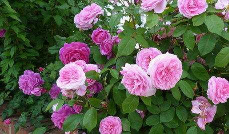
Do I want dusty rose?
mushcreek
9 years ago
Related Stories
GARDENING GUIDESWhat Kind of Roses Should You Grow?
Want to add the beauty of roses to your garden? Find out which ones, from old-fashioned to modern, are right for you
Full Story
GARDENING GUIDESLearn the Secret to Bigger and Better Roses
Grow beautiful roses using both ordinary and unusual soil amendments
Full Story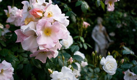
GARDENING GUIDESGreat Design Plant: Sally Holmes Rose
This simple yet versatile climbing rose grows vigorously all year; plant now for abundant spring and summer blooms
Full Story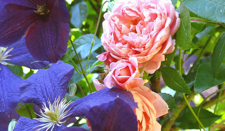
PLANTING IDEASGreat Garden Combo: Rose + Clematis for Small-Space Impact
We all need somebody to lean on. And when a rose supports a climbing vine, the results can totally transform a small garden
Full Story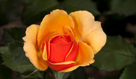
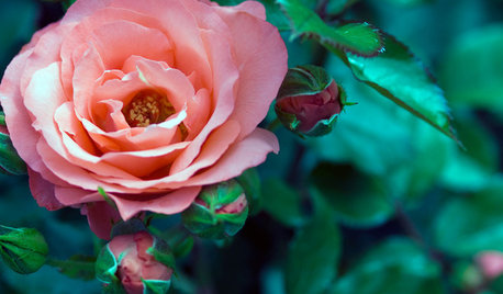
SPRING GARDENING5 Exotic Rose Colors for a Beautifully Different Garden
Give red a rest. Let these daring hues take the spotlight instead for a rose garden that turns heads
Full Story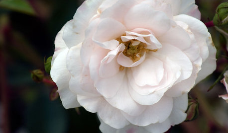
GARDENING GUIDES5 Favorite White Roses for a Purely Beautiful Garden
How does your garden glow? With roses that look like light and smell divine
Full Story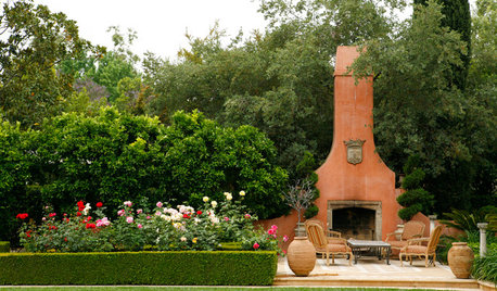
LANDSCAPE DESIGNMake Your Roses Even More Beautiful With These Companion Plants
Nourish your rosebushes and create a visual feast with these 7 classic and unexpected plant pairings
Full Story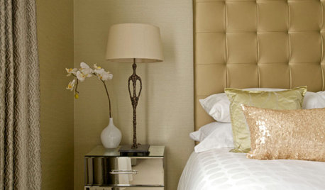
SHOP HOUZZShop Houzz: Get Trendy With Rose Gold
Soft and glam, this chic tone is warming up interiors everywhere
Full Story0
WINTER GARDENINGPruning Secrets for Exquisite Roses
Encourage gorgeous blooms year after year with this time-tested advice on how to prune your rosebush in winter for health and shape
Full StorySponsored
Leading Interior Designers in Columbus, Ohio & Ponte Vedra, Florida
More Discussions


Kiwigem
mama goose_gw zn6OH
Related Professionals
Belle Glade Interior Designers & Decorators · Linton Hall Interior Designers & Decorators · Cartersville Furniture & Accessories · Philadelphia Furniture & Accessories · Racine Furniture & Accessories · Rome Furniture & Accessories · Genova Furniture & Accessories · North Hollywood Furniture & Accessories · Zionsville Furniture & Accessories · Berkley Window Treatments · Oak Park Window Treatments · Rochester Hills Window Treatments · San Jose Window Treatments · Westfield Window Treatments · Baytown Window TreatmentsBeverlyFLADeziner
Annie Deighnaugh
tibbrix
Kiwigem
Kiwigem
tibbrix
flowerpwr45
mushcreekOriginal Author
User
tibbrix
Swentastic Swenson
busybee3
Annie Deighnaugh
voila
tibbrix
tomatofreak
Sueb20
tibbrix
kswl2
mushcreekOriginal Author
tibbrix
vedazu
Annie Deighnaugh
mushcreekOriginal Author
Annie Deighnaugh
voila