


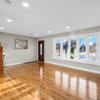
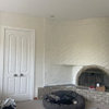
Paint options for Provence look if I paint yet again
Scarlett001
11 years ago
Sort by:Oldest
Comments (26)
Related Stories
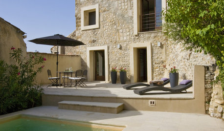
MODERN HOMESHouzz Tour: 800-Year-Old Walls, Modern Interiors in Provence
Old architecture and new additions mix beautifully in a luxurious renovated vacation home
Full Story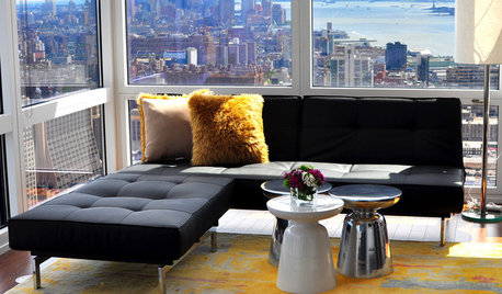
FURNITURENo Room for a Coffee Table? Think Again!
Consider an end, side, or accent table as a stylish and functional alternative
Full Story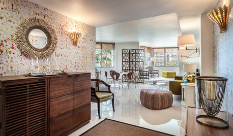
DECORATING GUIDESHouzz Tour: Happy Days Are Here Again in a Miami Apartment
The colors of Biscayne Bay, an owner’s fond memories and the groovy spirit of the 1970s inspire a bright redesign
Full Story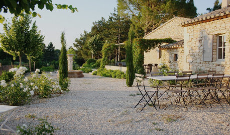
TRADITIONAL HOMESMy Houzz: A Centuries-Old French Estate Charms Again
Time and local artisans help a couple realize an idyllic French country retreat — and you can rent it
Full Story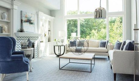
REMODELING GUIDES11 Reasons to Love Wall-to-Wall Carpeting Again
Is it time to kick the hard stuff? Your feet, wallet and downstairs neighbors may be nodding
Full Story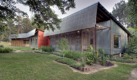
REMODELING GUIDESHello Again, Corrugated Panels
Once-Shunned Material Finds Expressive New Role in Contemporary Homes
Full Story
EXTERIORSHelp! What Color Should I Paint My House Exterior?
Real homeowners get real help in choosing paint palettes. Bonus: 3 tips for everyone on picking exterior colors
Full Story
PRODUCT PICKSGuest Picks: Everything Old-World Is New Again
Give even a new build a romantic history with lighting fixtures, hardware and drapes that recall the Old Country
Full Story
BUDGET DECORATING12 Ways to Make Your Home Feel New Again
Treat your furniture, walls, floors and countertops to some TLC, to give them a just-bought look for a fraction of the cost
Full Story
DECORATING GUIDESHemp, Hemp, Hooray! This Superplant May Be Legal Again in the USA
Hemp products are durable, sustainable, antibacterial and much more. Will the plant finally get the status it’s due in the States?
Full StoryMore Discussions


starinasgarden
Vertise
Related Professionals
Ashwaubenon Interior Designers & Decorators · Sweetwater Interior Designers & Decorators · Dallas Furniture & Accessories · Greenville Furniture & Accessories · Rochester Furniture & Accessories · Topeka Furniture & Accessories · Ives Estates Furniture & Accessories · Silver Spring Furniture & Accessories · Jacinto City Furniture & Accessories · Arlington Custom Artists · Laguna Beach Lighting · Rockland Lighting · Warwick Lighting · Channahon Lighting · Brownsville Window Treatmentscyn427 (z. 7, N. VA)
Scarlett001Original Author
Vertise
Scarlett001Original Author
Vertise
Scarlett001Original Author
KevinMP
Vertise
ellendi
indygo
nosoccermom
liriodendron
luckygal
Vertise
sis2two
Scarlett001Original Author
liriodendron
annac54
Vertise
Scarlett001Original Author
Vertise
Scarlett001Original Author
Tmnca
Scarlett001Original Author