


Undertones. Lets discuss.
domino123
10 years ago
Sort by:Oldest
Comments (4)
Related Stories
DECORATING GUIDESThe Hottest Houzz Discussion Topics of 2012
Discussions rocked and rolled this year with advice, support, budding friendships — and oh, yes, a political opinion or two
Full Story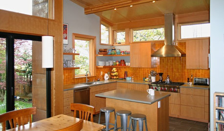
CONTRACTOR TIPS10 Things to Discuss With Your Contractor Before Work Starts
Have a meeting a week before hammers and shovels fly to make sure everyone’s on the same page
Full Story
WORKING WITH PROSGet the Upholstery Work You Expect: 10 Details to Discuss
Avoid disappointment and unexpected costs by going over these key areas with your upholsterer before work begins
Full Story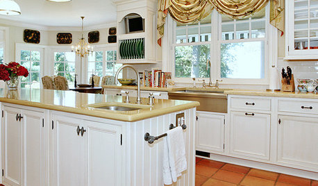
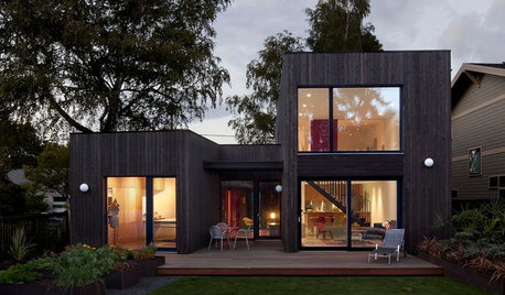
BASEMENTSDesign Workshop: Is It Time to Let Basements Become Extinct?
Costly and often unnecessary, basements may become obsolete — if they aren’t already. Here are responses to every reason to keep them around
Full Story
PRODUCT PICKSGuest Picks: Let 'Starry Night' Inspire a Formal Living Room
Use van Gogh's masterpiece to create a living room that's a work of art
Full Story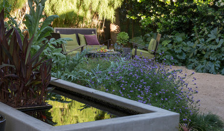
SAVING WATERHouzz Call: Are You Letting Go of Your Lawn?
Many facing a drought are swapping turf for less thirsty plantings. If you’re one of them, we’d like to hear about it
Full Story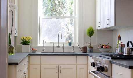
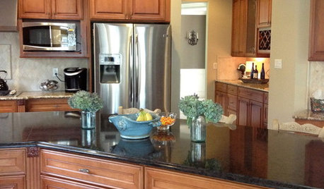
KITCHEN DESIGNLet's Toast Small Kitchens Everywhere
It's time for a tribute to the many wonderful qualities of compact kitchens — and some tips on how to plan them well
Full Story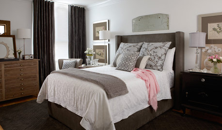
MORE ROOMSA Bedroom Lets Go to Gain Elegance and Serenity
Cluttered and outdated, this Ontario bedroom needed purging before it could take on a more sophisticated style
Full Story
HEALTHY HOMEDecorate With Intention: Let Your House Help You De-Stress
Break free of automatic TV time and learn how to really unwind and recharge with these easy ideas that don't cost a dime
Full Story


Lori A. Sawaya
mlweaving_Marji
Annie Deighnaugh
Lori A. Sawaya