


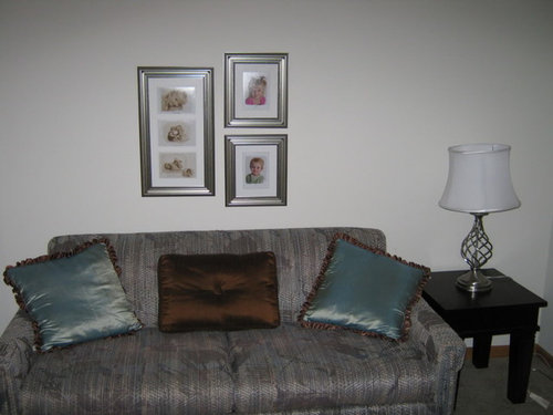
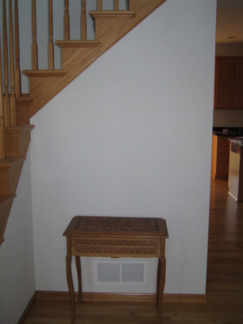
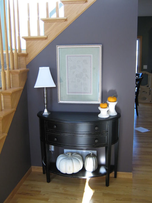
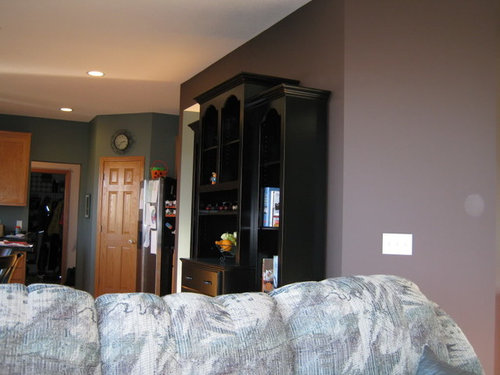
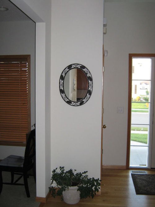
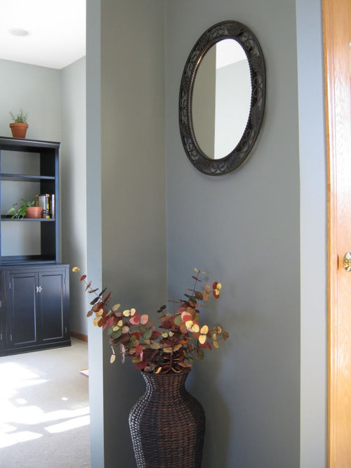
painting update - before and after pictures (pic heavy)
credomk
14 years ago


Sort by:Oldest
Comments (26)
Related Stories
WHITE KITCHENSBefore and After: Modern Update Blasts a '70s Kitchen Out of the Past
A massive island and a neutral color palette turn a retro kitchen into a modern space full of function and storage
Full Story
BEFORE AND AFTERSBefore and After: 19 Dramatic Bathroom Makeovers
See what's possible with these examples of bathroom remodels that wow
Full Story
FRONT YARD IDEASBefore and After: Front Lawn to Prairie Garden
How they did it: Homeowners create a plan, stick to it and keep the neighbors (and wildlife) in mind
Full Story
HOUZZ TOURSMy Houzz: Thoughtful Updates to an Outdated 1900s Home
Handmade art and DIY touches bring a modern touch to a classic Boston-area home
Full Story
HOUZZ TOURSMy Houzz: Elegant DIY Updates for a 1970s Dallas Home
Patiently mastering remodeling skills project by project, a couple transforms their interiors from outdated to truly special
Full StoryBEFORE AND AFTERSGray Cabinets Update a Texas Kitchen
Julie Shannon spent 3 years planning her kitchen update, choosing a gray palette and finding the materials for a transitional style
Full Story
BEFORE AND AFTERS8 Bathroom Updates Have Ideas for Every Style
All white, classic vintage and brightly eclectic are just some of the new looks sported by the transformed bathrooms you'll find here
Full Story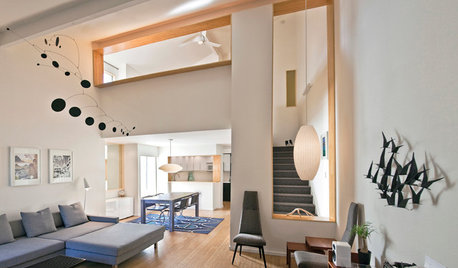
BEFORE AND AFTERSHouzz Tour: A San Diego Townhouse Gets a Bright Update
Savvy shopping and warm bamboo accents help California architects give their home a fresh, high-end feel
Full StoryRANCH HOMESMy Houzz: Warm and Airy Kitchen Update for a 1980s Ranch House
A dark and cramped kitchen becomes a bright and open heart of the home for two empty nesters in Central California
Full Story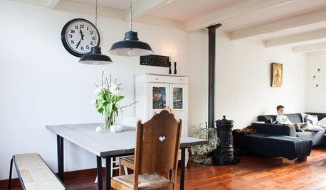
HOUZZ TOURSMy Houzz: Going Heavy on the Metal for Industrial-Style Beauty
Steel and iron pieces mix with antiques and heirlooms in an eclectic Netherlands home
Full Story

jjam
oopsie913
Related Professionals
Mansfield Interior Designers & Decorators · Mount Laurel Interior Designers & Decorators · Sweetwater Interior Designers & Decorators · Van Wert Interior Designers & Decorators · Washington Interior Designers & Decorators · Marietta Furniture & Accessories · Phoenix Furniture & Accessories · Queens Furniture & Accessories · San Diego Furniture & Accessories · St. Louis Furniture & Accessories · Fort Carson Furniture & Accessories · Greenwood Village Furniture & Accessories · Carpinteria Furniture & Accessories · La Jolla Lighting · Lawrence LightingMariposaTraicionera
credomkOriginal Author
juddgirl2
jlc712
nanny2a
les917
loribee
cattknap
cooperbailey
barb5
Kathleen McGuire
awm03
credomkOriginal Author
kathec
awm03
Robbi D.
dfzmom
credomkOriginal Author
jant
nhb22
credomkOriginal Author
clyft
meghnjosh
credomkOriginal Author