


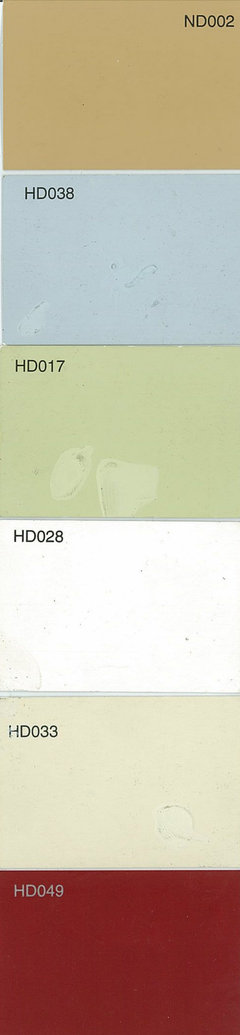
What colors to avoid in North facing rooms?
Zippity-do-dah
11 years ago
Featured Answer
Sort by:Oldest
Comments (37)

maire_cate
11 years agoRelated Professionals
Fernway Interior Designers & Decorators · New Providence Interior Designers & Decorators · Shorewood Interior Designers & Decorators · Washington Interior Designers & Decorators · Westbury Interior Designers & Decorators · Simpsonville Furniture & Accessories · Woodstock Furniture & Accessories · Glenvar Heights Furniture & Accessories · Urbandale Furniture & Accessories · Palmetto Bay Furniture & Accessories · Melbourne Custom Artists · Decatur Lighting · Wasco Lighting · Berkley Window Treatments · Baytown Window Treatments
teacats
11 years ago PRO
PROLori A. Sawaya
11 years ago- PRO
Lori A. Sawaya
11 years ago patty_cakes
11 years agopatty_cakes
11 years agonancy8947
11 years agoxantippe
11 years agoZippity-do-dah
11 years ago
jane__ny
11 years agolegomom23
11 years agokitchendetective
11 years ago- PRO
Lori A. Sawaya
11 years ago lynxe
11 years agocaryscott
11 years agokitchendetective
11 years agojane__ny
11 years agoZippity-do-dah
11 years agoalex9179
11 years ago
mybeachhousenc
8 years ago
Dorothy Harris
7 years agomelle_sacto is hot and dry in CA Zone 9/
7 years agoDorothy Harris
7 years agopandtkendall
7 years agonosoccermom
7 years ago
lizzierobin
7 years ago
Mary
7 years ago- PRO
Lori A. Sawaya
7 years ago - PRO
Lori A. Sawaya
7 years ago 
Richard Dollard
7 years agolast modified: 7 years agoMary
7 years ago- PRO
Lori A. Sawaya
7 years ago mpdhart
6 years ago
Cary Linda
2 years agoCary Linda
2 years agoCary Linda
2 years ago

Related Stories
MORE ROOMS8 Colors for North-Facing Rooms
Have a room with little sunlight? One of these vibrant, saturated paint colors will warm it up
Full Story
MORE ROOMS8 Colors for South-Facing Rooms
Choose one of these soft, cool colors to tone down the sun shining in
Full Story
BATHROOM DESIGN5 Common Bathroom Design Mistakes to Avoid
Get your bath right for the long haul by dodging these blunders in toilet placement, shower type and more
Full Story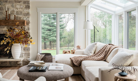
DECORATING GUIDES7 Major Decorating Mistakes and How to Avoid Them
Gain confidence to start your interior design project with this advice from a professional designer
Full Story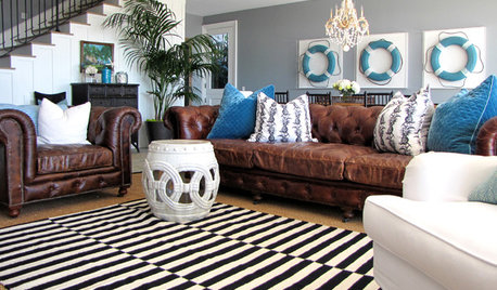
PETS5 Finishes Pets and Kids Can’t Destroy — and 5 to Avoid
Save your sanity and your decorating budget by choosing materials and surfaces that can stand up to abuse
Full Story
REMODELING GUIDESGet the Lighting Right: 8 Mistakes to Avoid
See How These Great Interiors Found the Right Lighting Solutions
Full Story
STORAGE9 Ways to Avoid a ‘Floordrobe’ in Your Bedroom
Repeat after me: The floor isn’t storage space for clothes! Tackle the ‘floordrobe’ effect with these smart tips
Full Story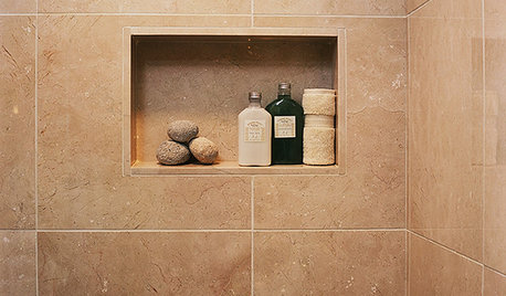

MOST POPULARMust-Try Color Combo: White With Warm Off-White
Avoid going too traditional and too clean by introducing an off-white palette that brings a touch of warmth and elegance
Full Story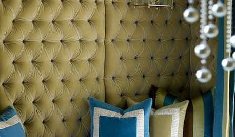
COLOR12 Fresh Palettes for Color Lovers
These unexpected color pairings create compelling displays in everything from powder rooms to great rooms
Full Story


Lori A. Sawaya