


did i mistake in my dining room with these colors? please help!
I am looking for some HONEST advice here so don't just say this looks good to make me feel better. We painted the top portion of the dining room in Baked Cumin and the bottom portion Dinner Party (both Benjamin Moore colors). DH is going to put up a thick white chair rail and some picture frame moulding wainscoting underneath the chair rail next week. So these photos show the room without the added effect of that crisp white moulding. BUT I am having massive doubts about the dinner party color. It is just SO DARK to me. I have draped next to the window the fabric for the curtains that will be going up. The curtains are a sage green with a large floral pattern in them and the flowers have some mauve, pale yellow and lots of hints of that deep burgundy color in them.
I like both the paint colors but NOT SURE if I am liking them TOGETHER. I plan on having touches of burgundy and sage green all throughout the open floor plan of the rest of the house. The top color is off the same paint card that the rest of the main areas of the house are painted so I feel compelled to have that color in every room of my downstairs. PLEASE HELP! Thx!
{{!gwi}}
{{!gwi}}
{{!gwi}}
{{!gwi}}
Comments (106)

momfromthenorth
14 years agoOh gosh, I wish I could give you a hug because I really feel your frustration on this project. I had a similar thing happen a few years back when I painted our DR a different color and the men-folk in my house had a sit-down strike. It was sooo frustrating.
Looking at the picture that came with your curtains, there are other green elements in that picture that balance the green in the curtains. The green chair and the pink/green in the wall prints. It's subtle but it's there.
Your new lower wall color is almost the same color as the wood in your DR and nothing wrong with that...but the curtains don't have that color in them...so they are competing with it.
If you paint the lower section white, you might want to try some different country style curtains that have these white/light yellow colors in them. Someone suggested a buffalo check - that would be pretty! Or another print perhaps?
Once you get your molding up, that will make a big difference too!
Hang in there - and good luck! And Happy Thanksgiving! :)
jant
14 years agoHi...Just to chirp in on Windham Cream. My BF painted it years ago and I have to say it isn't on my list of fav colors. She was after a cream but it has some very strange yellow/pale greeny tones...not attractive at certain times of the day. I think you could find something a bit easier to work with. Realize too that WHITE woodwork always brings out the stronger tones in any color. A creamy white will subdue the contrast.
Lori's BM Standish White isn't quite as strong as it shows in her pix. It IS an easy color to work with (I had it once) and although it changes with the light as all colors do, it's very attractive in all exposures. I would call it more yellow than I would a true cream. Bit it doesn't scream a true yellow...if that makes sense lol. Very pretty, very easy on the eyes.
Re: the WT's...Are you planning on doing them exactly as they show online? If so, that might change your color selection because there's a lot of incoming light that would be blocked with that tieback setup. I'm always more in favor of having drapes off the window to let max light in.... the inner edge of the drapes just halfway or so onto the casing.
I hope you get this worked out soon....lol. This has got to be frustrating!
Related Professionals
Fernway Interior Designers & Decorators · Mansfield Interior Designers & Decorators · Mount Laurel Interior Designers & Decorators · Washington Interior Designers & Decorators · West Palm Beach Furniture & Accessories · Annandale Furniture & Accessories · Glenvar Heights Furniture & Accessories · Greenwood Village Furniture & Accessories · Highland Park Furniture & Accessories · Little Chute Furniture & Accessories · Short Hills Furniture & Accessories · Bellwood Custom Artists · Pembroke Custom Artists · Fort Washington Lighting · South Bend Lightingandee_gw
14 years agoI think the Weston flax will be too yellow/gold and too strong for the room and draperies.
nutmegxo
Original Author14 years agohmmmmm I am seriously having massive anxiety not wanting to make another wrong move here. The windham cream looks nice on the card and looks nice against the curtains. It also matches my family room cabinets and would help me achieve that flow. Hubby was looking at philadelphia cream this morning saying that looked nice as well. As for standish white on the card that color does not look yellow at all so I am shocked that is the same color in loribees photos but her pictures look amazing...it looks like a creamy yellow in her pics.
I am doing the double tied back treatment as in the picture because I like it...and there is a ton of light coming in that room as the day goes on and so I don't mind covering up the windows a bit. Also I should mention that the only two windows in this room are on one wall. The rest of the room is plain wall.
juddgirl2
14 years agoLoribee - your foyer is beautiful. Can I ask where you found your wall clock? I don't have room for a grandfather clock but would love to have something like this for my foyer.
jant
14 years agoJuddgirl...tons on Ebay. I bought mine about 6 yrs ago there for maybe about $50? They're called train station clocks and are double sided.
Here is a link that might be useful: train station clocks
nutmegxo
Original Author14 years agoUPDATE ON PROGRESS: Well let's hope third time is a charm. At least I am learning from my mistakes. I repainted the bottom portion of the wall the crisp Super White and while I was doing it, I was thinking about what so many of you said in here about using a creamier off white. As of now we are planning on repainting the top part of the wall with Windham Cream - 95% sure we are going to use that color LOL. The people at the Benjamin Moore store said the Super White was "okay" for underneath the chair rail and the wainscoting but suggested Linen White as another option. It looks creamy and would blend in nicely with my family room cabinets and my other furnishings. If I go with the Linen White on the bottom part of the wall and for the trim, I will have to paint all the existing trim throughout my house including doors. I don't mind doing that but am fearful of another mistake.
Does anyone have experience with Linen White??? It looks nice on the card. Pictures of my family room cabinet above shows it is a creamy color that matches Windham Cream exactly. My family room sectional sofa is in a sage green. So I don't want to go with a grayish white or anything. When I look at all the whites the Linen White seems to just flow. I am doing all this tomorrow so I appreciate any last minute suggestions. This whole thread here has helped me immensely!!!
momfromthenorth
14 years agoHere's a suggestion: Why can't you use the Linen White on the lower section (below the chair rail) and the Windham Cream above...and leave your wood trim in the super white? It looks like there will be enough contrast between the LInen white and Super White to pull this off - and would save you from having to repaint ALL of the trim and doors in your house.
nutmegxo
Original Author14 years agothanks for that suggestion sippimom and I could very well do that but I think if the Linen White looks good once I put it up that I will just bite the bullet and paint the trim all over. I will just do it a little at a time. Just hope it looks good! lol
karinl
14 years agoOnly do that if you REALLY want to do it... not just to make this one room work and to integrate it. That white trim can work if it has to.
I'm a novice when it comes to selecting among different shades of cream, so I'll defer to more talented colourists on that front. But I will share a quote from a 1993 UK decorating mag that I found in the hospital today (son had appendectomy this weekend, spent a lot of time there!) that is making me begin to understand the subtle distinctions:
"You can make any space do what you wish, as long as you manipulate the light, the reflections, and the tonal value." That phrase, tonal value, and the implied concept of tonal quality, is starting to mean something to me... and may facilitate for you the process of standing back from the colour card and "feeling" what the room as a whole needs. Have you actually tried hanging the curtains in place?
One thing I will address though is your question about connecting rooms, and I say this without fully being able to visualize your house layout. I'm personally a huge fan of wallpaper (in case this wasn't already evident!), or for that matter anything that has patterns and texture, such as fabrics for drapes and upholstery. For me, those elements often bridge even quite disparate parts, So in your space I would probably look for walls or even parts of walls that I could wallpaper, and find paper that contained colours from both rooms and echoed and combined them.
Good luck tomorrow!
KarinL
nutmegxo
Original Author14 years agoThank you Karin!! I do often stand back and wait for a room to "speak" to me...no not hearing voices in my head LOL...but I really try to analyze all the little details. Maybe I overanalyze. I have a VERY good feeling about the Linen White for trim. I hope my hunch is right.
Hope your son is recovering!
Will definitely post update pictures within the next couple days ;)
nutmegxo
Original Author14 years agoThank you kmc...that link is beautiful...however I have already re-painted and I am happy to announce that I am happy with it!!! :)
Not sure if any of you with the better eye for color coordination will disagree, but I think I finally got it right here. We painted the top wall Windham Cream and it is beautiful creamy yellow. And when I stand in my kitchen I can see my family room cabinet which is the same creamy yellow color and also have a view of the dining room walls. It coordinates nicely. We painted the bottom part of the wall in Linen White. And I love that as well!! I think this looks good with the curtains and it appears as if it is the same type of color on the curtain packaging photo. Hubby is in process of putting up all the moulding now. Here is a preliminary picture...
{{!gwi}}
{{!gwi}}
{{!gwi}}
And I have to thank everyone in here because without all your feedback I never would have been able to work through this decision process and go through all that trial and error. THANK YOU!!
User
14 years agoLooks really nice! Much, much nicer than the beginning. Your curtains are going to look really pretty in there now. Can't wait to see them up.
Make sure you give DH a big hug for understanding the need to repaint and get it right. ;)

Lyban zone 4
14 years agoI am sure it is beautiful but on my monitor the three photos are so different that I am not sure what you have.
Could you take two more photos one with flash and one without, standing back a bit.barb5
14 years agoVery pretty!
Since I have both Windham Cream and Linen White in my home, I "know" your colors well. I can understand why you are happy with them.
Looks like your curtains are going to go beautifully with these colors.
ttodd
14 years agoLooks really, really nice! Can't wait to see the curtains up. I have to stop looking at those curtains because I'm a curtain junkie and now I want them too. But I won't. I can't.
Sorry to be so short in response but I'm cleaning for T-Day!

CaroleOH
14 years agoWow, I love the cream and white. Wasn't really loving the dark gold/red combo or the lighter gold/darker gold combo. They just seemed to be too much.
I think you've hit it spot on and our DR is going to be calm, cheerful and so pretty. Can't wait to see the drapes up.
I also think these new colors will really let your drapes be the focal point vs. competing with the bright wall colors!
nutmegxo
Original Author14 years agoOhhh thank you so much all of you!!! ttodd those curtains I got at Lowe's from the Waverly Home Classics collection. I just love their fabrics!!!
Yes sorry about the poor quality of the pics, I was just rushing to get something up in here. By end of week I will take better pictures once the room is all done. I am truly very happy! I walk by the dining room now and smile instead of cringe!!!
palimpsest
14 years agoI think the room is going to look better at all times of day, in natural light and artificial light, with the new scheme.
weav_2007
14 years agoNutmegxo - I have been following this thread with interest, as I struggle with decorating decisions also. I could feel your pain. I admire you for your determination to get this room right. You were gracious in responding to the comments. And there was no giving up in you. You rock! I think it's going to be a beautiful room. Please post pictures when you have your furniture & accents in the room.
nutmegxo
Original Author14 years agoweav - thank you very much! This really was a huge help getting feedback in here. I was pulling my hair out the other night because I just did not want to paint for the 3rd time and make a mistake. I will be posting pictures in a few days...
HAPPY THANKSGIVING EVERYONE! xo
pluckymama
14 years agoI just read your entire thread for the first time. What a difference the right color makes! Your windham cream/linen white combination is perfect! Kudos to you for persevering and having the courage to read all of these opinions and allowing them to clarify your vision for your room. Can't wait to see the finished pics with those curtains hung. It is going to be gorgeous and the windham cream is lovely. A color I will now be considering. Admire your instincts and your ability to get the job done!
loribee
14 years agoWow....it's done! Looks beautiful.
Hang those curtains and then finally relax.
You must be so happy! :)mimi_2006
14 years agoLove the new cream/white look. It's so rich and calm looking and I think your curtains are going to be beautiful against that wall. I think you got a winner :-)
barb5
14 years agoI came back to take a closer look at your chair rail. It looks really nice with the beading on the back plate. That beading picks up the convex curves of the chair rail.
Last winter we put in chair rail and routed a quarter concave bevel on each side of the back plate. It gives quite a different look because the light shadows in it instead of being reflected off, like yours does. I like the way we did it too, it is just makes me appreciate how the different cuts look in the wood.
karinl
14 years agoLooks great, even with the yellow-washed picture, and if that is how the light suffuses the room at times, heck, it even works then.
And my son is recovering nicely, thanks; due home today.
I'm another who is admiring your ability to define a problem, very graciously sift through and engage with a plethora of advice and opinion, articulate and refine your needs, and persevere to find what YOU really want. AND I agree that it's a nice chair rail. Enjoy the outcome!
KarinL
beekeeperswife
14 years agoOh, I really like the new look. I have seen the combination you used in the original pictures in my neighbor's house. I have never been able to figure out why it doesn't look right to my eye. I think once I saw your "after" shot I now know.
When I see the first picture, what goes through my head is "there is red, and there is yellow, white trim, curtains", now when I see it, I just see a calm room that looks really classy. Happy Thanksgiving, hope you get to use that room tomorrow!
Happyladi
14 years agoIt looks really nice. I can't wait to see the final picture with everything in place.
pdg777
14 years agoHi, I rarely ever come to this page, just popped in to see if anyone was talking Christmas decorating. LOL! Anyway, as I was reading thru all the comments I kept hoping that this would really work out for you. I liked the first two colors a lot. However, the last two, I think you nailed it! I'm so glad that it worked out, you put so much into it.
nicole__
14 years agoI really like the new color combo you have now!!!! WOW!!!! What a difference, very pleasing!
nutmegxo
Original Author14 years agookay drum roll please!!!!! LOL Here is the completed room...I still have my grandmother's old dining room set which I am saving my pennies to replace it. Also will be ripping up the carpet and putting in hardwood floors to match the floor. But anyway..I am ecstatic with the results!!! Hubby put in the crown moulding and the chair rail and the picture frame wainscoting and I did all the painting...
{{!gwi}}
{{!gwi}}
{{!gwi}}
{{!gwi}}
And once again THANK YOU to everyone...every single opinion/feedback in here helped me to achieve this goal!
Now I am ready to tackle my living room!!! tee hee tee hee
 PRO
PROacdesignsky
14 years agoWhat a calming and pretty result! It's such a transformation. I love the wainscot and the paint. Great job!
meghnjosh
14 years agoVery nice...This combo is much better for ur WTs...You guys have done a great job...Lucky you to have such an understanding and talented DH....
weav_2007
14 years agoit looks very nice - you did a great job. kudos to you and your dh. my shift key is not working on my laptop or i would have used my exclamation mark.
moremoremore
14 years agoI like the colors MUCH better. Can I ask you a question? Can we see the drapes pulled all the way to the sides w/o the tie backs? That's seems much more contemporary but still totally keeping with your country feel? I was just curious. Maybe it's just the valance that's bothing me...Sorry for the two cents that weren't asked for LOL...I think the drapes are really pretty in the room though!
k9arlene
14 years agoThe colors look lovely with the curtains. I wonder if you could extend the curtain rod so that more of the window is exposed when you tie the curtains back.
nutmegxo
Original Author14 years agoLOL I love tiebacks! I actually had to pin them back to keep them in place. I really need to get blinds in here because this room gets massive afternoon sun and it is blinding! So for now I have the curtains like this, covering up part of the window. I have always been a fan of fabric tie backs though. I am most likely putting white plantation blinds in here.
Thank you all for your compliments! I am very happy!
whitdobe
14 years agoI also admire your determination to "get it right". It was well worth it, the colors you settled on work perfectly. Your room looks beautiful!
karinl
14 years agoI guess I get to be the 100th poster! The result is indeed lovely, and I must say the picture on the wall really enhances the overall effect, blending as perfectly with the drapes as it does.
I'm really glad you shared this process; it's been instructive for me and likely for others - as I said, I would have pulled the strongest colours out of those curtains as well. In addition, I'm getting quite attached to the tie-back look myself after all this; I'd never thought of using it before.
Enjoy the result, and good luck with the living room!
KarinL
beekeeperswife
14 years agoI was just looking at a thread about Christmas decorating and voila, there was a table like yours, but painted. Since it sounds like you are thinking about changing it, I thought I'd show this to you. Look down to bellaflora's post, currently about 3/4 of the way down--the picture has china on the tree. It's just a thought.
Here is a link that might be useful: picture of painted dining table/chairs
momfromthenorth
14 years agoYou should be grinning!! It looks beautiful!
And would your DH like to come to my house to put in a chair rail here? LOL
Seriously, it all came together and looks perfect.
Now you can sit back and enjoy your holidays.
Shades_of_idaho
14 years agoHello, Nutmegxo, Thank you so very much for this thread. I am sorry it was such a hard deal for you . Your results are just stunning. Such a beautiful room. I learned so much through your trials. I am hanging onto this thread for future thought. I am just beginning the process of painting our house and only have the kitchen and my studio rooms painted.
Your husband did a beautiful job of all the wood work too.
Thank you for sharing.
Chris
nutmegxo
Original Author14 years agoGlad this thread was an inspiration for others as it was extremely helpful for me! My advice to anyone is to just keep going at it until you get it right and when it is right you will know it. And it is a process; you learn what not to do from your mistakes and appreciate the end result so much more once you have gone through all the experimenting. I am in total bliss with how this came out and the colors "fit" to my house...although I do appreciate dark, rich colors in other homes, my particular home I felt dictated soft creamy colors.
beekeeperswife- thanks for the link, I will check it out. My dining set was my grandmothers...consists of a large table with 6 chairs and a buffet. It is made of fruitwood and considered "mediterranean" style. I yearn to have a china cabinet..hopefully something that is french country style. Saving my pennies for that!
Lazarus St. Bernadine
8 years agoI must have been underwater for 6 years, so as usual, I'm putting in my 2 cents six years after the fact. But as long as this thread is still open and searchable, I'll have at it.
First let me emphasize that decorating is an art-NOT a science, so theoretically there is no right or wrong way to decorate if the end result is aesthetically pleasing to the occupants of the house. When you consult a professional designer, you are basically seeking their professional OPINION, not a one-size-fits-all protocol written in stone.
That being said, allow me to share my thoughts on decorating with chair rails and picture frame moldings based on 40 years of helping people make some choices in that area.
I generally suggest chair rails only for living rooms and dining areas. I always advise my associates to place the chair rail no more than one third the height between the floor and ceiling. With a standard 8" ceiling, the bottom of the chair rail is never placed more than 30" above the floor.
When picture frame moldings are installed below a chair rail, the longer side of the rectangular frames are placed horizontally. If they are also used above the chair rail, the longer sides are placed vertically. I personally prefer using PF moldings only below the chair rail. It is wonderfully budget friendly way to create the look of wainscoting.
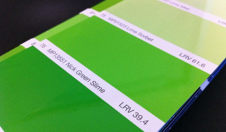
The only color I generally paint the wall space below a chair rail when it has PF moldings is semi-gloss white in whatever shade matches all the trim and moldings. While you might normally paint the wall space above a chair rail a lighter color, it is quite acceptable to go darker when you have a white wall space below the chair rail. However, if you use too dark a color where the LRV value is below 20 points, you risk having the area look very top heavy.
When you have a chair rail with no PF moldings, you can paint the upper and lower areas the same color. But if you use 2 colors, most people generally prefer using the darker color below the rail.


Kathleen McGuire