


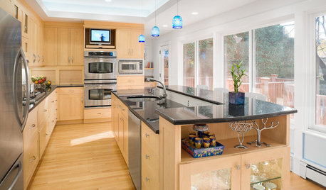
These lights?
User
9 years ago
Sort by:Oldest
Comments (29)
Related Stories
UNIVERSAL DESIGNHow to Light a Kitchen for Older Eyes and Better Beauty
Include the right kinds of light in your kitchen's universal design plan to make it more workable and visually pleasing for all
Full Story
REMODELING GUIDESHow to Get Your Pendant Light Right
Find out where to place a hanging light and how high it should be
Full Story
LIGHTING8 Creative Lighting Solutions for Food Prep
Get all the task illumination you need while distracting the eye from fluorescents, following the lead of the kitchens here
Full Story
BATHROOM DESIGNHow to Light Your Bathroom Right
Get ready for your close-up in a bath that's a sanctuary with task, accent, decorative and ambient lighting
Full Story
LIGHTINGYour Guide to Common Light Fixtures and How to Use Them
Get to know pot lights, track lights, pendants and more to help you create an organized, layered lighting plan
Full Story
LIGHTING5 Questions to Ask for the Best Room Lighting
Get your overhead, task and accent lighting right for decorative beauty, less eyestrain and a focus exactly where you want
Full Story
LIGHTINGThe Lowdown on High-Efficiency LED Lighting
Learn about LED tapes, ropes, pucks and more to create a flexible and energy-efficient lighting design that looks great
Full Story
LIGHTINGGet Turned On to a Lighting Plan
Coordinate your layers of lighting to help each one of your rooms look its best and work well for you
Full Story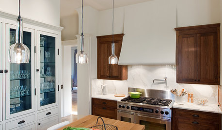
KITCHEN DESIGNPick the Right Pendant for Your Kitchen Island
Don't settle for bland builder-grade pendant lights when you can have your pick of colors and kinds to match your kitchen's style
Full Story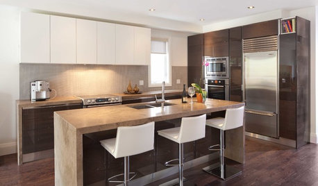
LIGHTINGGet Your Home's Recessed Lighting Right
Learn the formula for how much light a room needs plus how to space downlights, use dimmers and more
Full Story


TxMarti
UserOriginal Author
Related Professionals
Atlanta Furniture & Accessories · Bend Furniture & Accessories · Carlsbad Furniture & Accessories · Miami Furniture & Accessories · Norwalk Furniture & Accessories · Annandale Furniture & Accessories · Palmetto Bay Furniture & Accessories · Indian Creek Furniture & Accessories · Maywood Custom Artists · Decatur Lighting · Laguna Beach Lighting · Saint Petersburg Lighting · Lodi Window Treatments · Riverhead Window Treatments · Stoneham Window TreatmentsRNmomof2 zone 5
Gracie
UserOriginal Author
UserOriginal Author
Gracie
Gracie
UserOriginal Author
Gracie
UserOriginal Author
Gracie
UserOriginal Author
mattandrews
User
Gracie
Gracie
bbtrix
UserOriginal Author
Gracie
UserOriginal Author
UserOriginal Author
Gracie
UserOriginal Author
UserOriginal Author
Gracie
UserOriginal Author
vasue VA
UserOriginal Author