


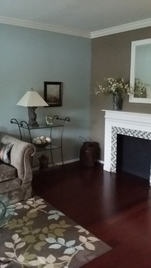
is corner basket too skimpy?
novacat_2010
9 years ago
Sort by:Oldest
Comments (29)
Related Stories
DECORATING GUIDESLocal Color: Tobacco Baskets Pack In Southeastern Style
Made of woven oak strips, these antique baskets bring rustic texture to rooms of all kinds
Full Story
HALLOWEENFall DIY Project: Greet Trick-or-Treaters With a Dip-Dyed Basket
We found an easy trick to add a nice design touch to any storage basket just in time for Halloween visitors
Full Story
KITCHEN DESIGNIs a Kitchen Corner Sink Right for You?
We cover all the angles of the kitchen corner, from savvy storage to traffic issues, so you can make a smart decision about your sink
Full Story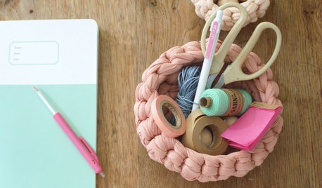
PRODUCT PICKSGuest Picks: Set Up a Sprightly Spring Craft Corner
Get a jump start on crafting season by organizing, updating and beautifying your workspace
Full Story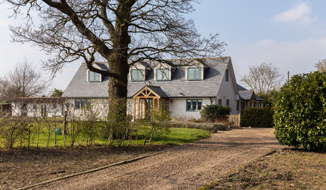
HOMES AROUND THE WORLDMy Houzz: Author Makes Her Home in a Quiet Corner of Hertfordshire
British novelist Freya North refreshes a dated bungalow to create an idyllic country home for her family
Full Story
MORE ROOMSAttic Bedrooms Turn a Corner
No longer mere storage space for broken dolls and old clothes, attics are being turned into the most stylish of bedrooms
Full Story
INSIDE HOUZZPro Corner: Add Keywords to Your Photos
Make your photos searchable by Houzz users by adding keywords for style, product descriptions and more
Full Story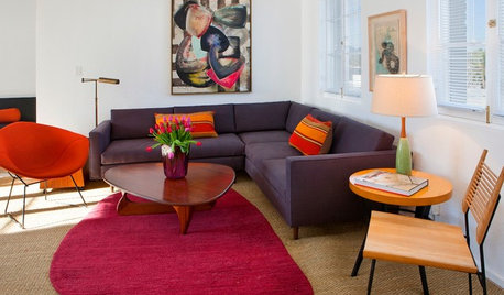
DECORATING GUIDESHouzz Tour: 2 Weeks to an Apartment Transformation
Speedy didn't mean skimpy for this couple's Santa Monica rental, thanks to a designer who thrives on tight deadlines
Full Story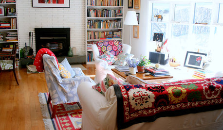
ACCESSORIESFinish Your Look With a Fun Mix of Textiles
Why box yourself into a design corner when you can spread out ever-changing throws, rugs and even bags?
Full Story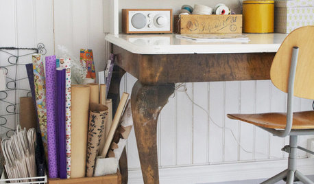
ORGANIZINGHelpful Catch-Alls Keep Visual Clutter at Bay
What a difference it makes when you corral your stuff in pretty bowls, baskets or crates
Full StoryMore Discussions


debbie1031
novacat_2010Original Author
Related Professionals
Glenbrook Interior Designers & Decorators · Rockland Interior Designers & Decorators · Bridgeport Furniture & Accessories · Dallas Furniture & Accessories · Evanston Furniture & Accessories · Nashville Furniture & Accessories · West Palm Beach Furniture & Accessories · Northbrook Furniture & Accessories · Bethlehem Custom Artists · Decatur Custom Artists · Green Bay Lighting · Laguna Niguel Lighting · Saint Petersburg Lighting · Oklahoma City Window Treatments · Sun Lakes Window Treatmentstibbrix
ellendi
surya55_gw
novacat_2010Original Author
tibbrix
novacat_2010Original Author
allison0704
novacat_2010Original Author
k9arlene
blfenton
amykath
novacat_2010Original Author
tibbrix
queen_gardener
k9arlene
novacat_2010Original Author
novacat_2010Original Author
tibbrix
novacat_2010Original Author
novacat_2010Original Author
novacat_2010Original Author
blfenton
erinsean
novacat_2010Original Author
novacat_2010Original Author
tibbrix
novacat_2010Original Author