

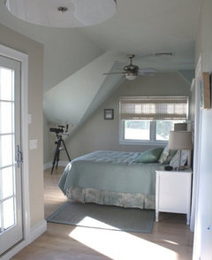
Color gurus..Edgecomb gray
ellendi
9 years ago
Featured Answer
Sort by:Oldest
Comments (11)
 PRO
PROLori A. Sawaya
9 years agoRelated Professionals
Boise Interior Designers & Decorators · Beaufort Furniture & Accessories · Englewood Furniture & Accessories · Greenville Furniture & Accessories · Memphis Furniture & Accessories · Rock Hill Furniture & Accessories · Annandale Furniture & Accessories · Port Chester Furniture & Accessories · Van Nuys Furniture & Accessories · Kendall Furniture & Accessories · Danville Custom Artists · Palm Springs Lighting · Santa Barbara Lighting · Patchogue Window Treatments · Salt Lake City Window Treatments
User
9 years agoellendi
9 years ago
Sueb20
9 years agonosoccermom
9 years agoellendi
9 years agodecordummy_gw
9 years ago
robo (z6a)
9 years ago- PRO
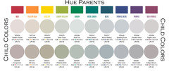
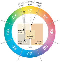
Lori A. Sawaya
9 years ago - PRO
Lori A. Sawaya
9 years ago

Related Stories

DECORATING GUIDESColor of the Week: Decorating With Warm Gray
Tired of tan? Getting gloomy from cool gray? Make warm gray your new go-to neutral
Full Story
MOST POPULAR50 Shades of Gray
Gray is hotter than ever, thanks to a hit novel full of risks and dark secrets. Tell us: Which paint shade possesses you?
Full Story
EXTERIOR COLORExterior Color of the Week: 7 Ways With Warm Gray
See why this hue can be the perfect neutral for any house
Full Story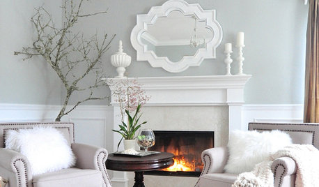
GRAYColor Guide: How to Work With Light Gray
The hottest new neutral can be cool or warm, formal or casual, and feminine or masculine. Talk about versatile
Full Story
GRAYChoosing Paint: How To Pick the Right Gray
Which Version of Today's 'It' Neutral Is For You?
Full Story
KITCHEN DESIGNObsessed With Gray in the Kitchen
See How to Use This Sexy Neutral to Heat Up Your Cookspace
Full Story
GRAYGoing Greige: Tips for Choosing This All-Around Neutral
Here are some ways to highlight and complement your home with this elegant hybrid of gray and beige
Full Story
WHITEHow to Pick the Right White Paint
White is white, right? Not quite. See 8 white paint picks for 8 very different effects
Full Story
DECORATING GUIDESThe Case for In-Between Colors
These mutable hues defy easy description, but their appeal all around the home isn't hard to get
Full Story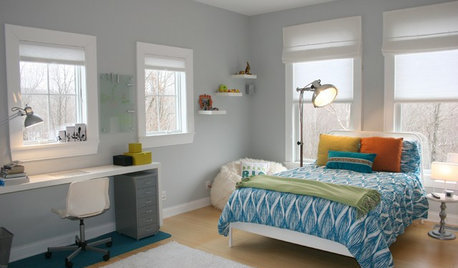
TRIMTrim Color Tips: Get Your White Trim Right
Set off wood tones, highlight architectural features, go minimalist ... white trim is anything but standard when you know how to use it
Full Story


decordummy_gw