


Eggplant, great to eat, never thought I would paint with it!
Christie Santercangelo
11 years ago
Sort by:Oldest
Comments (47)
Related Stories
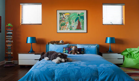
COLOR10 Color Combos You Never Thought Would Work
Orange and blue? Purple and green? Yes and yes. Unlikely pairings can look great if you do them right
Full Story
MOST POPULARSo You Say: 30 Design Mistakes You Should Never Make
Drop the paint can, step away from the brick and read this remodeling advice from people who’ve been there
Full Story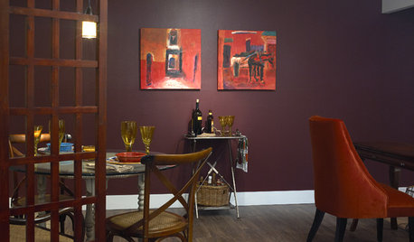
PURPLEEggplant Purple Makes Rooms Rich
Eggplant purple on walls or furniture offers a rewarding payoff: confident, luxurious rooms in homes from traditional to modern
Full Story
LIFEYou Said It: ‘I’m Never Leaving’ and More Houzz Quotables
Design advice, inspiration and observations that struck a chord this week
Full Story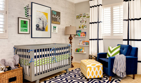
KIDS’ SPACESSee an Arizona Nursery That’ll Never Get Old
Age appropriate but not childish, this baby boy’s room will grow with him without a redesign
Full Story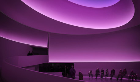
ARTSee the Sky as Never Before, Courtesy of Artist James Turrell
Experience light, space and perception in a whole new way at three museums across the United States — and maybe at your house, too
Full Story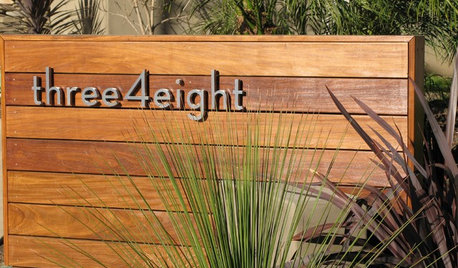
CURB APPEAL7 Finishing Touches for a Thoughtful Front Yard
Make a great first impression with artful house numbers, water features, garden art and more
Full Story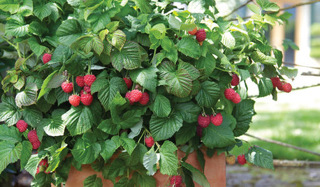
CONTAINER GARDENSPatio-Perfect Berry Bushes Like You’ve Never Seen
Small enough for pots but offering abundant fruit, these remarkable bred berries are a boon for gardeners short on space
Full Story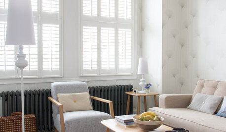
DECORATING GUIDESLiving Room Features That Never Go Out of Style
These key pieces will help your living room keep its good looks, no matter what's in fashion
Full Story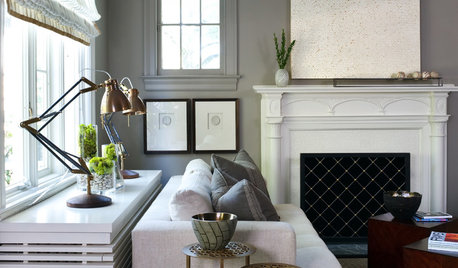
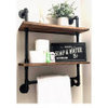
DECORATING GUIDESRadiator Covers Like You’ve Never Seen
From custom to DIY, these 10 ideas will help the radiator blend in, become a storage standout or both
Full StoryMore Discussions


Christie SantercangeloOriginal Author
beekeeperswife
Related Professionals
Gloucester City Interior Designers & Decorators · Lake Elsinore Interior Designers & Decorators · Ridgefield Park Interior Designers & Decorators · Atlanta Furniture & Accessories · Milwaukee Furniture & Accessories · Rome Furniture & Accessories · San Francisco Furniture & Accessories · Savannah Furniture & Accessories · Alpharetta Furniture & Accessories · Ives Estates Furniture & Accessories · Southchase Custom Artists · Walnut Creek Lighting · Sacramento Window Treatments · St. Louis Window Treatments · Westfield Window Treatmentsnosoccermom
Christie SantercangeloOriginal Author
caminnc
Annie Deighnaugh
jterrilynn
jterrilynn
cindyloo123
cindyloo123
Christie SantercangeloOriginal Author
jterrilynn
bostonpam
geokid
geokid
lascatx
cindyloo123
lascatx
msrose
Christie SantercangeloOriginal Author
lascatx
lascatx
Christie SantercangeloOriginal Author
cindyloo123
Christie SantercangeloOriginal Author
lascatx
patty_cakes
Christie SantercangeloOriginal Author
deeinohio
Christie SantercangeloOriginal Author
live_wire_oak
maju785
jterrilynn
patty_cakes
cindyloo123
Lori A. Sawaya
jerseygirl_1
msrose
Christie SantercangeloOriginal Author
caminnc
lascatx
beache
beekeeperswife
lascatx
Christie SantercangeloOriginal Author
nosoccermom
patricianat