


WWYD? Repaint or choose new curtains?
kathec
14 years ago
Sort by:Oldest
Comments (22)
Related Stories
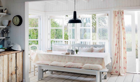
WINDOW TREATMENTSHow to Choose the Right Curtains
Custom or ready-made? Pinch or pencil pleats? Knowing the options will help you decide which window coverings are right for your space
Full Story
Houzz Call: Show Us Your Paint Makeovers
Let your newly repainted house or room do the "How d'ya like me now?" strut right here — it might just be featured in an upcoming ideabook
Full Story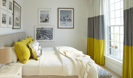
DECORATING GUIDES13 Decorating Tips for Short-Term Renters
Mirrors, curtains, lamps and other features set a stylish tone you can take with you
Full Story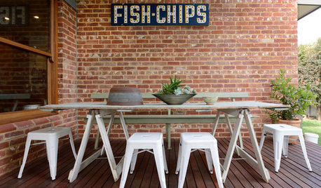
GARDENING AND LANDSCAPINGBudget Decorator: 10 Ways to Deck Out Your Patio
Hang a vintage sign here and some inexpensive curtains there, for a patio or deck that looks polished and pulled together
Full Story
DECORATING GUIDESFix Those 'Whoopsies': 9 Fast Solutions for Decorating Mistakes
Don't suffer in silence over a paint, furniture or rug snafu — these affordable workarounds can help
Full Story

WHITEHow to Pick the Right White Paint
White is white, right? Not quite. See 8 white paint picks for 8 very different effects
Full Story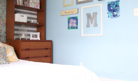
BUDGET DECORATINGThe Single Easiest Trick for Serial Redecorators
Take the no-sweat approach to no-commitment decorating with this inexpensive, readily available solution
Full Story
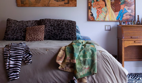
HOUZZ TOURSMy Houzz: Global Panache for a Dallas Refuge
Inspiration from travels helps new parents create a worldly, personal home and garden in their own corner of the globe
Full Story


augsburgdaisy
Happyladi
Related Professionals
Glenbrook Interior Designers & Decorators · Huntersville Furniture & Accessories · Lorton Furniture & Accessories · Medford Furniture & Accessories · Potomac Furniture & Accessories · Reno Furniture & Accessories · Roswell Furniture & Accessories · Newton Furniture & Accessories · Summerville Custom Artists · Bellwood Custom Artists · Camp Springs Lighting · Miami Springs Lighting · Saint Petersburg Lighting · Fraser Window Treatments · Westfield Window TreatmentskathecOriginal Author
readerlearner
User
My3dogs ME zone 5A
kathecOriginal Author
sweeby
charlieinnj
kathecOriginal Author
User
kathecOriginal Author
kathecOriginal Author
oilpainter
donnawb
nanjean68
kathecOriginal Author
clax66
kathecOriginal Author
justgotabme
parma42
parma42