


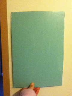
I think Im getting overwhelmed...
joneyjmw
11 years ago

Featured Answer
Sort by:Oldest
Comments (17)

patty_cakes
11 years agojoneyjmw
11 years agoRelated Professionals
Linton Hall Interior Designers & Decorators · Little Egg Harbor Twp Interior Designers & Decorators · Memphis Furniture & Accessories · San Diego Furniture & Accessories · Detroit Furniture & Accessories · Los Gatos Furniture & Accessories · Mill Valley Furniture & Accessories · Northbrook Furniture & Accessories · Potomac Furniture & Accessories · North Bellmore Furniture & Accessories · Arlington Custom Artists · Lafayette Custom Artists · Danville Custom Artists · Lodi Window Treatments · Baytown Window Treatmentsliriodendron
11 years ago
Annie Deighnaugh
11 years ago
graywings123
11 years agoEngineerChic
11 years agoTmnca
11 years agojoneyjmw
11 years agopatty_cakes
11 years agopatty_cakes
11 years agosteph2000
11 years agojoneyjmw
11 years agonosoccermom
11 years agoyayagal
11 years ago
neetsiepie
11 years ago
Sueb20
11 years ago

Related Stories
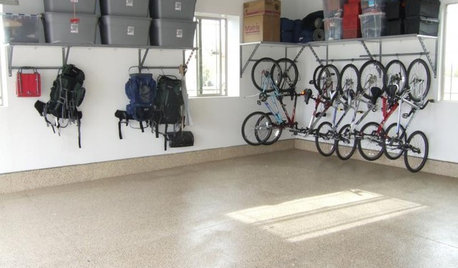
MOST POPULARGarage Cleaning Tips for the Overwhelmed
Don’t let this catch-all space get the better of you. These baby steps can get you started
Full Story
PETSSo You're Thinking About Getting a Dog
Prepare yourself for the realities of training, cost and the impact that lovable pooch might have on your house
Full Story
WINTER GARDENING6 Reasons I’m Not Looking Forward to Spring
Not kicking up your heels anticipating rushes of spring color and garden catalogs? You’re not alone
Full Story
LIFE7 Tips to Get With a New Minimalist Mentality
Feeling overwhelmed by your stuff? Here's how to pare down, simplify and keep just what you need and love at home
Full Story
LIFEStop the Toy Takeover by Changing the Way You Think
Make over your approach and get gift givers onboard with your decluttering efforts by providing meaningful toy alternatives
Full Story

LIFEYou Said It: ‘I’m Never Leaving’ and More Houzz Quotables
Design advice, inspiration and observations that struck a chord this week
Full Story
LIFEThe Polite House: How Can I Kindly Get Party Guests to Use Coasters?
Here’s how to handle the age-old entertaining conundrum to protect your furniture — and friendships
Full Story
DECORATING GUIDESGetting the Room Right: Part I
Great Spaces Show How to Avoid the Top 10 Decorating Mistakes
Full StoryMore Discussions


msrose