


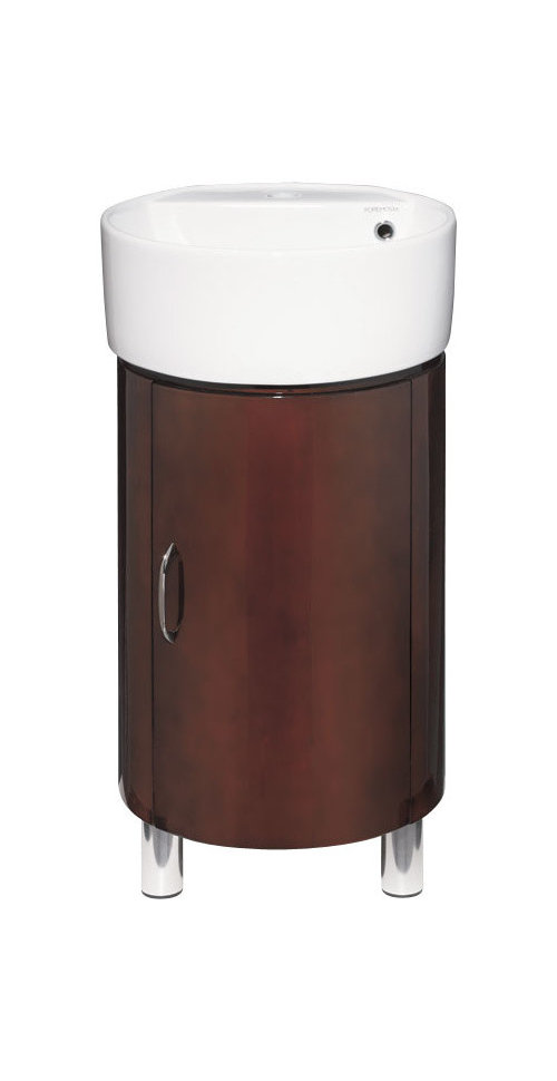
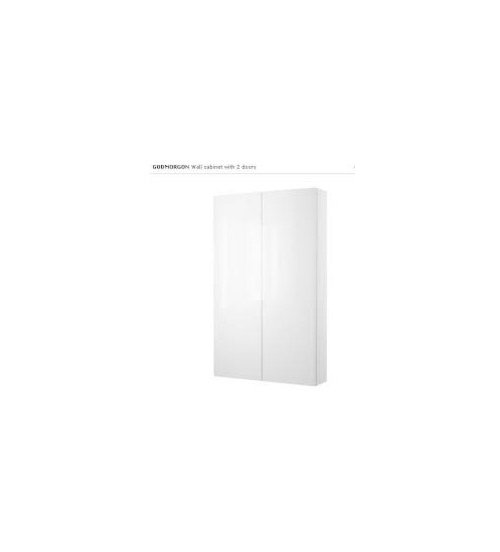
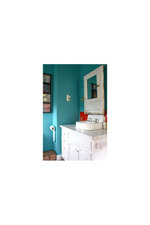
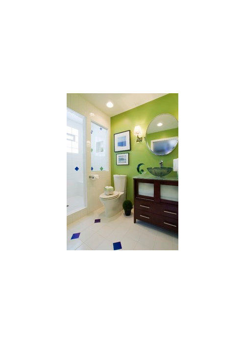
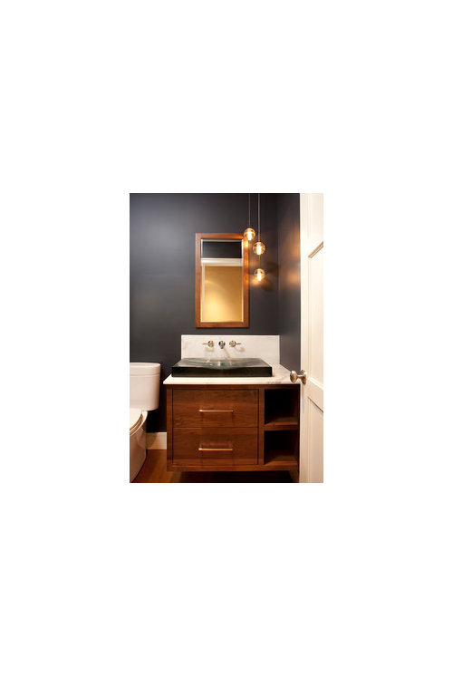
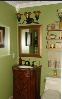
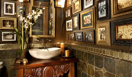
How dark is too dark? Powder
robo (z6a)
10 years ago

Featured Answer
Sort by:Oldest
Comments (26)

sas95
10 years ago
robo (z6a)
10 years agoRelated Professionals
Aspen Hill Interior Designers & Decorators · Nashville Interior Designers & Decorators · Kearny Furniture & Accessories · Duluth Furniture & Accessories · Aliso Viejo Furniture & Accessories · Carlsbad Furniture & Accessories · Clark Furniture & Accessories · Fillmore Furniture & Accessories · New Bedford Custom Artists · Florida City Lighting · Kendall Lighting · Spring Lighting · Tukwila Lighting · Clinton Window Treatments · Seattle Window Treatments
TxMarti
10 years agovioletwest
10 years agosas95
10 years ago
kitschykitch
10 years agojoaniepoanie
10 years agorobo (z6a)
10 years ago
williamsem
10 years agorobo (z6a)
10 years ago
romy718
10 years agoppbenn
10 years agorobo (z6a)
10 years agonosoccermom
10 years agorobo (z6a)
9 years agoedeevee
9 years agofishymom
9 years ago
Annie Deighnaugh
9 years ago
Bunny
9 years agofishymom
9 years agomadeyna
9 years agorobo (z6a)
6 years ago
Related Stories
COLOR9 Dark Wall Colors to Suit Your Mood
Tired of light and airy? Try dark and moody for a change; you may be surprised by the moods these colors inspire
Full Story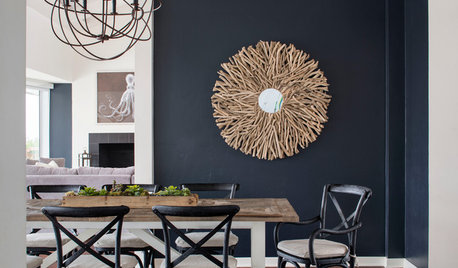
DECORATING GUIDESWhat Goes With Dark Walls?
Bring out the beauty of dark blue, charcoal and black walls with these decorative matchups
Full Story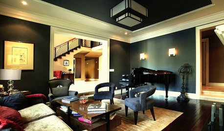
DECORATING GUIDES9 Ways to Use Rich, Dark Paint
See how deep colors — navy blue, charcoal, dark chocolate — can bring out your home's best details
Full Story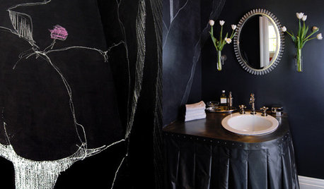
BATHROOM DESIGNChic and Moody: Dark, Seductive Bathrooms
10 Brooding Bathroom Styles to Fall For
Full Story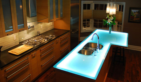
FUN HOUZZThe Case for a Glow-in-the-Dark Home
These fanciful, fun and functional ideas will have you lighting up your home in new and unexpected ways ... and not just at Christmastime
Full Story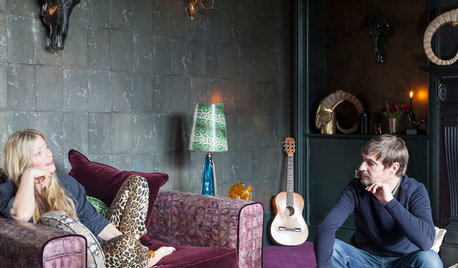
HOUZZ TOURSMy Houzz: A Creative Home Bursting With Dark Colors
Animal skulls, snakeskin wallpaper and black candles: This creative couple’s home celebrates an extravagant mix of color and texture
Full Story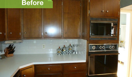
KITCHEN DESIGN3 Dark Kitchens, 6 Affordable Updates
Color advice: Three Houzzers get budget-friendly ideas to spruce up their kitchens with new paint, backsplashes and countertops
Full Story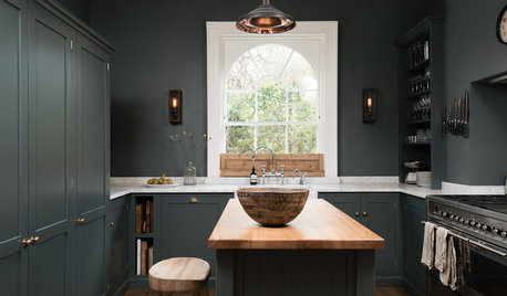
KITCHEN OF THE WEEKDark Gray Sophistication in a Shaker-Style Kitchen
Rich paint used throughout this compact London space helps create a kitchen that’s contemporary and inviting
Full Story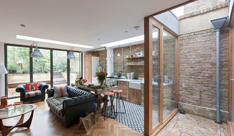
ECLECTIC HOMESHouzz Tour: Light Streams Into a Once-Dark London Flat
This ground-floor apartment’s layout was reconfigured in an innovative and airy transformation
Full Story


robo (z6a)Original Author