Anyone have a Martha Stewart - Sherwin Williams color you love?
kathec
14 years ago
Related Stories
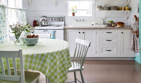
KITCHEN DESIGNThe Cure for Houzz Envy: Kitchen Touches Anyone Can Do
Take your kitchen up a notch even if it will never reach top-of-the-line, with these cheap and easy decorating ideas
Full Story
MOST POPULAR50 Shades of Gray
Gray is hotter than ever, thanks to a hit novel full of risks and dark secrets. Tell us: Which paint shade possesses you?
Full Story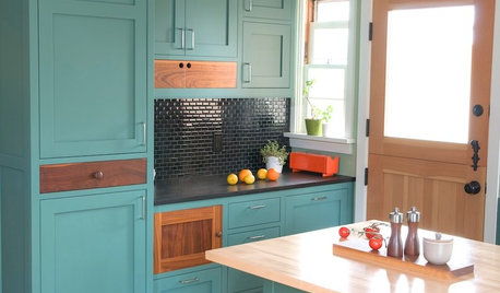
KITCHEN CABINETSKitchen Cabinet Color: Should You Paint or Stain?
Learn about durability, looks, cost and more for wooden cabinet finishes to make the right choice for your kitchen
Full Story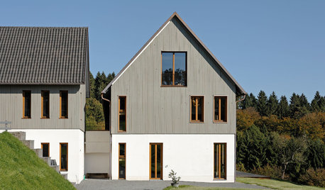
EXTERIOR COLORExterior Color of the Week: 7 Ways With Warm Gray
See why this hue can be the perfect neutral for any house
Full Story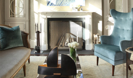
LIVING ROOMSRoom of the Day: High Eclectic Style in a Luxe Sitting Room
Rich textures and contemporary art make this swank sitting room both restful and invigorating
Full Story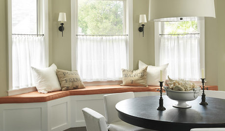
DECORATING GUIDESThe Case for In-Between Colors
These mutable hues defy easy description, but their appeal all around the home isn't hard to get
Full Story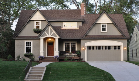
Houzz Call: Show Us Your Paint Makeovers
Let your newly repainted house or room do the "How d'ya like me now?" strut right here — it might just be featured in an upcoming ideabook
Full Story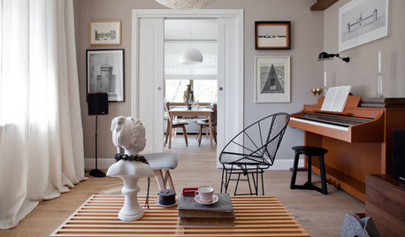
DECORATING GUIDESColor of the Week: Decorating With Warm Gray
Tired of tan? Getting gloomy from cool gray? Make warm gray your new go-to neutral
Full Story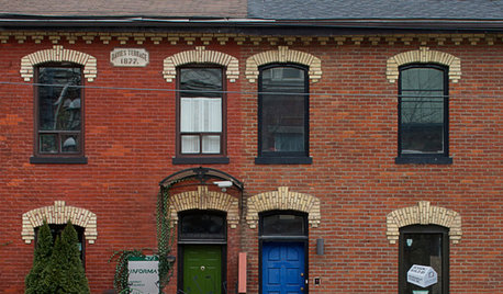
FRONT DOOR COLORSFront and Center Color: When to Paint Your Door Blue
Who knew having the blues could be so fun? These 8 exterior color palettes celebrate sunny-day skies to electric nights
Full Story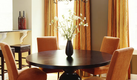
GRAYGoing Greige: Tips for Choosing This All-Around Neutral
Here are some ways to highlight and complement your home with this elegant hybrid of gray and beige
Full StoryMore Discussions



ttodd
tomorrowisanotherday
Related Professionals
Washington Interior Designers & Decorators · North Bergen Furniture & Accessories · Savannah Furniture & Accessories · Washington Furniture & Accessories · Wichita Furniture & Accessories · Chaska Furniture & Accessories · Millburn Furniture & Accessories · Park Ridge Furniture & Accessories · North Bellmore Furniture & Accessories · Los Gatos Custom Artists · Decatur Lighting · Wells Branch Lighting · Westmont Lighting · Mount Pleasant Window Treatments · Sun Lakes Window Treatmentstomorrowisanotherday
sue36
bungalow_house
scanmike
kathecOriginal Author
epiccycle
kathecOriginal Author
jrkp
HU-678870721