


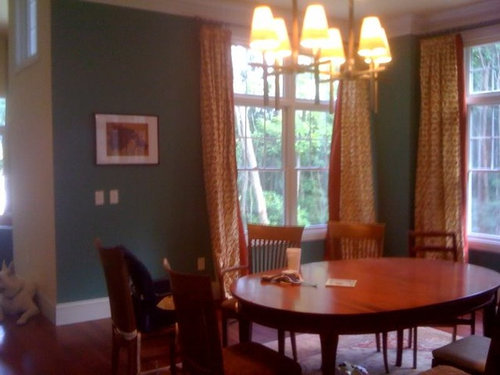
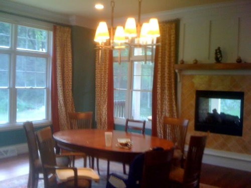
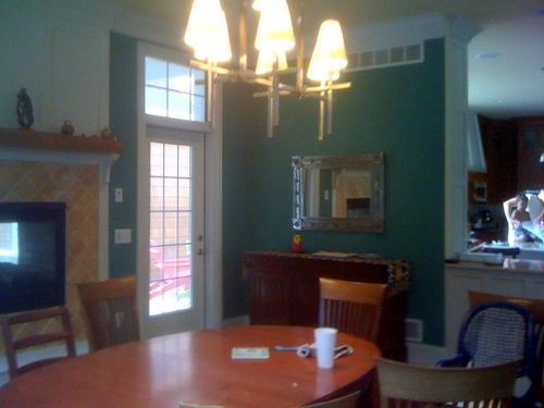
Afraid to ask...What should I do with my dining room?
gobruno
13 years ago
Sort by:Oldest
Comments (35)
Related Stories
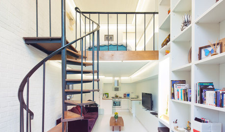
REMODELING GUIDESAsk an Architect: How Can I Carve Out a New Room Without Adding On?
When it comes to creating extra room, a mezzanine or loft level can be your best friend
Full Story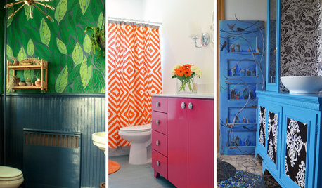
COLOR19 Bathrooms That Aren’t Afraid of Color
Bold hues and pretty patterns add a splash of fun to these personalized homes
Full Story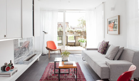
DECORATING GUIDESAsk an Expert: How to Decorate a Long, Narrow Room
Distract attention away from an awkward room shape and create a pleasing design using these pro tips
Full Story
MOST POPULAR8 Questions to Ask Yourself Before Meeting With Your Designer
Thinking in advance about how you use your space will get your first design consultation off to its best start
Full Story
REMODELING GUIDESSurvive Your Home Remodel: 11 Must-Ask Questions
Plan ahead to keep minor hassles from turning into major headaches during an extensive renovation
Full Story
WORKING WITH PROS12 Questions Your Interior Designer Should Ask You
The best decorators aren’t dictators — and they’re not mind readers either. To understand your tastes, they need this essential info
Full Story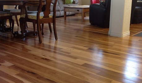
MATERIALSWhat to Ask Before Choosing a Hardwood Floor
We give you the details on cost, installation, wood varieties and more to help you pick the right hardwood flooring
Full Story
SELLING YOUR HOUSEFix It or Not? What to Know When Prepping Your Home for Sale
Find out whether a repair is worth making before you put your house on the market
Full Story
GREEN BUILDINGConsidering Concrete Floors? 3 Green-Minded Questions to Ask
Learn what’s in your concrete and about sustainability to make a healthy choice for your home and the earth
Full StoryDECORATING GUIDESAsk an Expert: How to Decorate a Small Spare Room
It can be difficult to know what to do with that tiny extra room. These design pros offer suggestions
Full Story


DLM2000-GW
lavender_lass
Related Professionals
Lake Elsinore Interior Designers & Decorators · Shorewood Interior Designers & Decorators · Atlanta Furniture & Accessories · Evanston Furniture & Accessories · Kirkland Furniture & Accessories · Fillmore Furniture & Accessories · Little Chute Furniture & Accessories · Murray Furniture & Accessories · Vail Furniture & Accessories · Riverton Furniture & Accessories · New Bedford Custom Artists · Bellwood Custom Artists · Hunters Creek Lighting · La Jolla Lighting · Walker LightingUser
powermuffin
gwbr54
always1stepbehind
juliekcmo
nicole__
jlj48
dianalo
htnspz
les917
mom2sethc
andee_gw
paintergirl94
sandra_zone6
kjmama
gobrunoOriginal Author
sandra_zone6
gobrunoOriginal Author
Oakley
sandra_zone6
cooperbailey
gobrunoOriginal Author
Penelope
Oakley
teacats
gobrunoOriginal Author
loribee
les917
dianalo
jjam
gobrunoOriginal Author
jendoeshair
ingrid_vc so. CA zone 9