


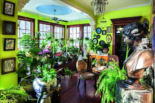
Hunt Slonem's Style
User
9 years ago


Sort by:Oldest
Comments (24)
Related Stories

ARCHITECTUREHouse-Hunting Help: If You Could Pick Your Home Style ...
Love an open layout? Steer clear of Victorians. Hate stairs? Sidle up to a ranch. Whatever home you're looking for, this guide can help
Full Story
HOUZZ TOURSMy Houzz: Treasure Hunting Pays Off in Maryland
Artfully layered accessories and patterns plus an eclectic furniture mix make for intriguing decor with vintage flair
Full Story
EVENTSTreasure Hunting at Texas' First Monday Trade Days
Check out some of the antiques, art and collectibles on offer at one of the largest flea markets in the U.S.
Full Story
EVENTSTreasure Hunting at the Brimfield Antiques Fair
More than 5,000 antiques dealers are selling their goods along a 1-mile stretch of rural New England this week. Here's what we found
Full Story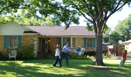
MOVINGHouse Hunting: Find Your Just-Right Size Home
Learn the reasons to go bigger or smaller and how to decide how much space you’ll really need in your next home
Full Story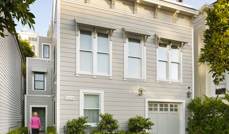
LIFE12 House-Hunting Tips to Help You Make the Right Choice
Stay organized and focused on your quest for a new home, to make the search easier and avoid surprises later
Full Story
LIGHTINGHouse Hunting? Look Carefully at the Light
Consider windows, skylights and the sun in any potential home, lest you end up facing down the dark
Full Story
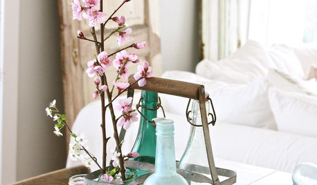
BUDGET DECORATINGBudget Decorator: 12 Vintage Finds to Take Home This Spring
Experience the thrill of the hunt and the triumph of a bargain when you set out on a thrifting jaunt with these finds in mind
Full Story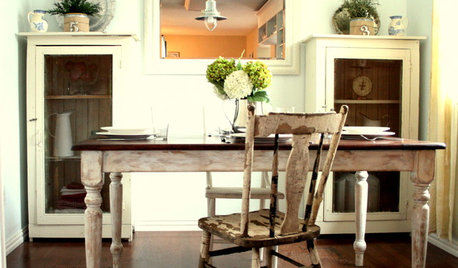
HOUZZ TOURSHouzz Tour: Making 'Normal' Beautiful for Less
Ingenuity, elbow grease and bargain hunting result in a light and lovely beach cottage style
Full Story


kitchendetective
Fun2BHere
Related Professionals
Boise Interior Designers & Decorators · View Park-Windsor Hills Interior Designers & Decorators · Beaufort Furniture & Accessories · Medford Furniture & Accessories · St. Louis Furniture & Accessories · Davidson Furniture & Accessories · Little Chute Furniture & Accessories · Carson Furniture & Accessories · Kingsburg Furniture & Accessories · New Bedford Custom Artists · Saratoga Custom Artists · West University Place Lighting · Batavia Lighting · Venice Lighting · South Yarmouth Window TreatmentsAnnie Deighnaugh
jmc01
emmarene9
kitchendetective
awm03
UserOriginal Author
tomatofreak
palimpsest
palimpsest
jlc712
Gooster
marcolo
clax66
alex9179
runninginplace
writersblock (9b/10a)
jterrilynn
kitchendetective
clax66
schicksal
anele_gw
kitchendetective