


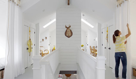
Please Critque Listing
greenthumbfish
10 years ago
Related Stories
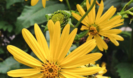
GARDENING GUIDESGreat Design Plant: Silphium Perfoliatum Pleases Wildlife
Cup plant provides structure, cover, food and water to help attract and sustain wildlife in the eastern North American garden
Full Story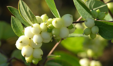
GARDENING GUIDESGreat Design Plant: Snowberry Pleases Year-Round
Bright spring foliage, pretty summer flowers, white berries in winter ... Symphoricarpos albus is a sight to behold in every season
Full Story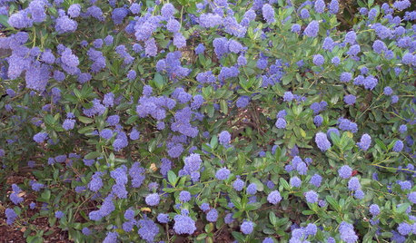
GARDENING GUIDESGreat Design Plant: Ceanothus Pleases With Nectar and Fragrant Blooms
West Coast natives: The blue flowers of drought-tolerant ceanothus draw the eye and help support local wildlife too
Full Story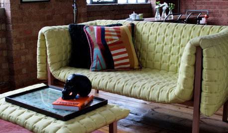
DECORATING GUIDESPlease Touch: Texture Makes Rooms Spring to Life
Great design stimulates all the senses, including touch. Check out these great uses of texture, then let your fingers do the walking
Full Story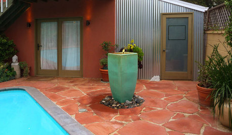
BEFORE AND AFTERSMore Room, Please: 5 Spectacularly Converted Garages
Design — and the desire for more space — turns humble garages into gracious living rooms
Full Story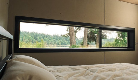
ARCHITECTUREDesign Workshop: Just a Sliver (of Window), Please
Set the right mood, focus a view or highlight architecture with long, narrow windows sited just so on a wall
Full Story
HOUSEPLANTSMother-in-Law's Tongue: Surprisingly Easy to Please
This low-maintenance, high-impact houseplant fits in with any design and can clear the air, too
Full Story
SHOP HOUZZShop Houzz: Last-Minute Gifts Under $100
The best crowd-pleasing gifts guaranteed to arrive in time for Christmas
Full Story0
DECORATING GUIDESColor Guide: How to Work With Bright White
There's a reason clean, crisp white is the eternal standard for walls. See how it can take your rooms from pallid to pleasing
Full Story
SHOP HOUZZShop Houzz: Gifts for Book Lovers
Give the bookworms on your list creative bookends, coffee table tomes and comfy reading nook essentials
Full Story


justgotabme
maddielee
Related Professionals
Lake Elsinore Interior Designers & Decorators · Washington Interior Designers & Decorators · Boston Furniture & Accessories · Charleston Furniture & Accessories · Franklin Furniture & Accessories · Indianapolis Furniture & Accessories · Minneapolis Furniture & Accessories · Rock Hill Furniture & Accessories · Urbandale Furniture & Accessories · New Bedford Custom Artists · West University Place Lighting · Pearland Lighting · Walnut Creek Lighting · Boston Window Treatments · Littleton Window Treatmentsbpath
Chadoe3
andee_gw
justgotabme
graywings123
mjlb
WalnutCreek Zone 7b/8a
ineffablespace
lascatx
yayagal
Happyladi
live_wire_oak
sable_ca
Bunny
Olychick
deegw
Annie Deighnaugh
TxMarti
Gooster
Happyladi
TxMarti
peegee
greenthumbfishOriginal Author
pammyfay
erinsean
nosoccermom
greenthumbfishOriginal Author
kellienoelle