


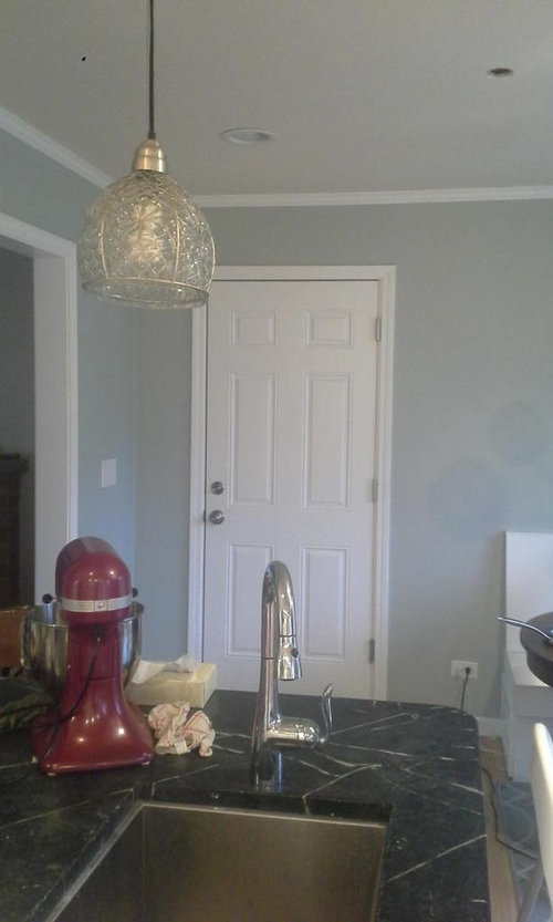
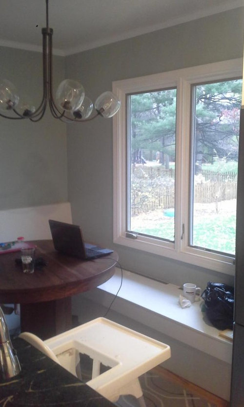
Need help with my kitchen color scheme
cplover
9 years ago
Sort by:Oldest
Comments (20)
Related Stories

SELLING YOUR HOUSE10 Tricks to Help Your Bathroom Sell Your House
As with the kitchen, the bathroom is always a high priority for home buyers. Here’s how to showcase your bathroom so it looks its best
Full Story
KITCHEN DESIGNPalatable Palettes: 8 Great Kitchen Color Schemes
Warm and appetizing or cool and relaxing? These 8 paint palettes can help you choose the best colors for your kitchen
Full Story
LIFEDecluttering — How to Get the Help You Need
Don't worry if you can't shed stuff and organize alone; help is at your disposal
Full Story
SELLING YOUR HOUSE5 Savvy Fixes to Help Your Home Sell
Get the maximum return on your spruce-up dollars by putting your money in the areas buyers care most about
Full Story
COLORPick-a-Paint Help: How to Create a Whole-House Color Palette
Don't be daunted. With these strategies, building a cohesive palette for your entire home is less difficult than it seems
Full Story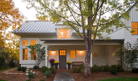
SELLING YOUR HOUSEHelp for Selling Your Home Faster — and Maybe for More
Prep your home properly before you put it on the market. Learn what tasks are worth the money and the best pros for the jobs
Full Story
REMODELING GUIDESWisdom to Help Your Relationship Survive a Remodel
Spend less time patching up partnerships and more time spackling and sanding with this insight from a Houzz remodeling survey
Full Story
ENTRYWAYSHelp! What Color Should I Paint My Front Door?
We come to the rescue of three Houzzers, offering color palette options for the front door, trim and siding
Full Story
COLORColor Palette Extravaganza: Room-by-Room Help for Your Paint Picks
Take the guesswork out of choosing paint colors with these conveniently collected links to well-considered interior palettes
Full Story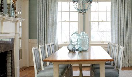
REMODELING GUIDESRoom of the Day: Antiques Help a Dining Room Grow Up
Artfully distressed pieces and elegant colors take a formerly child-focused space into sophisticated territory
Full StoryMore Discussions


bestyears
cploverOriginal Author
Related Professionals
Caledonia Interior Designers & Decorators · Ashwaubenon Interior Designers & Decorators · Bel Air North Interior Designers & Decorators · Mount Sinai Interior Designers & Decorators · Lake Zurich Furniture & Accessories · Fort Carson Furniture & Accessories · Greenwood Village Furniture & Accessories · Zionsville Furniture & Accessories · Arlington Custom Artists · Lawrence Lighting · Spring Lighting · Aurora Window Treatments · El Mirage Window Treatments · Placerville Window Treatments · South Yarmouth Window TreatmentscploverOriginal Author
Sueb20
Sueb20
cploverOriginal Author
bestyears
cploverOriginal Author
vwhippiechick
bestyears
cploverOriginal Author
Skypathway1
cploverOriginal Author
cploverOriginal Author
raee_gw zone 5b-6a Ohio
missymoo12
cploverOriginal Author
ccornish72
cploverOriginal Author
cploverOriginal Author