


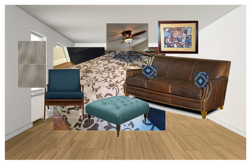
Family Room - take 189
kellienoelle
10 years ago
Sort by:Oldest
Comments (64)
Related Stories
PRODUCT PICKSGuest Picks: A Fresh Take on the Modern Family Room
Kid-friendly furnishings, shots of color, playful patterns and warm wood tones make for one hip space
Full Story
KITCHEN DESIGNKitchen of the Week: A Seattle Family Kitchen Takes Center Stage
A major home renovation allows a couple to create an open and user-friendly kitchen that sits in the middle of everything
Full Story
MIDCENTURY HOMESRoom of the Day: A Fresh Take on a Rare Eichler in San Francisco
The midcentury modern home gets a makeover that retains its classic features while incorporating a contemporary minimalist feel
Full Story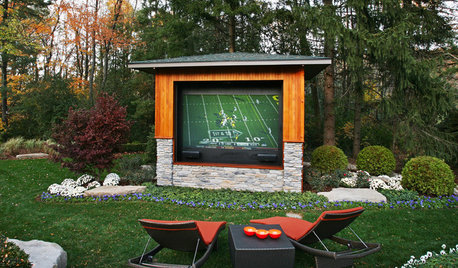
GARDENING AND LANDSCAPINGDouble Take: This Outdoor Screen Makes Game Day a Snap
A Michigan family goes long and wide on their backyard party central with a supersize screen, fire pits and lounging for a crowd
Full Story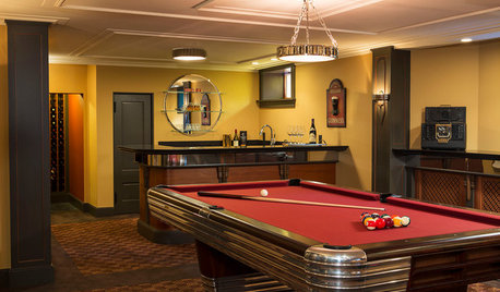
GREAT HOME PROJECTSTake Your Cue: Planning a Pool Table Room
Table dimensions, clearances, room size and lighting are some of the things to consider when buying and installing a pool table
Full Story
DECORATING GUIDESLove Your Living Room: How to Take Advantage of a Big Space
Go from cavernous to cozy in your living room with defined areas, warm colors and lighting that's up to the task
Full Story
LIVING ROOMS15 Decorating Moves to Take Your Living Room to the Next Level
These tricks with furniture, lighting, color and accessories go a long way toward making a space fashionable and comfortable
Full Story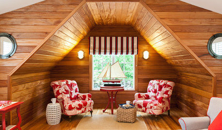
COASTAL STYLEFresh Take: 9 Twists on Nautical Style
Strip down a themed room for a crisp, classic shipshape look
Full Story
INSIDE HOUZZHouzz Prizewinners Take Their Kitchen From ‘Atrocious’ to ‘Wow’
A North Carolina family gets the kitchen they always wanted — and not a minute too soon — courtesy of the Houzz sweepstakes
Full Story
HOUZZ TOURSHouzz Tour: A Brooklyn Townhouse Takes a Warm, Contemporary Turn
Softening a traditional boxy shape creates better access and a more interesting look for a Brooklyn family home
Full StoryMore Discussions


kellienoelleOriginal Author
kellienoelleOriginal Author
Related Professionals
Beaufort Furniture & Accessories · Dallas Furniture & Accessories · Hilton Head Island Furniture & Accessories · Indianapolis Furniture & Accessories · Phoenix Furniture & Accessories · Potomac Furniture & Accessories · Skokie Furniture & Accessories · Annandale Furniture & Accessories · Detroit Furniture & Accessories · Robbinsdale Furniture & Accessories · New Bedford Custom Artists · Baldwin Park Lighting · Hanover Park Window Treatments · Rockford Window Treatments · Stony Brook Window TreatmentsHolly- Kay
kellienoelleOriginal Author
kellienoelleOriginal Author
User
kellienoelleOriginal Author
kellienoelleOriginal Author
Faux68
Holly- Kay
User
kellienoelleOriginal Author
kellienoelleOriginal Author
Faux68
User
User
geokid
vinilismo
kellienoelleOriginal Author
sjhockeyfan325
kellienoelleOriginal Author
Holly- Kay
User
kellienoelleOriginal Author
kellienoelleOriginal Author
romy718
User
Faux68
Faux68
romy718
User
kellienoelleOriginal Author
kellienoelleOriginal Author
sjhockeyfan325
kellienoelleOriginal Author
User
kellienoelleOriginal Author
mlweaving_Marji
kellienoelleOriginal Author
Holly- Kay
kellienoelleOriginal Author
Holly- Kay
User
kellienoelleOriginal Author
kellienoelleOriginal Author
User
User
kellienoelleOriginal Author
kellienoelleOriginal Author
User