


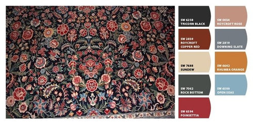
Looking for help with colors - Library
mlweaving_Marji
10 years ago

Sort by:Oldest
Comments (47)
Related Stories

COLORPick-a-Paint Help: How to Create a Whole-House Color Palette
Don't be daunted. With these strategies, building a cohesive palette for your entire home is less difficult than it seems
Full Story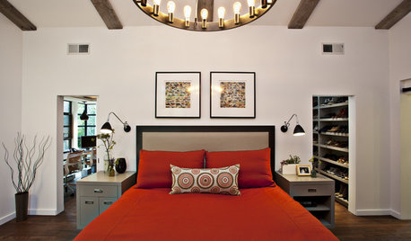
COLORColor Palette Extravaganza: Room-by-Room Help for Your Paint Picks
Take the guesswork out of choosing paint colors with these conveniently collected links to well-considered interior palettes
Full Story
COLORPick-a-Paint Help: How to Quit Procrastinating on Color Choice
If you're up to your ears in paint chips but no further to pinning down a hue, our new 3-part series is for you
Full Story
HOUZZ TOURSMy Houzz: Saturated Colors Help a 1920s Fixer-Upper Flourish
Bright paint and cheerful patterns give this Spanish-style Los Angeles home a thriving new personality
Full Story
DECORATING GUIDESLuxuriate in a Gentlemen's Club Look at Home
Rich colors, comfy furniture and cozy paneling make these masculine spaces inviting, but you can keep them as private as you please
Full Story
EXTERIORSHelp! What Color Should I Paint My House Exterior?
Real homeowners get real help in choosing paint palettes. Bonus: 3 tips for everyone on picking exterior colors
Full Story
ENTRYWAYSHelp! What Color Should I Paint My Front Door?
We come to the rescue of three Houzzers, offering color palette options for the front door, trim and siding
Full Story
COLORPick-a-Paint Help: 11 Ways to Mine Your World for Colors
Color, color everywhere. Discover the paint palettes that are there for the taking in nature, shops and anywhere else you roam
Full Story
DECORATING GUIDESDownsizing Help: Color and Scale Ideas for Comfy Compact Spaces
White walls and bitsy furniture aren’t your only options for tight spaces. Let’s revisit some decorating ‘rules’
Full Story
COLORPaint-Picking Help and Secrets From a Color Expert
Advice for wall and trim colors, what to always do before committing and the one paint feature you should completely ignore
Full StoryMore Discussions
Holly- Kay
nosoccermom
Related Professionals
Duluth Furniture & Accessories · Lake Zurich Furniture & Accessories · Medford Furniture & Accessories · Newnan Furniture & Accessories · Rome Furniture & Accessories · Champlin Furniture & Accessories · Nixa Furniture & Accessories · Rogers Furniture & Accessories · Seal Beach Custom Artists · Sacramento Lighting · East Setauket Window Treatments · Hanover Park Window Treatments · Salt Lake City Window Treatments · Sun Lakes Window Treatments · Taylor Window TreatmentsAnnie Deighnaugh
User
teacats
indygo
mtnrdredux_gw
mtnrdredux_gw
mlweaving_MarjiOriginal Author
mlweaving_MarjiOriginal Author
Annie Deighnaugh
Annie Deighnaugh
mlweaving_MarjiOriginal Author
mlweaving_MarjiOriginal Author
mlweaving_MarjiOriginal Author
loribee
mlweaving_MarjiOriginal Author
mlweaving_MarjiOriginal Author
mlweaving_MarjiOriginal Author
mlweaving_MarjiOriginal Author
Annie Deighnaugh
mlweaving_MarjiOriginal Author
rosie
mlweaving_MarjiOriginal Author
springroz
busybee3
gsciencechick
User
Annie Deighnaugh
mlweaving_MarjiOriginal Author
kellienoelle
User
mlweaving_MarjiOriginal Author
mlweaving_MarjiOriginal Author
mlweaving_MarjiOriginal Author
User
Vertise
Annie Deighnaugh
cyn427 (z. 7, N. VA)
busybee3
romy718
nosoccermom
loribee
mlweaving_MarjiOriginal Author
Annie Deighnaugh
mlweaving_MarjiOriginal Author
Annie Deighnaugh