


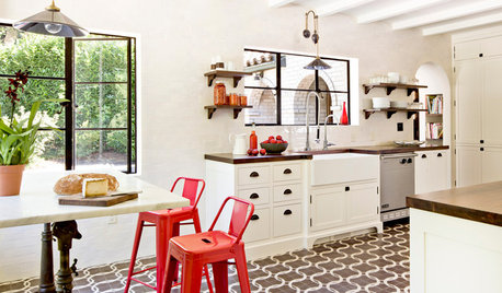
How do you know if your vision will work before you start? pics
Boopadaboo
13 years ago


Related Stories
REMODELING GUIDESWhat to Know Before You Tear Down That Wall
Great Home Projects: Opening up a room? Learn who to hire, what it’ll cost and how long it will take
Full Story
MOST POPULAR10 Things to Ask Your Contractor Before You Start Your Project
Ask these questions before signing with a contractor for better communication and fewer surprises along the way
Full Story
REMODELING GUIDESWhat to Consider Before Starting Construction
Reduce building hassles by learning how to vet general contractors and compare bids
Full Story
DECORATING GUIDES9 Planning Musts Before You Start a Makeover
Don’t buy even a single chair without measuring and mapping, and you’ll be sitting pretty when your new room is done
Full Story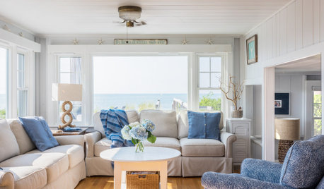
WHITEWhat to Know Before You Paint Your Walls White
A coat of white paint can do wonders in one room and wreak havoc in another. Here are tips for using the popular hue
Full Story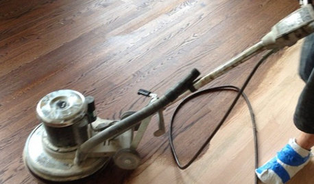
GREAT HOME PROJECTSWhat to Know Before Refinishing Your Floors
Learn costs and other important details about renewing a hardwood floor — and the one mistake you should avoid
Full Story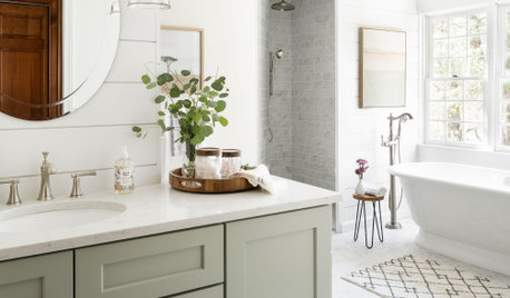
BATHROOM DESIGN14 Design Tips to Know Before Remodeling Your Bathroom
Learn a few tried and true design tricks to prevent headaches during your next bathroom project
Full Story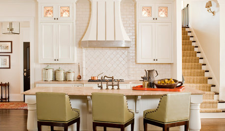
FURNITUREWhat to Know Before Buying Bar Stools
Learn about bar stool types, heights and the one key feature that will make your life a whole lot easier
Full Story
KITCHEN CABINETSChoosing New Cabinets? Here’s What to Know Before You Shop
Get the scoop on kitchen and bathroom cabinet materials and construction methods to understand your options
Full Story
DECORATING GUIDESHow to Decorate When You're Starting Out or Starting Over
No need to feel overwhelmed. Our step-by-step decorating guide can help you put together a home look you'll love
Full Story


graywings123
punamytsike
Related Professionals
Birmingham Interior Designers & Decorators · Des Moines Furniture & Accessories · Houston Furniture & Accessories · Long Beach Furniture & Accessories · Rochester Furniture & Accessories · Rockville Furniture & Accessories · St. Louis Furniture & Accessories · Alpharetta Furniture & Accessories · Annandale Furniture & Accessories · Fair Lawn Furniture & Accessories · Bethlehem Custom Artists · Hastings Custom Artists · Immokalee Custom Artists · Hialeah Gardens Lighting · Westfield Window TreatmentsBoopadabooOriginal Author
juliekcmo
deeinohio
teacats
lazy_gardens
BoopadabooOriginal Author
forhgtv
juliekcmo
BoopadabooOriginal Author
punamytsike
rmkitchen
annzgw
BoopadabooOriginal Author
BoopadabooOriginal Author
ingrid_vc so. CA zone 9
forhgtv
User
dianalo
pammyfay
BoopadabooOriginal Author
annzgw
jey_l
BoopadabooOriginal Author
Valerie Noronha
punamytsike
BoopadabooOriginal Author
BoopadabooOriginal Author
Jamie
BoopadabooOriginal Author
Jamie
dianalo
annzgw
BoopadabooOriginal Author
work_in_progress_08
chijim
peaches12345
punamytsike
BoopadabooOriginal Author
peaches12345
BoopadabooOriginal Author
BoopadabooOriginal Author