


Paint samples, round one
domino123
10 years ago
Sort by:Oldest
Comments (9)
Related Stories
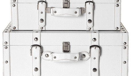
ORGANIZINGGuest Picks: Stylish Storage Box Round-up
Stash Things Away In Style with One of These 20 Storage Options
Full Story
HALLOWEENLow-Boo Halloween Decor for the Little Ones
A designer balances fright-night scares with familiar delights to cater to the smallest of trick-or-treaters
Full Story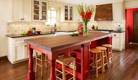
KITCHEN DESIGNSample Bright Color in the Kitchen
Spice up your kitchen with just a dash of bold hues, then you'll know if you're ready for the whole enchilada
Full StoryCOLOR10 Great Places for Rich Fall Colors Year-Round
Use nature’s burgundies, golds and oranges in these select spots for a comforting feel no matter what the season
Full Story
FURNITUREUse Wicker and Rattan for a Tropical Flavor All Year Round
Find out more about what separates — and unites — these classic materials
Full Story
COLORCelebrate Summer Year-Round With Water Colors
Swimming-pool colors bring that warm summer feeling indoors
Full Story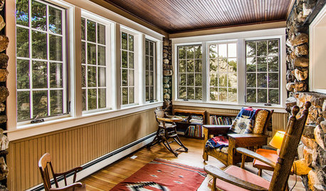
PORCHESRoom of the Day: A Colorado Porch for Year-Round Enjoyment
New windows, insulation and other upgrades turn this sun porch on a 1914 stone house into a 4-season room
Full Story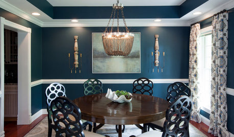
FURNITUREEclectic Matchups: 10 Round Dining Tables With Chairs
Check out these ideas for pairing round tables with complementary chairs of different styles
Full Story
10 Ways to Round Up Some Texas Style
Get a Lone Star State feel minus the clichés with cool art, hipster vinyl and pieces with history to balance the look
Full Story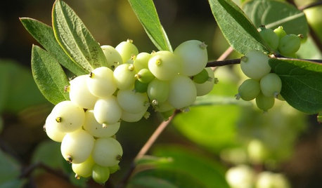
GARDENING GUIDESGreat Design Plant: Snowberry Pleases Year-Round
Bright spring foliage, pretty summer flowers, white berries in winter ... Symphoricarpos albus is a sight to behold in every season
Full StoryMore Discussions


juliekcmo
Annie Deighnaugh
Related Professionals
Mansfield Interior Designers & Decorators · Washington Interior Designers & Decorators · Indianapolis Furniture & Accessories · Long Beach Furniture & Accessories · Rochester Furniture & Accessories · Walnut Creek Furniture & Accessories · Clark Furniture & Accessories · Kansas City Furniture & Accessories · Hudson Custom Artists · Paradise Custom Artists · Southchase Custom Artists · Jefferson Valley-Yorktown Lighting · Walnut Creek Lighting · Lodi Window Treatments · Palm Beach Gardens Window TreatmentsBunny
yayagal
Holly- Kay
liriodendron
Vertise
domino123Original Author
LE