Shop Products
Houzz Logo Print
palimpsest

The unpopular guest room, Phase II.

palimpsest
11 years ago

Before I posted this guest room the first time around, I posted a few threads: "Art, how much personal resonance?" and "Why not laminate?" and something on budget rooms that have to meet certain criteria.

In the "Art" thread the most popular answer is that personal resonance trumps art by theme or by color scheme.

In the "Why not laminate?" thread, it seemed that most people would prefer a wood top even if they have to cover it to protect it.

In the one about budget rooms, one of the responses was "I would rather sleep on the floor than in a room with that furniture. (It was Louis XVI, with a laminate top, but okay)

I posted this room as a "what would you do with it", knowing that I needed to do some things to it. What surprised me was the amount of "start over" type responses.

"None of the art goes together": so much for personal resonance.

"The color is depressing" "Get a real headboard" "That's furniture for a small child's room" "old fashioned, D----" and the "What is that on the nightstand?" distraction, and others.

What I *didn't say was that I had just compiled the room in "get it done* fashion. So what I did was kind of an experiment. I wanted to see what people would say rather uncensored by the fact that it was a current work in progress. I also wanted to see if people just pay lip service to art not having to match, thinking that following trends is unimportant and "do what you love it's your house". (Not one of those comments by the way.)

My conclusion is that most of it is lip service because the biggest criticisms of the room were about the art not going and the lack of trendiness of the room. So I have to conclude that a lot of people say it because it sounds enlightened, but it's not how they feel.

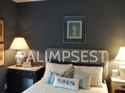
Anyway, here is the room with the art rehung, and the offending Madonna removed, as well as the (also much disliked) chair in place.

For reference, the room is for my father who is 88 and has rather strict (but unspoken) criteria for a good room.

Art: all the art has personal resonance for my father. Some of it was hung in his office, some in his house, and there will be more of this type to come.

Portrait over bed: signed numbered lithograph that hung over my sister's bed when she was small

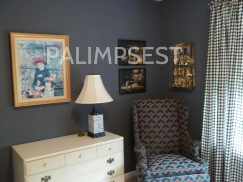
Window right: a pair of copper gold and sterling engravings of peacocks from my father's office.

Window left: Egyptology from Franklin Mint. This was not much displayed because the vitrine was so big.

Bamboo on linen midcentury modern pictures: his Aunt brought these from a tour of Asia.

Two Sisters by Renoir: one of his favorite french impressionists.

The paint color pre-existed.

Curtains and headboard fabric- a *new* offering from Country Curtains

Bedspread: Echo from Macy's He hates duvets and things that slide around

Window blind: custom from The Shade Store (most expensive non-art item in the room)

Delft lamps: from my parents' bedroom or the house.

Case pieces: Ethan Allen custom room plan. From a Master Bedroom of a couple about his age, through eBay.

Chair: eBay. Everyone hated this fabric, which I really didn't get, it's Bargello which is actually sorta trendy and it works well with the paint color. This is his putting on shoes and socks chair.

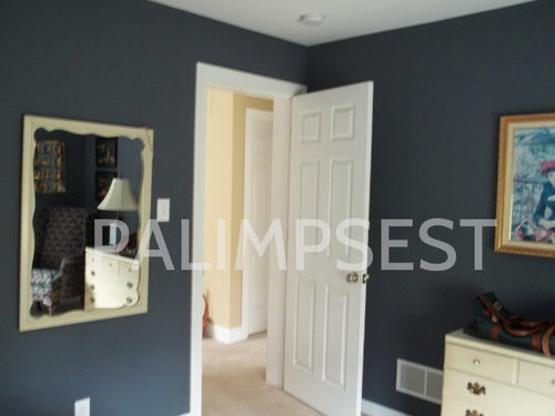
So, I rehung the mirror, which I knew needed to be done, and I juggled the art, which I knew needed to be done. Phase I was assembling it in a day so my father could sleep in it.

Now that he has a room that is "his" room he is willing to stay for a couple days.

His big criteria are that everything work perfectly, that he have a chair to put on and take off his shoes, and a specific place for things. He still needs a towel rack and he would like a bench at the bottom of the bed to put the throw pillows on and fold the bedspread completely off like he has at home. And he does not like garish things. Trendy is anathema to him. He still has cordovan shoes from 40 years ago and I coat that he is wearing in a picture where I am a toddler.

The pictures to the left of the bed are my mom, his dad coaching basketball in 1918 and a birthday card sent on the day of his birth.

It still need better lampshades on two of the lamps, too.

Here it is for good or bad:


Comments (59)

  • mtnrdredux_gw
    11 years ago
    last modified: 9 years ago

    Ahh, we could have a whole nother forum on money and families! I totally get and respect the ethic of not wasting things.

    Color is indeed contextual! Like I said in an earlier post, only the french (Hermes) could take orange out of detergent/fastfood purgatory and make us think orange is chic!

    But I am afraid I am a deeply ingrained colorphobe. Okay, I like emerald, but I don't think I've ever seen any material that captures a true emerald. Malachite, nope. Not just the color but the lurid swirls!!

    We have a very long row of daylilies on our road frontage. I really really want to take them out, because they are orange. I have taken out red tulip bulbs. ANd just today, as DH casually mentioned, "oh look the leaves are turning", I said "don't remind me, you know how much I hate it". Red, orange, and yellow? All those people coming to New England for leaf season?? Can it trade houses with someone not afflicted by this?

  • yayagal
    11 years ago
    last modified: 9 years ago

    Well I think it's a perfectly lovely room because you accomplished your goal and pleased your father. It feels cozy, yet probably still reminds him of his past with the photos and art and the travel items, I love that. There are many people who wouldn't be comfortable in a perfectly turned out room if it wasn't in their comfort zone and achieving the "comfort zone" is not an easy thing to do, especially with budget constraints. I've been in many high end rooms that I would hate to live in yet yours is one that most of us could see ourselves resting there so be happy, you did it!!!!

  • deegw
    11 years ago
    last modified: 9 years ago

    I've been mulling my response to this for quite a while. The thing that bothers me about this experiment is that the original question implied that the room was a general guest room.

    I think the responses would have been very different if you said that the room was being decorated for a very particular elderly man.

    Still enjoyed the experiment even though some key information was omitted.

  • User
    11 years ago
    last modified: 9 years ago

    I would take down the print of the two sisters because it looks very faded, regardless of the room's occupants. The rest of the artwork and room look fine for a general guest room. If it is specifically for your 88 year old father, I would change everything on the walls--- maybe framing some large front pages from newspapers from different decades in this life? Anyway, i would absolutely change the artwork, every bit of it, even if I did not have replacements. The rest of it looks fine! A guest room needs to be clean, uncluttered and comfortable, and I think you have achieved that.

  • busybee3
    11 years ago
    last modified: 9 years ago

    the room before looked fine to me as a guestroom... but, the bed definitely looks more comfortable now with more(sleeping) pillows added! tho, my (almost 88yo)dad would not have the patience for 4 decorative bedpillows!! lol
    i would have chosen to hang the mirror over the dresser and put the 2 sis where the mirror currently is...would look better to me that way...

  • juliekcmo
    11 years ago
    last modified: 9 years ago

    I really like the room. The proportions are great. Good lighting (hard to do with the dark wall color).

    But I just can't get past that chair fabric. But as we know Pal has great taste, I will give a pass and assume the colors look much better in real life.

  • palimpsest
    Original Author
    11 years ago
    last modified: 9 years ago

    kwsl, I think you may have misunderstood the art thing. Everything in the room was something either given to him or something he bought at some point, except for the print over the bed, which my mother bought for my sister, and this is my sisters house.

    Actually the mirror started out over the dresser and the two sisters started out where the mirror is. The mirror was attached to the dresser though. I went back and forth, but the location here is functional. He can stand back and use it as a full length mirror, but over the dresser he couldn't

    This will serve as a general guest room on occasion because my dad still lives in his own house. Eventually it will be his room I guess. If someone else is staying in it, the personal photos could be put in the drawer.

    Since her kids are all out of the house the bedrooms are all essentially guest rooms, but the idea, as we do them is to make them a each room that is still somewhat specific to her daughters or son, so they will feel like they are staying in their own house, too. (Even though they were all out of the house when she moved here).

  • palimpsest
    Original Author
    11 years ago
    last modified: 9 years ago

    I didn't leave out that the room would primarily be used by an 88 year old male, just to be evasive, (not completely).

    Actually the reason that I left it out is that both "88" and "male" tend to connote a certain apathy toward decor or design in a lot of people's minds. I read a lot of threads saying "DH hasn't even noticed or DH doesn't care about___".

    My dad has lived in a designed/decorated house for almost 44 years, he notices things, and he is strictly regimented about fully making his bed, and doing everything in a specific way. If the decorative pillows on his bed at home disappeared, he would wonder why, since they've always been there, and he might actually feel like he was being patronized by somebody who was trying to simplify his life without his asking....

  • mtnrdredux_gw
    11 years ago
    last modified: 9 years ago

    You are so lucky to have him. And he is lucky to have you.

    And it sounds like your sister is lucky to have the both of you!

    My DH had no particular interest in decor, but having had to listen to me prattle on, he has gotten into it. He is now very good at it, especially issues of layout, flow, proportion. My Dad was raised in humble circumstances, and didn't look like someone much concerned with things like decor, but he loved fresh flowers in particular and lots of girly stuff, like china, figurines, fine furniture, etc

  • lyfia
    11 years ago
    last modified: 9 years ago

    I wasn't part of the original threads, but I wanted to comment here. I see no issues with the art as it is personalized and even if it was a general guest room why does it have to be all depersonalized? I guess if you are a guest you are in somebody's home and I personally like when the room is a reflection of the family I'm visiting. I'm not talking about personal family photos though, a room full of only that may make me wonder why they were all relegated to the guest room, that is unless the whole house was that way.

    I personally like the room. It is unique and has taken into account the occupant and the home owner and overall looks well put together to me. I guess the best combination of a design imo. Considering the occupants and still make it look pulled together. I wish I could accomplish this in my own home. Working with the practical stuff we need and the things we love or are sentimental along with making it a stylish room.

    I do have to agree the fabric on the chair isn't my cup of tea, but only because I don't like "pink" unless it is a hot pink/magenta. Otherwise the blue on my monitor seems to work well.

  • tinam61
    11 years ago
    last modified: 9 years ago

    Good job! I think your dad (and others) should feel very comfortable in this room. I see absolutely no reason to change the art.

    tina

  • lynxe
    11 years ago
    last modified: 9 years ago

    I don't recall commenting on previous posts on this room. Maybe I did; maybe I didn't. So I hope I'm consistent!

    Art: I think personal resonance almost always trumps its "fitting in" with the rest of a room. Sometimes, however, a piece of art seems to jar so strongly with the rest of the room's contents, that something must be done about it, e.g., we actually had a piece reframed because the original frame was silver, while everything else in the room was either gold or metallic-toned or worked with those colors.

    Sometimes, art seems not to work because of issues of size & scale, and that usually strikes me more forcefully than do issues of color and "fitting in."

    I don't recall the pieces you showed in the original thread, but the ones in this one seem perfectly fine to me. Still, if it were my room, I'd probably either hang something else over the bed or reframe: the piece seems slightly too narrow.

    "My conclusion is that most of it is lip service because the biggest criticisms of the room were about the art not going and the lack of trendiness of the room."

    Trying for trendy is so pointless. Go for what you like, or, in this case, for what the user of the room would like. I blame the need to appear trendy for all the (in my eyes) boring beige/taupe/pale/off-white/and-these-day-pale-gray walls in shelter magazines combined with too much tailored furniture and dull dull dull espresso wood finishes. I was flipping through a magazine while waiting in line at the food store last night: The Most Beautiful Rooms or Most Elegant Houses in the World or some such, and wouldn't you know it, but it seemed that 90% of the rooms were off white or beige. What a huge yawner. I wouldn't have paid $3 or $4 for that magazine, never mind the $9 or so that was probably the actual cover price.

    ( Gee, lynxe, tell us what you really think. ;) )

    But, after that not-so-mini rant, I have to say that I just cannot abide the pink in that chair. Other than that, I do like the upholstery pattern and the overall color scheme. If only that pink were a rich, bright rose or raspberry! Or even a darker, more brooding color in the red family. I simply have an aversion to certain pinks, particularly when combined with certain colors - like the blue in the chair.

    Teal and emerald green; those I love. Mauve....? Shudder. Please, only in flowers and even then, it depends. Ditto on bandaid pink.

    Still, the chair works very well with the rest of the room.

    "The pictures to the left of the bed are my mom, his dad coaching basketball in 1918 and a birthday card sent on the day of his birth."

    The birthday card is a FANTASTIC idea. I just love it! Genius....I want to copy it, for me or for someone!

  • Gracie
    11 years ago
    last modified: 9 years ago

    I'm going to agree with deee on this--I too feel somewhat "bothered" by your experiment because you held back the most important information, which changes the answers completely. I sensed a little defensiveness of the room choices in the original thread, and I came away with the feeling there was more to this than just a design exercise.

    You said the homeowner was in her late 50s and designing a room for guests, plural, so in that context, the furnishings seemed not so welcoming to guests. For an 88 year old man, it should be all about the personal and familiar. I'm sure he gets a true sense of "home" when he visits your sister. It is a very thoughtful room remodel.

  • stinky-gardener
    11 years ago
    last modified: 9 years ago

    What a beautiful, cozy, inviting room! I'd sure love to be a guest in it! (But could I remake the bed that nicely? I'm not sure!) The wall color is so tranquil, and the bedding is delightful...all those wonderful pillows, and the quilted coverlet, so soft and comfy! All the details, the lamps, the art, the curtains...create a mix that is at once masculine, and feminine. I love a room with soul and "personality." Great job.

  • lynxe
    11 years ago
    last modified: 9 years ago

    "Color is indeed contextual! Like I said in an earlier post, only the french (Hermes) could take orange out of detergent/fastfood purgatory and make us think orange is chic!"

    For some time now, I have fantastized about having a purple, red, and orange living room. Unfortunately, there is too much gold and blue in some of the things already in it, like upholstered arm chairs and the carpet. We have a guest BR with the walls painted a boring off-yellow. The floors have an orange tone to them, and there is a large oil painting, frame is gold, and with tones of purples and lavenders in it. I am seriously considering painting the walls a shade of lavender.

    If that doesn't work out, there's a short hall with an old crazy quilt hanging on one wall; it has much maroon plus reds and pinks in it and is bordered in maroon velvet. The floor's stain reads orange(ish), and a neighboring room has somewhat honey-colored walls. I could do the hall's walls in lavender. Those things in combo could indeed give me a red, purple, and orange space.

  • palimpsest
    Original Author
    11 years ago
    last modified: 9 years ago

    Finding the card was kinda accidental.

    The chair was selected using a certain kind of decision matrix. It's not something I would chose if I was putting a new chair with new upholstery in a room.

    The chair needed to have a fairly firm, high seat, and arms so he can sit down and get up pretty easily. I needed to go with the existing paint color, and something under $250 delivered or easily picked up was important. There were two that met the criteria out of a bunch that I looked at. The other was an 80s shape with 80s flamestitch, so this was the better of the choices available.

    I sometimes end up selecting things that are not perfect because they meet a particular decision making process.

    There were better chairs, there was better upholstery, but they either didn't go with the paint at all, or they were expensive. It's not unusual in this area for a wing chair with good upholstery for a used wing chair to be as expensive a new lower end upholstered chair.

    There will be other parts of this house that will also be unusual because if my father sells the vast majority of the furniture is going to end up in the rest of our houses. You are going to be seeing some schemes based around 1960s versions of colonial revival or french furniture.

  • palimpsest
    Original Author
    11 years ago
    last modified: 9 years ago

    In one of the earlier preparatory threads, when I mentioned my father at 88, there were a couple responses, that said "Oh I doubt he would care about anything then except the mattress being good and the lighting and heat being adequate.

    I said that it would be used a lot by a couple of people.

    But the room still has to work as a designed room whether it is for anybody, so I wanted some uncensored opinions, and the only way to get that is to not seem attached to it yourself. That sometimes leads to the "(It's hideous but) It's your house, do what You like" That's always reasonable advice, I was looking for something else. I also find that a bit patronizing, it's kind of like saying "We love you the way you are (despite the fact you are weird and annoying to be around)"

  • bronwynsmom
    11 years ago
    last modified: 9 years ago

    Pal, I'm with Sparklebread and the others who said if he is happy in it, you've succeeded completely.

    I think the rich wall color helps make everything from all those parts of his life come together. No comment on the Bargello chair. It's a classic pattern, but I've never liked it, which is purely a personal thing. There are all kinds of lovely things that people just don't like.

    Mntrdredux, in your case, I offer my deepest sympathy! Not liking fall colors? A horrible handicap. You should plan to spend October in Hawaii! But I am with you about daylilies of that most common shade of orange. Unless they are massed for tens of yards along a fence (a creosote brown horse pasture or a weathered gray split-rail) in the country, I can do without them, too.

  • porkandham
    11 years ago
    last modified: 9 years ago

    I remember when you originally posted pictures of this room. I'm pretty sure I responded that it looked like it would function well as a guest room and that I would remove the Renoir print. I stand by my original assessment. I don't care for reproductions of well known art, but otherwise the room is fine. The upholstery isn't my favorite, but I understand why you chose that chair. Not that my opinion matters - The only opinions that really matter in this case are your sister's and your father's. If it was my room, I'd probably return the mirror to the dresser and buy an inexpensive full length mirror to put on the back of the door or maybe on the inside of the closet door.

    Again, it looks like a comfortable room for your father (and any other guests who may use it.) I hope he will be able to enjoy it for many years to come!

  • tinam61
    11 years ago
    last modified: 9 years ago

    I'm with Mountain on the fall colors, although I do love the fall foliage! I do not like "earth tones". I do think those colors would affect my attitude if I decorated my house in those tones. I only use pink/blue/white flowers outside! I'm happy to know I'm not the only one. LOL

    tina

  • marcolo
    11 years ago
    last modified: 9 years ago

    The only thing that I would change in that room--a personal bugbear--is the different heights of the bedside lamps. But the artfully arranged pile of old books required to raise the one on the right would probably drive your dad nuts by knocking off all of his necessities.

  • palimpsest
    Original Author
    11 years ago
    last modified: 9 years ago

    The shape of the flared shades bothers me, too. I can solve the height issue with the right-sized barrel shade, which I am waiting to go on sale :)

    Bronwyn, you hit on something that I sometimes forget when I post in the forums when you commented about things that you just don't like. I think my defensiveness about some of the choices in the original thread stem from this situation. (Although it's a bit hard to not be a little defensive when someone says "get rid of everything and start over" :))

    Anyway, the people who do design for others are more objective about specific items than most of the people who do it for enjoyment in here. And I think that's natural and necessary.

    So when someone says "here is my chair fabric what works with this?", I sometimes think "ooof that hideous" or "dull as dishwater", and then file my opinion away and say. "Okay if that's what you're working with, B works better than A or C".

    So the chair (to continue the focus on that particular item) was one of my objective choices, it met the criteria and the fabric works with the color palette. I kind of couldn't get past my feeling of "So what, it's a dated fabric? it works with the wallcolor" while the pleasure-decorator can't get past the "So what, it works with the wallcolor, I hate the fabric." We are coming from two different places. (I have a potential client who wants to feature a personally enhanced and signed Thomas Kinkade--believe me, I know how to suppress my personal opinion, a lot.)

    If I had $40K to do this room instead of keeping it under $2000, I would do a complete recreation of the 1975 version of my parents' bedroom at home with grasscloth wall covering, sheared wool broadloom, heavy linen drapes with coarse tassels, a delft and pewter chandelier, with the mahogany and yew Chippendale furniture. The only thing I would rework was the 35 lb bedspread, which you could smother someone with.

  • cindyloo123
    11 years ago
    last modified: 9 years ago

    I'm certainly no decorator but for what it's worth:
    I like the chair, lol, and it works well with the two pink and blue prints. But I feel like those three pieces are from one room and the rest of it has come from at least two other rooms. The question becomes, "How do decorate around some elements that scream 80s?" I don't have the answer.

    I must be the only one that finds the pattern on the headboard and curtains totally out of place with everything else. It is screaming country at me and I don't see anything else in the room that is screaming with it. I think a stripe would have worked better.

    I am biased against dark walls, especially in a small room. But as much as I hate the darkness, sometimes a dark color has so much life that even I can appreciate it. That is not the case here. Here, I just see dark and dreary.

    I think if you go with dark walls you have to do a lot to balance them with everything else and I don't see that here. You have dark walls with a lot of dark things against them (the chair, the end table in the corner, the picture mat, the dark photos in the corner, even the curtains and headboard). I think a nice pastel color on the walls, would almost make everything else in the room work well enough if not perfectly.

    The bedding and pillows...now THAT is a lovely, well balanced design.

    I'm sorry to be so negative Pal, but it appears to me that you want honest opinions. Like I said, I have no answers and I admit I have no design skills. But I do recognize a well done room when I see it. I know you have skills, but they are not reflected in this room.

  • desertsteph
    11 years ago
    last modified: 9 years ago

    I see no problem with how you originally asked about the room.

    I don't remember if I posted before but I wouldn't be concerned with trends. My place certainly isn't 'trendy'. There are a number of things that I wouldn't have picked - for me. If I were doing the room for an elderly parent I'd do just what you did. I'd do my best to meet their needs and wants within the budget allowed.

    The chair isn't a pattern or colors I'd pick - but gee, I still have a way over 50 yrs old sofa from my MILs house and several chairs from there with fabric on them I wouldn't have picked either. I think about changing them and maybe someday I will. Haven't in 35 yr so don't anyone hold their breath on it happening.

  • cindyloo123
    11 years ago
    last modified: 9 years ago

    I just read your whole intro to this thread Pal. Now I understand the wall color and why the vent cover is painted white, etc.

    I also noticed at least one person thinks the chair looks country. It doesn't look country to me but what do I know. Whether it is country or not, I don't think the gingham compliments it at all.

    I think all of the art is fine and since it all has special meaning, it seems that is the ONE thing you really want to work around. Therefore, I submit that the key to making the room work is the wall color.

  • lazy_gardens
    11 years ago
    last modified: 9 years ago

    My objection to the chair is purely practical. There is so little contrast between it and the walls that it's hard to see.

  • User
    11 years ago
    last modified: 9 years ago

    I did misunderstand the artwork in the room, not understanding that it was his to begin with. In that case it will be nice for him to have familiar objects about him in that room.

  • palimpsest
    Original Author
    11 years ago
    last modified: 9 years ago

    I saw the disconnect between the artwork and the furniture coming before I really got started, and the particular objections to the furniture in the first thread, too. (Thus the "How much personal resonance and Why not Laminate discussions.

    My sister (who does live in a rural area) does have taste that is kind of "80s country inn". She would probably still be putting up wallpaper borders if I let her; her neighbors do.
    The art in the rest of her house runs heavily to P.Buckley Moss's Amish series, milk painted plaques, and Longaberger baskets.

    My father's taste is a bit more formalized, "real" traditional instead of "traditional" and a little bit sophisticated on some level. His library/den at home had black grasscloth wallcovering for many years.

    He liked the dark blue gray wallcolor in this room when he saw the house. The room is in my sister's house, so I tried to somehow reflect that, but my father will be using it, and I tried to reflect that. So, disconnected--without, I hope, being schizophrenic.

  • jab65
    11 years ago
    last modified: 9 years ago

    I'm late to the party and totally missed the first go-round, but I love it. The room color is beautiful, white bedspread really brightens it up, chair is Ok, or perhaps better than OK since it's sturdy and comfortable.

    But for me the best part is that it incorporates so many of your dad's memories and favorite things. As we get older we NEED things that are familiar to us so we feel grounded and content. Kudos to you!

    Guests don't have to love the artwork. They're just visiting. But your Dad does. You can take this with a grain of salt, since I have a large picture of my Mom (taken in Scotland when she was 3, and she lived to 94) in my guest room. :)

  • threeapples
    11 years ago

    I have a very strong opinion about "matching" art to a room, a sofa, a color scheme, etc., because I study art for a living. Though most often artists do not create art for specific uses unless it is an installation piece. So, ideally, the buyer purchases the art because it "speaks" to them in some way. But, there are obviously people who buy art because they want it to match, they need something of its size, etc. I personally have never done that and don't intend to. It seems so contrived and locks the art into serving only one purpose, i.e., to fill the space above a sofa, etc. I prefer the idea that art can be relocated to suit its owners changing interests, give it a more private or public exposure within a house, etc.

    I like this room because the art is not used as "decoration," but rather is included in the room for the meaning it brings to Palimpsest's father and, hopefully, future guests in this room.

  • marcolo
    11 years ago
    last modified: 9 years ago

    I don't see how someone interprets an off-white carpet, white trim, a white bedside table, a dark bedside table with a white top, white lampshades, white bedclothes, white-and-dark patterned curtains and headboard, and a white dresser as a lot of "dark" things against the paint.

    I do have vivid and grim memories of that chair fabric, so I'm not one to judge objectively there.

  • cindyloo123
    11 years ago
    last modified: 9 years ago

    Hey Marcolo, I never noticed the off white carpet, lol. Maybe a broader view of the room would give me a whole different perspective. There is simply no substitute for seeing a room in person.

    Still, the number of light colored objects in the room does not change the truth of this statement: "You have dark walls with a lot of dark things against them (the chair, the end table in the corner, the picture mat, the dark photos in the corner, even the curtains and headboard)."

    All I'm saying is that if for example the wall color and that print above the bed both stay, I would do something to break up the mat color from the wall color. Each detracts from the other. The same with the dark base on the nightstand, etc.

  • palimpsest
    Original Author
    11 years ago
    last modified: 9 years ago

    It's also a very hard room to photograph with an inexpensive camera, because the metering and the focus on the camera go a little crazy between the light coming in the window and the dark color. The room gets so much light that the window needed a blackout shade.

  • lynxe
    11 years ago
    last modified: 9 years ago

    It's interesting to me that there seems to be a bias (?) against dark rooms. For me, it would depend on a room's purpose and, related, the time of day I'd be most likely to use the room (or someone else would be using it). For example, I love the idea of a dark library. A guest BR that one would use only or mostly to sleep in: why cannot it be dark as well?

  • User
    11 years ago
    last modified: 9 years ago

    The art being "personal" doesn't bother me at all. What does bother me is the framing of that art. A more uniform approach to that will let the art be what you notice, and not the fact that it's all "different". Using a similar mat color and similar frame color for all of the art would go a long way towards minimizing the visual clutter of all of the different pieces. That's visual clutter is probably what is registering to most people when they say they don't "like" the different pieces.

  • palimpsest
    Original Author
    11 years ago
    last modified: 9 years ago

    I think the frame should suit the subject matter or style first, and then if a compatible frame or style can be found for all, fine. But the Asian stuff looks better in Asian frames and the contemporary print looks better in a contemporary frame.

    Unless you are framing a dozen botanicals and hanging them in a grid, or photos, I think uniformity is overrated. It's also starting to smack a bit of one stop shopping, to me, now that you can buy a set of matching frames complete with a template to hang them with.

    But if you want to sent a $2000 check to reframe the pieces in more compatible frames of the quality they are currently in, I will email you my framer's address, thanks :)

  • lynxe
    11 years ago
    last modified: 9 years ago

    "I think the frame should suit the subject matter or style first, and then if a compatible frame or style can be found for all, fine. But the Asian stuff looks better in Asian frames and the contemporary print looks better in a contemporary frame."

    The room I'm in now plus stairwell I can see from the desk:

    1. Ink & watercolor in front of desk is matted in beige and with ornate gold frame.

    2. On the wall to the left are 6 pieces in a group: 2 Asian things (watercolor on rice paper maybe?) with black mats and plain gold frames; 3 modernist ink & watercolor pieces all with white mats and with 1 in a silver-gold frame, 1 in a good gold frame, and 1 in a plain black frame. The grouping works because of the themes, colors, and sizes of the art itself.

    3. Two modernist portraits, works on paper, black and white (prints), each matted in off white and with modern black frames.

    4. A portrait in a Rembrandt-ish style, work on paper in black and white, modern black frame.

    5. Work on paper by a local artist of a crow, ditto on colors, mats, frame.

    6. Two framed Mercer tiles that are blue and beige and framed together, with beige mat and gold frame.

    7. A rock painted to look like a Victorian guy with muttonchops -- don't ask ;) -- in a silver shadowbox-type frame.

    8. Work on paper, modernist/contemporary of a woman who looks somewhat like a Spanish dancer, in blacks & browns with much red in the background, creamy mat and ornate brown frame.

    9. Four Japanese prints, two very old, all matted & framed the same: black mats and the same Asian-style frames that look sort of like bamboo.

    Like I said earlier, we have on occasion reframed pieces because they don't work with the rest of a room. But we also always mat & frame to suit the individual piece of art.

  • lynxe
    11 years ago
    last modified: 9 years ago

    five pieces in a group on wall to the left. I double counted one of them. I did not sleep well last night: that's my excuse!

  • awm03
    11 years ago
    last modified: 9 years ago

    "I have a very strong opinion about "matching" art to a room, a sofa, a color scheme, etc., because I study art for a living. Though most often artists do not create art for specific uses unless it is an installation piece. So, ideally, the buyer purchases the art because it "speaks" to them in some way. But, there are obviously people who buy art because they want it to match, they need something of its size, etc....It seems so contrived and locks the art into serving only one purpose, i.e., to fill the space above a sofa, etc. I prefer the idea that art can be relocated to suit its owners changing interests, give it a more private or public exposure within a house, etc."

    For years I lived in fear that a very good friend of mine, an art historian & museum curator, would sneer at my wall art because he had the very same attitude. I've decided to he]] with being intimidated by the art cognoscenti. If the 'art' fits the room, and you bought it for that specific purpose, and it's pleasant, so what?

    Think of the many rooms you've seen in interior decorating magazines & books that were decorated around a wonderful & valuable painting. Those clients had the money to also buy custom colored fabrics, carpets, or wallpaper & a talented decorator to pull it all together. They can make the space fit the art. I can't afford that. So if I find some affordable "art" that fits the space, and I like it well enough, what, really, is wrong with that? You and my friend make it sound like this indicates a lack of good taste or artistic sense, when actually using art (be it real or mass produced) that helps pulls the space together is an artistic talent in itself (interior decorating).

    Sorry for the reprimand, but I find the idea that you should only have art that speaks to you equally confining. For too long I left bare spots on the wall, waiting for that piece that spoke to me (these talking pictures -- amazing!) that I could afford. If it's pretty & it works in the room, I say use it, be happy with it, and don't feel guilty that it's merely decorative.

  • palimpsest
    Original Author
    11 years ago
    last modified: 9 years ago

    I don't think that was a sneer--I think you are carrying baggage from having a friend like that. I think you might be a bit touchy about this because some tiny part of you wonders if there is something to the opinion? It's the opinion that most people who are in the arts have, which means they are more educated about it. But it automatically gets put into "snob" category.

    The people who want everything to match are just as rigidly snobby about the personal resonance trumping coordinated or matching art in their own way.

    All of the art in this room probably started out as being decorative: the girl over the bed was in a blue bedroom, the Asian bamboo pieces were in the library when it had black wallpaper. They are old enough and have other associations now...so the personal resonance comes in later.

    But there is a very narrow scope of what is acceptable decoratively in Gardenweb. much narrower than the design world at large. That's fine, but the narrowness is often expressed by people who claim to be the opposite.

    I posted this room knowing a lot of people would dislike it and criticise it, and that's okay (there are probably people who hate it even more, but are refraining). I think rooms should be client or occupant-based first, not like it came from the latest middle of the road furniture store flyer.

  • awm03
    11 years ago
    last modified: 9 years ago

    Well, I used to have baggage from friends like that, I'll admit :) My range of friends has expanded over the years, fortunately. Few care what's on my walls, probably.

    Yes, there IS something to the opinion. Ideally, we should have meaningful art that we love. However, I can't often afford the stuff I like, and the affordable stuff doesn't appeal to me or work in my room (the interior decorating vs. art thing again). So I'll use something that fits the space & colors. I will stick with my contention that this is not so terrible as some make it out to be. Wish I had realized this earlier.

    I wasn't criticizing the art in your room. It's there for the best of reasons: Your father likes it, & it's personal. I liked the room before, and I like it now.

  • palimpsest
    Original Author
    11 years ago
    last modified: 9 years ago

    Not every piece of art or object you put in a room can be fraught with meaning. And, I don't really thing it should be. Then you would be too attached to everything.

    I bought two pieces of art recently, one at a show and one at a sidewalk sale. The one from the sidewalk sale cost $1.00. It's a French post-Impressionist seascape printed on cardboard, and a scratch in the deep blue-gray sea is inexpertly colored in with a bright green magic marker. They are hung equally prominently and the one that was $1 spoke to me because it was cheap. If it disappeared tomorrow I wouldn't be upset.

    But I think you are MUCH more locked in if you are concerned about art coordinating for the sake of coordinating. What happens if you change the wall color. What if it has personal meaning by this time? You have very little freedom if you don't let go and just hang what you like.

  • awm03
    11 years ago
    last modified: 9 years ago

    If you change the wall color, then you're not out of pocket for too much money, usually, with the interior decorator art. What if I paid $500 or more for something meaningful by a real artist (not a machine)? Then I'd REALLY be reluctant to change the room colors if they'd clash with the expensive piece. Same problem with a colored sofa, I guess.

    I used to own a go-with-anything picture. In 1988, we moved to a new house because of a transfer. We had 3 small kids, not much money, & we bought a fixer-upper and worked on it for the next 8 years. To fill wall space & add some color to a pale yellow room, I bought this "print" (ok, it was really a poster) & had it matted & framed:

    It looked fine & I liked it. Nothing more, nothing less. We moved to another house in 1996, and same thing: I needed to fill a space for a strong yellow wall. The poster worked well until I got the mirror I wanted. Poster was moved to an emerald green room to act as a place holder, and it looked fine. By now, I'd had it 11 years & was a little tired of it -- dated matting & frame for sure -- but it still looked right. Soon the poster was moved to another room, pale blue walls this time, to fill a bare spot, and again it looked fine. I was beginning to wonder if there was any wall color the poster didn't work with. After 14 years, the frame fell apart & the whole thing came crashing down. DH & 3 sons admitted they were glad because they never liked it anyway (sabotage?!). Now I have an orange room, and the art piece there (real art, signed, speaks to me & all that) is, in truth, too small. Looking at the picture of the print, I kinda wish I still had that poster. It would be perfect in the orange room :)

  • User
    11 years ago
    last modified: 9 years ago

    I get both framing the art to suit the art only, and framing it all "alike". Personally, I frame all of my art to suit the art, but it also has to suit my home as a whole and possibly go anywhere in that home. Thus it's all "Gallery Framed". And so while I might have a small hint of color in the bottom mat of a double or triple matted piece, the top mat is always going to be some shade of cream, or tan. That top mat might be fabric, or wallpaper, or just about anything really, but it's going to be some ivory/white shade. The mat is there to provide a neutral backdrop to the art, no matter which room I place it in. And all of my frames are either black or gold. I have some pieces, like my Persian tapestry and an original watercolor, in larger more ornate moldings, as it suits them, but those frames will still be black or gold. It's the same with the thin "poster" frame molding that is on some of the more contemporary pieces or an old poster of a WWII plane. They will all be black or gold and have some form of cream as the top matte as well. But, my sister has a fine arts degree and her own frame shop, so I get the family discount. I can't imagine paying full retail for framing something these days! She did a museum mount piece for a customer recently that was over 1K!

    And that's why I'd like to gently suggest that you at least measure the frames for the pieces and see if they are standard off the shelf sizes. Those are pretty easy to change out DIY, and you can always apply the kraft paper dust sheeting to the back yourself as well. I've also painted frames black when I found garage sale pieces that worked for me. I have a couple of $1 garage sale poster finds right next to an original fine art photograph, and it all works because of the gallery look. I could give a rat's behind that one might be considered "art" but not the others. It all speaks to me about form or line or color, so it's all art to me. :)

  • mtnrdredux_gw
    11 years ago
    last modified: 9 years ago

    I think if the client(s) are happy, this room is done. It is really refreshing to see a professional like Pal apply his expertise to a real world, realistic room with real world constraints. When I look at shelter mags, they always start with a salon with 12 foot ceilings and oversized windows overlooking the Seine. Wow, what a challenge.

  • palimpsest
    Original Author
    11 years ago
    last modified: 9 years ago

    I totally get the shortcomings of the various art in this room, and I totally get the matching or coordinated frame thing, too. I have done this alot for myself and for other people.

    But the copperplates are framed in teak with radiused corners. These were Not just cut on the miter saw and nailed together. And the mats are wrapped in silk, no cut bevel. At the time I am sure the frames were semi mass produced, but to do this level of framing as a one-off would be $$$.
    The bamboo and linen pieces are hand made are slighly differing sizes, less than 1/8", and that style of frame, the black with the incised "bamboo" picked out in gilt seems to have disappeared.

    The only one I would consider reframing at all would be the girl over the bed, because that is an early modernist metal frame and is quite fogged and pitted.

    But I think to take something out of a high quality custom frame to replace it with something cheap and DIY from a craft store is a complete travesty...that's just something I will never understand. I have one particular client who, after I had a series of pictures custom framed,refused to pay that kind of price for the next set of things she got framed. She wonders why the frames on these sag a bit, that the mats shift etc. and its because it was done on the cheap. I have framed a couple things myself and am probably better than average, and worse than a lot of people in these forums, but I would not subject anything more than a poster to that kind of indignity (in my hands, and that's who would do it here).

  • palimpsest
    Original Author
    11 years ago
    last modified: 9 years ago

    With its various imperfections, one of the reasons that I wanted to show this room is that I think it is very hard to tell when or where it came from, and that is something that I try to achieve (always for myself, and on occasion if another client will let me)

    I could be mistaken but if I had said "Here is a room from 1986", would anybody see anything that would make them Absolutely certain that it was Not from 1986, but from last month? Or from 1996 or from any particular time.

    I am Not saying it's timeless or classic, those are kind of rare things. But I do think it's "undatable" at least, and for certain types of rooms that's a good thing.

  • awm03
    11 years ago
    last modified: 9 years ago

    The only thing that would tip me off to the room possibly being contemporary is the white metal door knob -- but that's a stretch, admittedly.

  • rosie
    11 years ago
    last modified: 9 years ago

    That's a big part of what I like about it. Truthfully, most of the art so carefully, and happily, chosen by posters because it completes their vision I wouldn't have in my house. I really like that when you see one picture in a room you have no idea what all the others are going to be. That's actually important to me, I just realized, but--it takes all tastes...

    This is a fun experiment, Pal, and it's been enjoyable reading. I am wondering if you may have weighted the criticisms heavier than they should have been. I know I wasn't swimming alone in liking the room overall, although last time I dropped by Marcolo and I were the only ones who needed those bedside lamps evened up, i.e., balanced in some way.

    Oh, I've been sticking pins in some really nasty people over on a political forum and my husband, in the spirit, tells me now to tell you to just paint it red. He doesn't know who you are or what "it" is, but he is loyal, if that's what it is. I told him I would. :)

  • peegee
    11 years ago
    last modified: 9 years ago

    My only reaction to this room for an elderly person would be concern over the lovely but dark color, which I would wonder if it might cause some with aging eyes some difficulty, despite the generous light........But then you mentioned your Dad loves the color.