Shop Products
Houzz Logo Print
my5kiddos

How would you work with this fabirc?

pinegrove
16 years ago

I found this paisley fabric and I am highly considering it for my little girl's nursery. There are coordinating fabrics to go with it as well, thuogh this will make the biggest impact. Originally I was going to do a pink and green room with a chair rail, but this fabric has me thinking that yellow may be a pretty background for this fabric, along with other pink, green and white accents.

The current paint colors I am looking at are C2 colors: Kiwi (green), Don Ceaser (pink), and Chelsea (yellow).

Has anyone ever seen or worked with this fabric before? It seems to be readily available.

If so, what paint colors did you use? If not, by looking at this, which way would you go in terms of wall color?

Much appreciation,

Kimberly

Here is a link that might be useful: Gypsy Paisley Fabric
Comments (21)

  • squirrelheaven
    16 years ago

    It does look like a familiar fabric. Don't know the specific colors, but to me, I think a light, soft yellow would feel relaxing and extra cheerful; a light, soft pink calm and extra girly; a bright green vibrant and active. A bright pink, kind of tart :) A bright yellow -- shazamm! A soft green, kind of in the middle.

    Just some thoughts!

    I guess I like the idea of a soft yellow on the walls and some hot pink pillows or something with it :) That Compatible Cream seems to be a great soft yellow.

  • kitchendetective
    16 years ago

    I'd like a pale pink on the walls, although part of the decision has to do with how you are going to distribute the fabric. Will it be, for instance, curtains and an easy chair, in which case it will comprise a lot of area, or just a bedskirt and a couple of shams? This is such a vibrant fabric that I'd probably work up a couple of boards with varying distribution of that fabric, colors, and coordinating fabric, just to see what proportions of color and print I was going to like. That fabric looks a lot like something I used in middle school decades and decades ago; I adored it. If I were only using a touch of it, I might want green or a more intense pink on the walls. I don't know the colors you've considered (no C2 samples here), so I can't be specific.

  • pinegrove
    Original Author
    16 years ago

    Here are pictures of the actual fabric swatches and paint chips that I have.

    Just a few more details:

    The room is south facing with one large double window directly across from the entrance door.

    I plan to use white furntiure with glass pulls and knobs...either pink or green.

    If we go ahead with the chair rail and crown molding, it will be white, as is the other trim and doors.

    There are four recessed lights in this room, but accent lighting will be used as well.

    The carpet is neutral, but I am thinking of getting an area rug if I find one that would work.

    I am thinking of using the paisley fabric for the crib skirt and valance. I will likley choose the polka dots to accent these pieces, as I have a green gingham from PBK that I will use for basket liners in the room. I probably will not use the dark green fabrics. Not sure how to incorporate teh stripes, but I really like this fabric as well. I need to plan a bumper, crib skirt, valance and a few accent pillows with these fabrics. Basket liners, crib sheets and changing pad covers will come from PBK.

    For paint we can use a combination of colors with a chair rail of just do crown molding and one wall color. The swatches shown are C2 Kiwi (green), Chelsea (yellow) and Don Caesar (pink). I am not tied to these colors, I just happened to have a bunch of C2 swatches. I also have two BM fan decks I can look at...but honestly, find the vast amount of choices overwhelming.

    Any thoughts, ideas, opinions welcome:)

    Thank you,

    Kimberly

  • msrose
    16 years ago

    No matter what color you choose for the wall, it's going to be such a beautiful room with all those fabrics. I'm thinking I wouldn't go with the yellow for the walls. I don't feel like it shows up enough in the fabric, although it may be more obvious in person. The paisley is my favorite fabric, so I would definitely use it the most and the others for accents. You might want to look at some of the nurseries at Rate My Space and see if you like the looks of the green wall, pink wall, or both.

    Laurie

    Here is a link that might be useful: Rate My Space

  • mimi_2006
    16 years ago

    I think the green looks awesome with it. I liked the idea of yellow until I saw the paint samples and the green just looks perfect.

  • kitchendetective
    16 years ago

    Oh, how wonderfully your choices work together! I still like pink for the walls. I might think about one shade lighter than the Don Caesar, only because, although it's a perfect match, it may intensify once it covers the large area of the walls. Likewise with the green. The yellow is not my favorite, for the reason mentioned above, but I might like a couple of throw pillows or a small toybox, or some little bit of it thrown in. The stripes would be cool as the outer side of the bumpers. Is there room for a chaise or chair and ottoman for lullaby time or nursing, etc.? The polka dot would be adorable on a skirted chair. A kid's chair like this would be adorable, perhaps piped in that solid green:

    {{!gwi}}

  • patricianat
    16 years ago

    I think I would do a buttery yellow wall color, use this fabric, the green color fabric and the polka dot in some way, even if just to wrap picture frames or trim pillows. It will be very, very pretty.

  • limogique
    16 years ago

    I only like the pink..the green is too minty for the fabric on my monitor. Yellow..not at all. Use white below the chair railif you have one otherwise use just pink. Love the fabrics.

  • squirrelheaven
    16 years ago

    Seems pink might be the dominant color in the room, so I'd make either the yellow or the green next in proportion. If you go with yellow and pink, use the green in a smaller quantity as an accent; vice versa, if you want a pink and green room, use yellow as the accent color.

    I still like the idea of pink on a yellow backdrop, with a bit of green, but you'd need more yellow than just the bit in the paisley.

    I remember you having two boys -- is this a new baby?? :)

  • pinegrove
    Original Author
    16 years ago

    Thanks everyone:)

    Squirrelheaven- Yes, I am a mother of boys:) I actually have three boys. I lost my fourth pregnancy on Thanksgiving of last year, my fourth boy. So hard to believe that I am actually having a girl. Hey, I still owe you pictures:)...waiting on the red ginghan bedskirts for my boy's "blue" room. Also still waiting for the shutters to arrive for the house. I just painted my third son's room Seedling by C2...just need to get him into a big boy bed. I also have my backsplash scheduled to get done...you helped me with mock ups of that as well...I just posted about it over in kitchens.

    Kimberly

  • squirrelheaven
    16 years ago

    Congrats! Lots of kids, lots of fun!

    Still no shutters, that's amazing. Looking forward to seeing pics!

  • Ideefixe
    16 years ago

    I love all your swatches, but I'm not crazy about the paint choices. Fresh white seems a better choice. I'd also add a dark accent of a kind of coconut brown, either as a wood tone or a fabric trim. If you love the paisley and/or , buy enough of it so that you can keep the theme when she moves into a big girl bed.

    I like the stripes as a bed skirt, but tailored not gathered. It would make a good bulletin board as well.

  • igloochic
    16 years ago

    I think the yellow would be gorgeous.

    On the bedding, I did bedding for my friends son and used a combination of fabrics in the same tones (circus theme using some antique fabric and some new). For the bumperpad I used pokadots (polkadots?) on one side, and a print on the other so you see both when you look at the bed. I did the skirt in a simple gathered look (loose gathers verses really tight ones) and made it extra long and used stripes. I was matching this to the "big top" which was over the crib and had striped fabric hanging down the wall. I then made a quilt using my dominent red with stars fabric on one side and incorporated several different primary colored fabrics, including the dots and stripes and the inset pictures from antique pieces. The mix together would seem overpowering, but really the dots, stripes and prints looked wonderful together. I'd suggest trying something similar for your bumper pad to work in both the dots and maybe the paisley and then do stripes on the skirt (and make it long, it looks better). Then use that lovely green for welting/piping on the pad. Do a comforter with the paisley and the back with one of those fabulous soft fuzzy fabrics :) You can work the rest in. There's not a one I wouldn't use.

    Or you could do a simple railroad quilt with the cotton's and make them all fit into the quilt piece and then use the dots/stripes as mentioned above.

    How busy are you mommy? Heh heh...I'm still working on my son's bedding....he came too early to finish it (7 weeks early) and was so sick I didn't ever get back to it! By the time I get back to it he'll be grown out of the danged crib LOL

  • spanky_md
    16 years ago

    Does this help? I had to approximate your paint colors since I didn't have the original chips to scan. The first three are yours, more or less. The pale pink is someone else's suggestion and I tried a light olive that is a tint of the olive in the swatch.

    I used the swatch from the fabric site so the colors should be pretty accurate in that, at least.

    {{!gwi}}

    {{!gwi}}

    {{!gwi}}

    {{!gwi}}

    {{!gwi}}

    {{!gwi}}

  • squirrelheaven
    16 years ago

    I think the colors need to be paler, myself. I like the pale pink more than the dark and think the yellow and green would be more flattering to the fabric also. I like the soft apple green better than the first with some blue in it, too. The colors go up more intense than the swatches, too, so they might be a bit much for you at these swatches (go up one or two).

    jmo :)

  • kitchendetective
    16 years ago

    I think softer tones are called for for the walls, too, although it may be my monitor that makes the paint samples look neon.
    This site has some really cool stuff for kids' rooms. I haven't ordered from it, but I'm sorely tempted!

    Here is a link that might be useful: Scroll for pinks and greens

  • pinegrove
    Original Author
    16 years ago

    Spanky MD- thank you for the color swatches:)

    I agree with Squirrel and Kitchendetective that a softer toned wall color would be better. I know from past experience, when choosing a brighter color, it ends up repainted...lol. I do not want it to feel like day glow pink when we walk into the room.

    If I went with softer (similar toned) colors, do you think pink/green walls or a combination of two colors, possibly including yellow, would be too much with a chair rail and crown molding? Or, should I stick with one color on the walls?

    Thank you,

    Kimberly

  • kitchendetective
    16 years ago

    I think it depends upon what else you are doing with the room. How many windows are there? Will curtains be to the floor? Shades? How much of each fabric will be visible? Things like that will influence how complex you'll want your wall treatment to be. I would prefer one or two colors, though, rarely three. Restoration Hardware has its pinks on sale. I've never seen them in person, but it might be worth looking into.

  • pinegrove
    Original Author
    16 years ago

    Kitchen Detective- The link you provided has some wonderful things:)

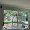
    This morning, I was thinking about the window, as it is the first thing seen upon entering the room. It is a double window. I am really not sure what to do with this window, as I do have a little shelf underneath it for storage. I love the idea of sheers, but not sure if they work with a valance, or if I would need panels for it to look right.

    Here are some current pictures of this room. This ds#3's third nursery as we have moved a lot (but are here to stay a while), so I never "finished" it with painted walls and such. He will be moving to another room...I am working on that one as well.

    From the door:

    From the window:

    The room is about 9.5 x 13 feet. The crib will remain the same. I plan to repaint the dresser and night stand white, add new hardware. The glider may or may not stay. There are no ties to it...really, it is uncomfortable. If it goes, I may center the crib on that wall, not sure yet, but I do want to move the crib from where it is, especially if it will be adorned with custom bedding:) I could also put the crib across from the window where the dresser is to balance out the fabrics.

    Any thoughts, ideas, opinions now that you have seen the room?

    Thank you,

    Kimberly

  • kitchendetective
    16 years ago

    One possibility:
    Paint walls and ceiling blush or petal pink, trim in white.
    Use a the fuschia or deep pink color in the paisley for a roller or Roman shade. Trim in lime green, pink, and yellow ball fringe. Hang floor length, lined curtains made of the paisley. If you can't find another place for the shelf now under the window, swag the curtains back. Paint the blue parts of the furniture lime green. Paint the crib white and add some polka dots to mimic the polka dot fabric. Add a skirted chair and ottoman covered in the paisley. Make the crib skirt from the stripe and the bumpers from the polka dots on the outside and the stripe on the inside. Same goes for any tenting for the crib. Use the lime green for a froufy little girl's chair with welting in pink and yellow. Hang a whimsical chandelier of white metal and pink crystals, or white with green parakeets and pink crystals. Throw in a bright green throw rug--something easily washable.

  • fabriclover
    16 years ago

    I love this fabric and this is would look great in that room. I also found another fabric that may look nicely. Please post pictures of the room when it is complete.

    Here is a link that might be useful: cool retro fabric