


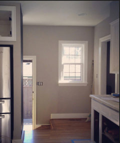
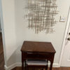
Help! Looking for the right Grey, preferably EK
jjam
9 years ago
Featured Answer
Sort by:Oldest
Comments (19)

beachlily z9a
9 years ago
tibbrix
9 years agoRelated Professionals
Aspen Hill Interior Designers & Decorators · New Providence Interior Designers & Decorators · Wanaque Interior Designers & Decorators · Charlotte Furniture & Accessories · Houston Furniture & Accessories · Mesa Furniture & Accessories · Savannah Furniture & Accessories · Eureka Furniture & Accessories · Fallbrook Furniture & Accessories · Central Falls Custom Artists · Modesto Lighting · Tampa Lighting · Lodi Window Treatments · Los Angeles Window Treatments · Bell Window Treatmentsjjam
9 years agojuliekcmo
9 years agotibbrix
9 years agoteacats
9 years agojjam
9 years ago
Holly- Kay
9 years agojjam
9 years agojterrilynn
9 years agochispa
9 years agotibbrix
9 years agoHolly- Kay
9 years agotheclose
9 years agojjam
9 years agojjam
9 years agotibbrix
9 years agotheclose
9 years ago
Related Stories

GRAYChoosing Paint: How To Pick the Right Gray
Which Version of Today's 'It' Neutral Is For You?
Full Story
GRAY8 Ways Your Bathroom Would Look Great in Gray
Gray may be a neutral, but it need not be dull
Full Story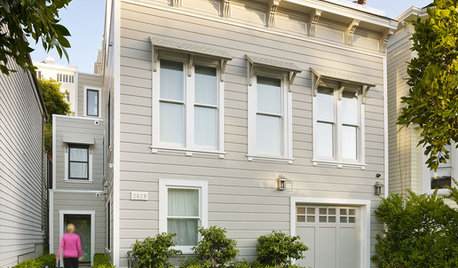
LIFE12 House-Hunting Tips to Help You Make the Right Choice
Stay organized and focused on your quest for a new home, to make the search easier and avoid surprises later
Full Story
WORKING WITH PROS5 Steps to Help You Hire the Right Contractor
Don't take chances on this all-important team member. Find the best general contractor for your remodel or new build by heeding this advice
Full Story
CURB APPEAL7 Questions to Help You Pick the Right Front-Yard Fence
Get over the hurdle of choosing a fence design by considering your needs, your home’s architecture and more
Full Story
DECORATING GUIDESSet the Right Mood With the Right Lines
Soothe with curves or go straight-up efficient. Learn the effects of lines in rooms to get the feeing you’re after
Full Story
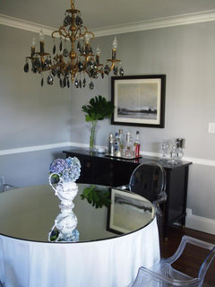
DINING ROOMSColor Feast: When to Use Gray in the Dining Room
The right shade of gray pairs nicely with whites and woods to serve up elegance and sophistication
Full Story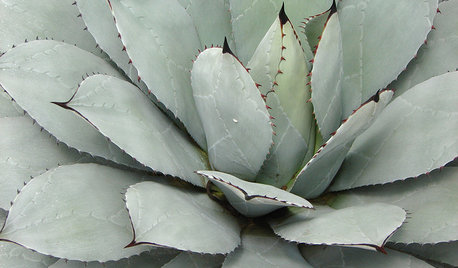
FOLIAGEGet a Cool Garden Look With Gray and Blue Plants
Looking for plants that calm with color in the heat of summer? Look no further than these 14 soothing beauties
Full Story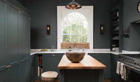
KITCHEN OF THE WEEKDark Gray Sophistication in a Shaker-Style Kitchen
Rich paint used throughout this compact London space helps create a kitchen that’s contemporary and inviting
Full Story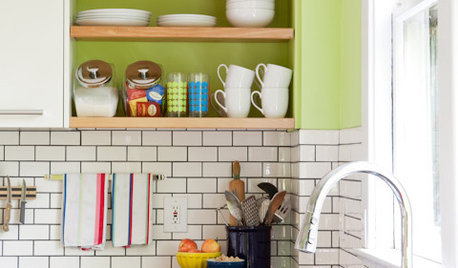
KITCHEN DESIGNSubway Tile Picks Up Gray Grout
Heading into darker territory, subway tile offers a graphic new look for kitchens, bathrooms and more
Full Story
Holly- Kay