


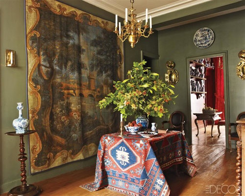
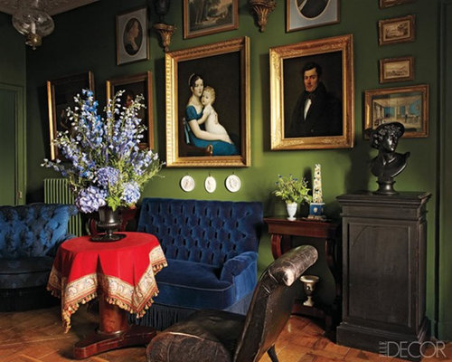
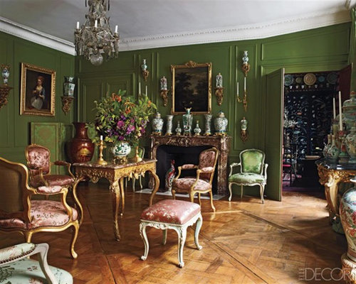
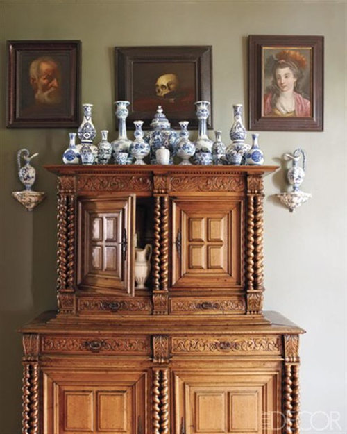
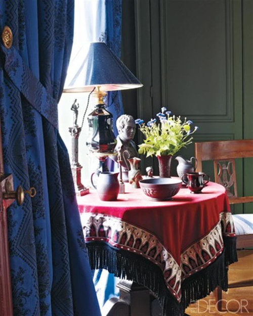
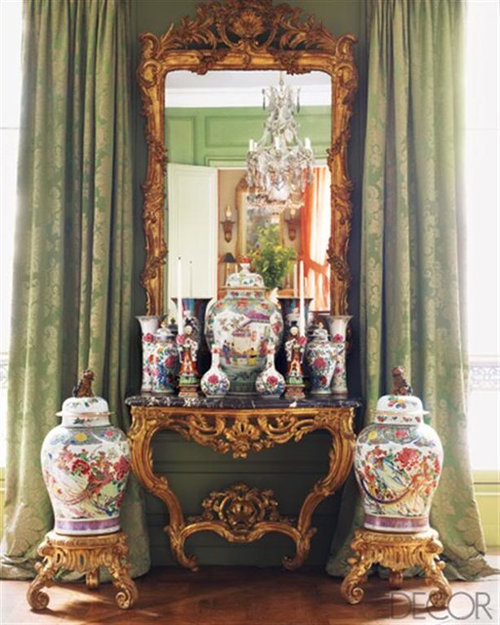
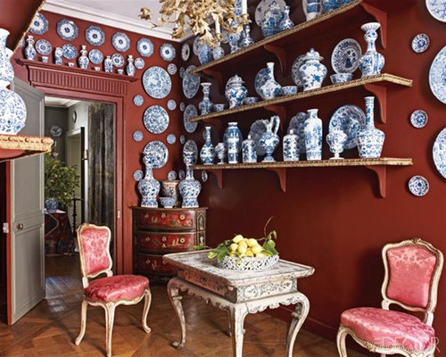
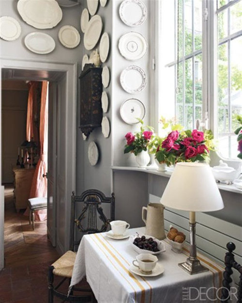
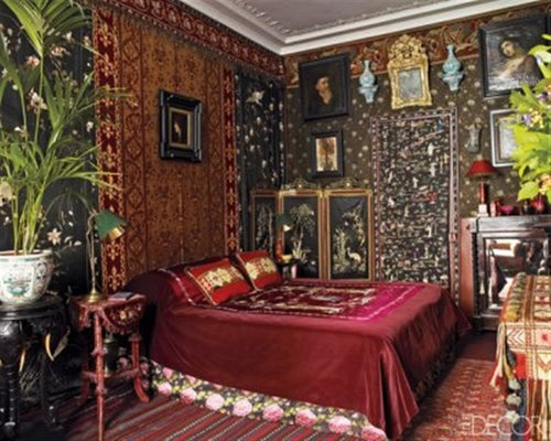
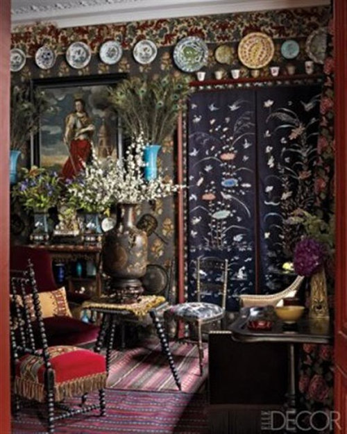
A Richly Layered Apartment
User
12 years ago
Sort by:Oldest
Comments (22)
Related Stories
DECORATING GUIDES15 Rooms Bursting With Bravely Layered Patterns
With patterns mixed to bold effect, these rooms show that to the fearless sometimes go the style spoils
Full Story
DECORATING GUIDESHouzz Tour: Layered Look Adds a Fresh Sense of Style
Midcentury art, pottery and a mix of furnishings bring a hip edge to a traditional Los Angeles home
Full Story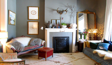
HOUZZ TOURSMy Houzz: Creative Layers Bedeck a Family's Toronto Rental
Eclectic touches, personal treasures and plenty of color harmonize beautifully for a musical couple and their kids in Canada
Full Story
HOUZZ TOURSMy Houzz: Peeling Back Layers in a 1908 Home
Hidden fireplaces, buried hardwood and covered beadboard resurface thanks to a Mississippi couple's DIY efforts
Full Story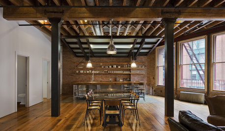
REMODELING GUIDESRegional Modern: Vibrant Layers of Old and New in NYC
Urban life mixes with history in New York's lofts, townhouses and apartments
Full Story
PLANTING IDEASDesigning With Conifers: Layers of Texture for Your Garden
Sharp and prickly or fine like ferns, richly textured conifers bring unexpected interest to the landscape
Full Story
COLORHow to Layer Tones of Gray for Depth and Harmony
Use texture, pattern, contrast and more to create a subtle, sophisticated look with this popular color
Full Story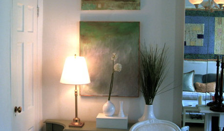
How to Layer Comfort Into Urban Spaces
Soft upholstery, rugs, window treatments and artwork add style and ease to city living
Full Story
WINDOW TREATMENTSThe Art of the Window: How to Embrace the Layered Look
Here are 12 ideas for using layered window treatments to add warmth, texture and style to your rooms
Full Story
DIY PROJECTSHigh-End Look for Less: Make a Layered Headboard for $20
No sewing and sawing means no hemming and hawing; just gather some inexpensive materials and get going
Full Story


powermuffin
RRM1
Related Professionals
Aspen Hill Interior Designers & Decorators · Garden Acres Interior Designers & Decorators · Glenbrook Interior Designers & Decorators · Manhattan Furniture & Accessories · Carlsbad Furniture & Accessories · Fillmore Furniture & Accessories · Mill Valley Furniture & Accessories · North Hollywood Furniture & Accessories · Chapel Hill Custom Artists · Hialeah Gardens Lighting · Pearland Lighting · Del City Window Treatments · East Setauket Window Treatments · East Setauket Window Treatments · Orange County Window Treatmentsrmkitchen
patty_cakes
Diane Smith at Walter E. Smithe Furniture
chispa
lynninnewmexico
ttodd
nancybee_2010
forhgtv
palimpsest
User
palimpsest
leafy02
dianalo
sombreuil_mongrel
UserOriginal Author
Boopadaboo
franksmom_2010
mtnrdredux_gw
mtnrdredux_gw
loribee