

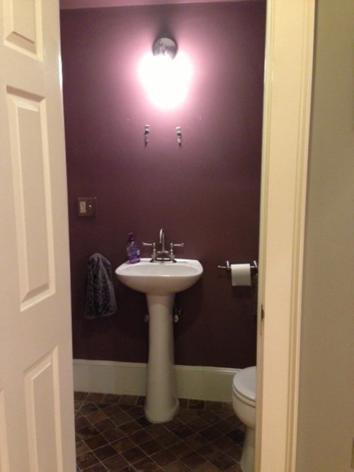
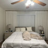
Happy with my new powder room color!
Sueb20
10 years ago
Sort by:Oldest
Comments (22)
Related Stories
CONTAINER GARDENSHappy Houseplants, Happy People
Potted plants add life and beauty to a room. Learn easy ways to keep them healthy
Full Story
BATHROOM DESIGNPowder Room Essentials to Keep Guests Happy
Set out these bathroom necessities (hello, hand towels) to make your company comfortable and your parties run smoothly
Full Story
Happy Prep for Today
Big, geometric prints and bold colors find favor with a new school of prep
Full Story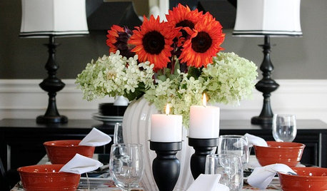
FALL AND THANKSGIVINGIt's Black and White and Fall All Over in a Holiday-Happy Home
Get inspired for budget-friendly fall decorating by a resourceful stylist's thrifty but sophisticated adornments
Full Story
COLORFUL HOMESHouzz Tour: Pattern-Happy Personality in Los Angeles
Bland design defaults didn't scare this owner; she used color, prints and quirky mixes to turn them on their head
Full Story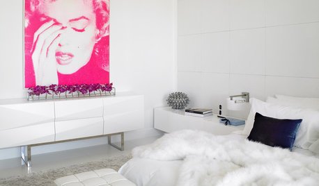
DECORATING GUIDESHappy Birthday, Marilyn Monroe
Celebrate the ever-enthralling Hollywood star with artwork, furniture and fabrics sporting her unforgettable image
Full Story
DECORATING GUIDES12 Ways Your Home Can Say Happy Derby Day
Add a dash of fresh Kentucky Derby style to your home
Full Story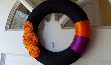
ENTERTAININGGuest Picks: Have a Happy (Classier) Halloween
Plastic pumpkins, begone! These spooky grown-up home accessories bring all of the creepiness and none of the kitsch
Full Story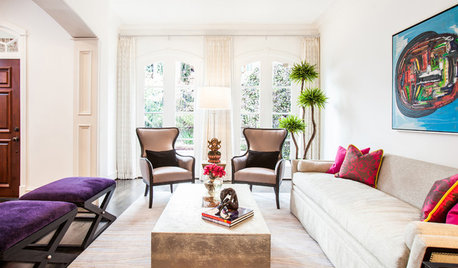
LIVING ROOMSRooms of the Day: Bringing the Happy Into Formal Spaces
Two renovated rooms inspire a lighter, more colorful look for a formerly traditional living room and dining room in Texas
Full StorySponsored
Industry Leading Interior Designers & Decorators in Franklin County
More Discussions


Sueb20Original Author
Sueb20Original Author
Related Professionals
Birmingham Interior Designers & Decorators · Columbia Furniture & Accessories · Eagan Furniture & Accessories · Rock Hill Furniture & Accessories · Topeka Furniture & Accessories · Glenvar Heights Furniture & Accessories · Miami Beach Furniture & Accessories · North Hollywood Furniture & Accessories · Richfield Furniture & Accessories · Englewood Lighting · Kendall Lighting · Palm Springs Lighting · York Lighting · Rockville Window Treatments · St. Louis Window TreatmentsSueb20Original Author
KelliC
TxMarti
User
alex9179
Sueb20Original Author
mtnrdredux_gw
MarinaGal
hhireno
busybee3
Sueb20Original Author
hilltop_gw
gsciencechick
Sueb20Original Author
jamie81
User
Sueb20Original Author
hhireno
jamie81
Pipdog