


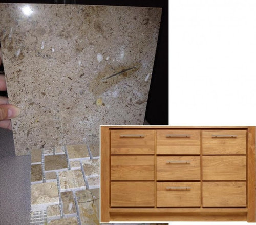
Way in over my head - HELP! - xposted to bathrooms
Swentastic Swenson
9 years ago
Related Stories

LIFEHow to Fall Head Over Heels for Your Partner Again
Bring back that loving feeling this Valentine’s Day, and you just might live happily ever after
Full Story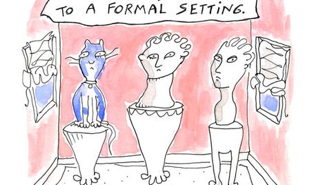
MOST POPULAR7 Ways Cats Help You Decorate
Furry felines add to our decor in so many ways. These just scratch the surface
Full Story
PETS6 Ways to Help Your Dog and Landscape Play Nicely Together
Keep your prized plantings intact and your dog happy too, with this wisdom from an expert gardener and dog guardian
Full Story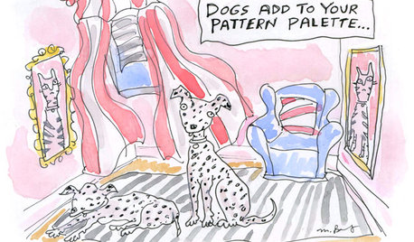
8 Ways Dogs Help You Design
Need to shake up a room, find a couch or go paperless? Here are some ideas to chew on
Full Story
COLORPick-a-Paint Help: 11 Ways to Mine Your World for Colors
Color, color everywhere. Discover the paint palettes that are there for the taking in nature, shops and anywhere else you roam
Full Story
SELLING YOUR HOUSE10 Tricks to Help Your Bathroom Sell Your House
As with the kitchen, the bathroom is always a high priority for home buyers. Here’s how to showcase your bathroom so it looks its best
Full Story
BATHROOM WORKBOOKStandard Fixture Dimensions and Measurements for a Primary Bath
Create a luxe bathroom that functions well with these key measurements and layout tips
Full Story
SMALL SPACESDownsizing Help: Storage Solutions for Small Spaces
Look under, over and inside to find places for everything you need to keep
Full Story
KITCHEN DESIGNHere's Help for Your Next Appliance Shopping Trip
It may be time to think about your appliances in a new way. These guides can help you set up your kitchen for how you like to cook
Full Story
MOST POPULAR9 Real Ways You Can Help After a House Fire
Suggestions from someone who lost her home to fire — and experienced the staggering generosity of community
Full StoryMore Discussions
Swentastic SwensonOriginal Author
nhb22
Related Professionals
San Diego Furniture & Accessories · West Palm Beach Furniture & Accessories · La Mirada Furniture & Accessories · Tucker Furniture & Accessories · Kendall Furniture & Accessories · Paradise Custom Artists · Arcadia Lighting · Batavia Lighting · Laguna Niguel Lighting · South Bend Lighting · East Bridgewater Window Treatments · La Vista Window Treatments · Oklahoma City Window Treatments · San Jose Window Treatments · Westfield Window Treatmentslazy_gardens
Swentastic SwensonOriginal Author
palimpsest
socome
Swentastic SwensonOriginal Author
Charlee_MO
socome
socome
BeverlyFLADeziner
Swentastic SwensonOriginal Author
Kiwigem
BeverlyFLADeziner
Swentastic SwensonOriginal Author
chickadee2_gw
Swentastic SwensonOriginal Author
theclose
Swentastic SwensonOriginal Author
rightdi_gw
robin_DC
Lyban zone 4
Swentastic SwensonOriginal Author
Kiwigem
Swentastic SwensonOriginal Author
socome
socome
Swentastic SwensonOriginal Author
socome
Swentastic SwensonOriginal Author
Kiwigem
Swentastic SwensonOriginal Author
Kiwigem
socome