Shop Products
Houzz Logo Print
funkyart_gw

Static Roman Shade as Valance

funkyart
11 years ago

I am batting around ideas on how to stretch 3 yards of a fabric into window treatments for 2 window banks in a breakfast nook area-- each bank has two windows that are standard width but short. I was hoping that I could make 2 blinds for each bank-- but there just isnt enough yardage for that.

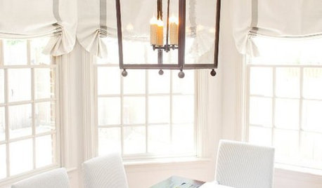
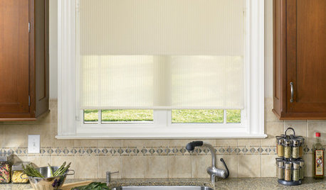
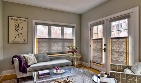
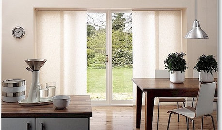
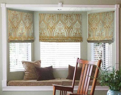
I've spent hours trying to locate the fabric-- if I could only buy more, there's be no problem. The fabric is over at the other house and I dont have a photo-- but it's "chinese bird" by Jack Valentine Designs. The print is large and a mix of bright yellow and retro blues and greens. I think it's gorgeous and I want to allow the print to show. I am also not a big fan of traditional valances.. so what I am thinking is that I'll make a roman shade style valance but make it stationary in a position about 1/3-1/2 way down the window-- much like the photo below. I'd back the shades with either a linen or a coordinating fabric.

Does this sound hokey? I don't need privacy in this location--I do want to cut the afternoon sun and add some color and softness to the room.

If this makes sense, then my next question is-- there's a door in the room that will have a blind. Is it ok to use a coordinating fabric there rather than the Chinese Bird? I am imagining either a thin stripe in the same colors or a solid linen. What about the adjoining kitchen? Would it look out of place to use a different fabric on that window? Could I use matchstick bamboo blinds under the valances and then carry them through to the door and the kitchen window?

Wish I had a photo of the Chinese Bird print-- I can add one tomorrow but for me, the print is perfect enough for this space that I want to work to find a way to use it!!

Comments (22)

  • Annie Deighnaugh
    11 years ago

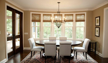
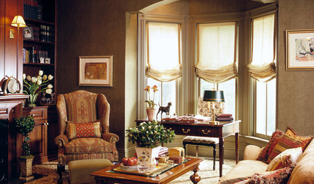
    I made faux hobbled roman shades as valances in my breakfast nook:


    and I went with a coordinating fabric in the window in the kitchen which is open to the breakfast nook.

  • funkyart
    Original Author
    11 years ago

    Does hobbled in the context of roman shades mean "static" and unusable? I love your mix of patterns, Annie-- thanks for the photo! Seeing what you've done has convinced me that coordinated fabrics will be just fine.

    I think that faux shades are definitely the direction I want to go-- the right casual look and it should showcase the pattern if I keep the folds on the bottom like the photo I shared. That will also make it more likely that I will have enough fabric. I won't be able to do the nice big folds that you have in yours.

    I have seen custom roman shades where the back fabric was visible. As I've gone through photos this afternoon, I am not seeing that. Perhaps it's the angle-- anyhow, I think using the coordinating fabric for the back of the valance will also help tie it all together.

    Now to find the second fabric! I may run over to the other house and take a photo of the fabric-- I'd love help in finding a great match!

  • patty_cakes
    11 years ago

    I like the idea of *matching* fabrics better! Too much of the same thing can sometimes look mundane~Annies's pictures proves the point! ;o)

  • graywings123
    11 years ago

    2 yards of fabric spread over 4 window sashes gives you 18' per window, and at most 16 inches with hems at top and bottom. If you add in any faux folds, it is going to come up even shorter,

    Have you tried calling Jack Valentine Designs and asking if they know where you might be able to get more fabric?

  • funkyart
    Original Author
    11 years ago

    Actually, I have 3 yards of fabric. It's still going to be tight because it is a large pattern that I'd want to be positioned just so.. but I think it is doable. It's at least worth blocking it out on the material.

    I've contacted the seller (design diva fabrics) and just this weekend got a number for JVD. I will try them next week. I am not optimistic given that I havent found ANY reference to it online. Also, it's hand printed so I am guessing it was a very short run.

    Pattycakes, I am with you. I like the dynamic of multiple patterns and since I am going for a quasi-sorta modern cottage style (which basically means all the stuff I already have with a few modern lines and colors thrown in), I think it will work well.

  • Annie Deighnaugh
    11 years ago

    Thanks for the compliments.

    Hobbled means that each fold is visible as opposed to stacked one on top of the other.

    What you might consider is getting a coordinating print to use as bands on either side of the main fabric. That way you can get more impact from the main fabric and make it go further. Then you can add straps, as I did, to cover the seams in a solid color from the print. It would be very pretty. (I made my straps from another fabric which I folded over and pressed down using stitch witchery so no stitching shows through.

    {{!gwi}}

    For example, I have no idea what your fabric looks like, but let's say it's the fish pattern...use that as the center strip for each shade centering on the important part of the pattern you want, and sew a strip of the solid blue on either side and cover the seams with the greek key trim.

    Such fun! There are so many ways to play with those options....just using a stripe for the side bands, 3 different coordinating prints...possibilities are endless and it would look so great with your cottage look you're going for.

  • Annie Deighnaugh
    11 years ago

    Of course, then you can use that side fabric....whatever pattern you pick...to use for the kitchen window....unless you have some narrow strips of the main fabric left over and then you can use that to make side strips for the kitchen window and reverse it....so cool!

  • caminnc
    11 years ago

    I agree with Annie, use two different fabrics. Can be really cute.

  • funkyart
    Original Author
    11 years ago

    Annie, I had considered using bands of a different fabric but everything I saw in my head looked bad-- homemade. But I was stuck in a rut. Your example of coordinated fabrics got my adrenalin pumping--love the way a bright combo looks!! Also love the idea of using straps to cover the seams. I would really like one roman shade valance for each window block and your suggestions make that very possible.

    Caminnc - I love your example too. I was picturing a solid or a very subdued second fabric--but I think the bold second fabric is really doing it for me.

    I bailed on going over to the other house to photograph the fabric. Storm prep-- and more accurately, storm paralysis kept me home. I am going to go out in a bit and hope to grab a quick photo. Would love your collective input on what to pair with it.

    Thank you both!

  • Annie Deighnaugh
    11 years ago

    Not homemade....custom!

    I've made all the window treatments in this house....definitely custom!

    Why is it homemade is great in bread and not so great in sewing???
    :)

  • funkyart
    Original Author
    11 years ago

    So true, Annie.. I proudly display my homemade bread, preserves, etc. Why not my decor? I intend to make almost all my WT in the new house but my skills are rusty so I am self conscious about making my window treatments look I patched together scraps. This IS a scrap.. but an expensive scrap!

    Here's the best photo I could get of the pattern/color. It's pretty darn close to true color. The lighting is very odd today with the storm and all of the photos I took on the window had an odd cast to them.

    I don't usually like such a bright yellow--the walls are almost certainly going to be a gray green and I'll play with the turquoise and greens in the coordinating fabric, pillows and kitchen accessories.

  • funkyart
    Original Author
    11 years ago

    The color is very off here.. but it gives a better representation of the full pattern with the scale of the window.

  • funkyart
    Original Author
    11 years ago

    I am going to block out the fabric later this week.. but I have come to the realization that I may not be able to make it work. I have barely enough fabric to do what I want to do-- and that's without consideration of positioning the pattern correctly on each shade. I am not ready to give up.. so I am still looking for a coordinating fabric. I don't expect any of you can help with a color match given the quality of the photos-- but do you recommend a pattern? I was thinking stripes but the photos above have me thinking a pattern with a strong green or turquoise component.

    I love how the bright color brings the dull and dreary space alive.. but if it doesnt work, I will surely find another fabric that will have the same effect.

  • Annie Deighnaugh
    11 years ago

    Maybe something like this

    Or

  • patty_cakes
    11 years ago

    Funky, your choice of fabric is fabulous! I love anything with birds, no not care for yellow, but the combination, pattern, etc. is TDF!

    Annie's 1st fabric swatch isn't too bad, I like the pattern, but are you wanting that much blue? I have to add it's not as typical as a standard stripe would be.

  • funkyart
    Original Author
    11 years ago

    Thank you, Patty! It is really different from the other fabrics that have caught my attention over the years-- but I really love it!

    Annie, like the first fabric you shared but I've not seen anything like that in the right color of blue. It is definitely a retro-leaning medium turquoise blue.

    I am open to either green or blue as a primary color for the second fabric.. but probably lean more towards the blue. I think the right pattern is key.. it has to be one that I'll want to use on the back door and the kitchen window. I don't have anything in particular in mind.. but I'd like something interesting enough on its own as coordinating with the Chinese Bird.

    I found this print but I think it is too much...

  • Annie Deighnaugh
    11 years ago

    Oh yes it's too much....you want to be aware of scale...the 2 prints should be of very different scale...or you can mix with stripes, solids, geometrics, small dots. But 2 prints of similar scale will compete and the overall look is the loser, especially if they are close to each other...th e further apart, the moe likely you can get away with it...

  • funkyart
    Original Author
    11 years ago

    Yeah, it's definitely too much.. too big, too busy, too everything. I don't think I can look online. I will have to go make the rounds with my fabric in hand. I do like the idea of a geometric.. and a stripe is always safe (but expected).

    Thanks for your suggestions and guidance, Annie.

  • loves2read
    11 years ago

    This has the yellow, green, blue in the fabric you like

    Here is a link that might be useful: Fabric suggestion

  • loves2read
    11 years ago

    and this has birds in it
    with more turquoise color

    Here is a link that might be useful: another suggestion

  • loves2read
    11 years ago

    and this has birds in it
    with more turquoise color

    Here is a link that might be useful: another suggestion

  • funkyart
    Original Author
    11 years ago

    Thanks for your suggestions, Loves2read! I have realized while checking out Annie's suggestions and doing my own search that I need to match the coordinating fabric in person. The blue, in particular, would need to be right in order to use it in such large swipes in the room (door blind and the kitchen wt) and still keep that cohesive look. I know that when I am matching photo to photo that I am finding "matches" with blues that I know are not right.

    I also think I need to be aware of the sheen/weight of the fabric. This has almost a chintz feel and a slight sheen. I think I need a fabric that can stand up to it.. if that makes sense.. and I am not sure you can see that in a photo (though the darn wrinkles sure showed.. it does wrinkle easily).

    Thanks again to all.. I have ideas to work with. Now I need to hit the pavement and start looking!