


Please help, Dining room needs to belong...(pics)
jjam
16 years ago
Sort by:Oldest
Comments (53)
Related Stories
DECLUTTERINGDownsizing Help: How to Edit Your Belongings
Learn what to take and what to toss if you're moving to a smaller home
Full Story
LIFEDecluttering — How to Get the Help You Need
Don't worry if you can't shed stuff and organize alone; help is at your disposal
Full Story

HOUSEKEEPINGWhen You Need Real Housekeeping Help
Which is scarier, Lifetime's 'Devious Maids' show or that area behind the toilet? If the toilet wins, you'll need these tips
Full Story

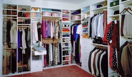
ORGANIZINGGet the Organizing Help You Need (Finally!)
Imagine having your closet whipped into shape by someone else. That’s the power of working with a pro
Full Story
KITCHEN DESIGNDesign Dilemma: My Kitchen Needs Help!
See how you can update a kitchen with new countertops, light fixtures, paint and hardware
Full Story
BATHROOM DESIGNKey Measurements to Help You Design a Powder Room
Clearances, codes and coordination are critical in small spaces such as a powder room. Here’s what you should know
Full Story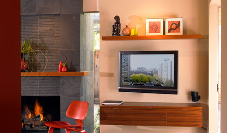
DECORATING GUIDESDecorate With Intention: Helping Your TV Blend In
Somewhere between hiding the tube in a cabinet and letting it rule the room are these 11 creative solutions
Full Story

patricianat
natal
Related Professionals
Bel Air North Interior Designers & Decorators · Wareham Interior Designers & Decorators · Mansfield Furniture & Accessories · North Myrtle Beach Furniture & Accessories · Phoenix Furniture & Accessories · Toledo Furniture & Accessories · Chaska Furniture & Accessories · Fort Carson Furniture & Accessories · Gages Lake Furniture & Accessories · Potomac Furniture & Accessories · Bethlehem Custom Artists · Green Bay Lighting · La Jolla Lighting · Del City Window Treatments · Inwood Window TreatmentsjjamOriginal Author
patricianat
lynnski
budge1
ileyana
organic_smallhome
organic_smallhome
ileyana
patricianat
goldeneyedaisy
jjamOriginal Author
annzgw
jjamOriginal Author
noodlesportland
ummm
jjamOriginal Author
johnatemp
jjamOriginal Author
teacats
noodlesportland
johnatemp
patricianat
demeron
riverrat1
segbrown
eaglesgal
black-thumb
black-thumb
labradoodlelady
jjamOriginal Author
msrose
kellyleeann
jjamOriginal Author
eaglesgal
jjamOriginal Author
eaglesgal
jjamOriginal Author
black-thumb
eaglesgal
lnmca
riverrat1
dorothy9_gw
teachbls
teachbls
jjamOriginal Author
jjamOriginal Author
jjamOriginal Author
threedgrad