


Anybody have orange wall color?
awm03
15 years ago
Featured Answer
Sort by:Oldest
Comments (27)

dilly_dally
15 years ago
nhb22
15 years ago
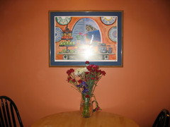
awm03
15 years agormkitchen
15 years agokoidom
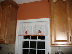
15 years agoawm03
15 years agoindygo
15 years agojaymielo
15 years agojyyanks
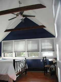
15 years agoalmagh
15 years agomacfrodge_gmail_com
15 years ago
IdaClaire
15 years agoawm03
15 years agoUser
15 years agoprairiegirlz5
15 years ago
rob333 (zone 7b)
15 years agoIdaClaire
15 years agomarisany
15 years agohouse_vixen
15 years agoawm03
15 years agohouse_vixen
15 years agoawm03
15 years agokitchendetective
15 years agoCyndi Charney
15 years agoawm03
15 years agodeclansmom
15 years ago


Related Stories
COLORTake a Slice From Psychology to Use Orange Better
Get the scoop on this attention-seeking hue and learn how it can bring a refreshing zing to your interiors — and your spirit
Full Story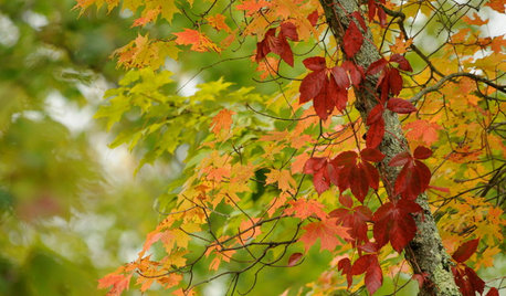
COLORFall on the Wall: Decorating With Rich Reds, Browns and Oranges
For your interiors, take a cue from nature’s colorful seasonal offerings
Full Story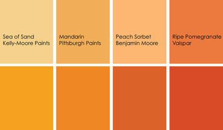
COLORColor Feast: When to Use Orange in the Dining Room
Dial up the zest at mealtimes with doses of snappy orange on dining room walls and furniture
Full Story
BOLD COLORZest for Orange Stays Strong in Fall 2012
From pumpkin to tangerine, this hue is still hot stuff on walls, rugs, furniture and accessories
Full Story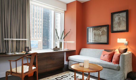
MOST POPULARFalling for Color: 9 Ways With Pumpkin Orange
From racing stripes to accent walls, see how to work this vibrant hue into your home
Full Story
PRODUCT PICKSGuest Picks: Keep Your Eyes Peeled for Orange
Give your rooms an energy shot with vibrant orange curtains, chairs, accessories and more
Full Story
COLORCooking With Color: When to Use Orange in the Kitchen
Try a dash of Cayenne or swaths of Sweet Orange for zesty, high-energy kitchen flavor
Full Story
ORANGEColor Guide: How to Work With Orange
Orange is the most controversial color in the spectrum, but its warmth and personality can charm almost anyone
Full Story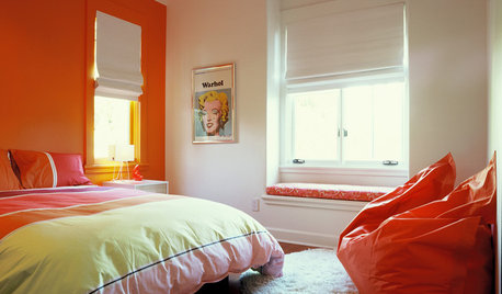
COLORDreaming in Color: 6 Sensational Orange Bedrooms
Orange is looking to be a hot color contender, say the experts. Use it for a dynamic bedroom that's right on trend
Full Story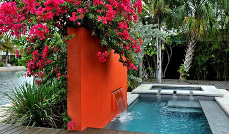
COLOROrange in the Garden: Do You Dare?
Tangerine and other oranges are boldly cavorting from fashionable interiors to outdoor rooms. See some in-vogue examples here
Full Story


jaymielo